vskip=2pt \onlineid1517 \vgtccategoryResearch \vgtcpapertypesystem \authorfooter All authors are with Carnegie Mellon University. Emails: willepp@cmu.edu, vaishnag@andrew.cmu.edu, domoritz@cmu.edu, adamperer@cmu.edu. \shortauthortitleEpperson et al.: Dead or Alive: Continuous Data Profiling for Interactive Data Science
Dead or Alive: Continuous Data Profiling for Interactive Data Science
Abstract
Profiling data by plotting distributions and analyzing summary statistics is a critical step throughout data analysis. Currently, this process is manual and tedious since analysts must write extra code to examine their data after every transformation. This inefficiency may lead to data scientists profiling their data infrequently, rather than after each transformation, making it easy for them to miss important errors or insights. We propose continuous data profiling as a process that allows analysts to immediately see interactive visual summaries of their data throughout their data analysis to facilitate fast and thorough analysis. Our system, AutoProfiler, presents three ways to support continuous data profiling: (1) it automatically displays data distributions and summary statistics to facilitate data comprehension; (2) it is live, so visualizations are always accessible and update automatically as the data updates; (3) it supports follow up analysis and documentation by authoring code for the user in the notebook. In a user study with 16 participants, we evaluate two versions of our system that integrate different levels of automation: both automatically show data profiles and facilitate code authoring, however, one version updates reactively (“live”) and the other updates only on demand (“dead”). We find that both tools, dead or alive, facilitate insight discovery with 91% of user-generated insights originating from the tools rather than manual profiling code written by users. Participants found live updates intuitive and felt it helped them verify their transformations while those with on-demand profiles liked the ability to look at past visualizations. We also present a longitudinal case study on how AutoProfiler helped domain scientists find serendipitous insights about their data through automatic, live data profiles. Our results have implications for the design of future tools that offer automated data analysis support.
keywords:
Data Profiling, Data Quality, Exploratory Data Analysis, Interactive Data Science.![[Uncaptioned image]](/html/2308.03964/assets/figures/teaser.png)
In AutoProfiler, data profiles update whenever the data in memory updates and are sorted with the last updated dataframes at the top.
In this example, a user has (1) loaded a dataframe about housing prices and sees the profile for in the sidebar.
(2) The user then investigates the price column and exports a chart to code so they can persist this chart and tweak the code for follow-up analysis.
Introduction
In recent decades, data analysis is no longer bottlenecked by the technical feasibility of executing queries against large datasets, but by the difficulty in choosing where to look for interesting insights [5]. Interactive programming environments such as Jupyter notebooks help since they support fast, flexible, and iterative feedback when programming with data [2, 33]. However, while these coding tools were designed to track the state of program execution and variables for debugging, they were not inherently designed to track how data is manipulated and transformed. This forces users to manually make sense of and write additional code to explore their data.
Exploratory Data Analysis (EDA) is critical to understanding a dataset and its limitations and is a common task at the beginning of a data analysis [47, 49]. Yet the manual effort required to construct data profiles for EDA takes up a significant part of data analysts’ time: recent surveys of data scientists show that they spend almost 50% of their time just cleaning and visualizing their data [3]. Since data profiling is so time intensive, it is easy for users to skip over important trends or errors in their data. This can lead to negative downstream consequences when this data is used for modeling and decision-making [41]. In particular, many data quality issues are potentially silent: models will still train or queries will execute, but the results will be incorrect [16]. For example, in the data profile of apartment prices in Dead or Alive: Continuous Data Profiling for Interactive Data Science we can see that some apartment prices have negative values. If these values are not addressed, analyses or models that use this data may lead to wrong decisions.
We propose continuous data profiling as a process that allows analysts to immediately see interactive visual summaries of their data throughout their data analysis to facilitate fast and thorough analysis. To explore how automated tools can best support continuous data profiling, we have built a computational notebook extension AutoProfiler that tightly integrates data profiling information into the analysis loop. AutoProfiler maintains the advantages of the interactive notebook programming paradigm, while giving users immediate feedback on how their code affects their data. This tightens the feedback loop between manipulating data and understanding it during data programming.
We explore three main features in AutoProfiler. First, it automatically displays profiling information about each dataframe and column to facilitate data understanding. By showing data distributions and summaries, AutoProfiler jump-starts a user’s EDA. Second, when the data in memory updates, the profiling information updates accordingly. “Live” updates in user interfaces have been shown to reduce iteration time [27]; with AutoProfiler we apply this concept to data profiling to understand how it helps facilitate data understanding. Third, although AutoProfiler eliminates the repetitive work of authoring data profiling code, users still need to be able to conduct flexible follow-up analysis and persist interesting findings in their notebook [40]. AutoProfiler supports this by authoring code for the user through code exports to help users quickly select subsets, find outliers, or author charts.
We present two complimentary evaluations of AutoProfiler. In a user study with 16 participants, we evaluate two levels of automated assistance to see how different versions of the tool help users find errors and insights in their data. Half of the participants used AutoProfiler (a “live” profiler) and the other used a version that presents the same information but in a static, inline version (which we denote as “dead”). In this evaluation, we found that users experience similar benefits from both versions of the tool, “dead” or “live”, and generate 91% of findings from the tools as opposed to their own code. Participants found live updates intuitive and felt it helped them verify their transformations while those with static profiles liked the ability to look at past visualizations. Furthermore, participants described how the systems sped up their analysis and exports facilitated a more fluid analysis. In our second evaluation, we conducted a long-term deployment of AutoProfiler with domain scientists to use the system during their analysis. These users described how the “live” system enabled them to find and follow up on interesting trends and how AutoProfiler facilitated serendipitous discoveries in their data by plotting things they might not have checked otherwise. We discuss how future automated assistants can build on AutoProfiler to augment data programming environments. In summary, our paper makes the following contributions:
-
1.
We demonstrate the benefits of continuous data profiling with AutoProfiler, which supports data programming with automatic, live profiles and code exports.
-
2.
We evaluate this tool in a controlled study and demonstrate how continuous profiling helps analysts discover insights in their data and supports their workflow.
-
3.
We also present a longitudinal case study demonstrating how AutoProfiler leads to insights and discoveries during daily analysis workflows for scientists.
1 Related Work
Our work builds on prior literature on assisted data understanding, live interfaces, and linking GUI and code interfaces.
1.1 Data understanding is critical yet cumbersome
Understanding data and its limitations has long been an important, but often overlooked, part of analysis. Tukey was an early advocate for plotting distributions and summary statistics to get to know your data before confirmatory analysis (hypothesis testing) began [47]. Current best practices taught in introductory statistics courses still emphasize the importance of starting analysis with summaries of individual columns, such as distributions and descriptive statistics, before moving on to plot combinations of columns or investigating correlations [42]. Recent research has highlighted how with the increasing emphasis on developing AI models, people often undervalue data quality leading to negative downstream effects [41]. Multiple surveys of production data scientists describe the difficulty and time spent on data understanding, profiling, and wrangling [19, 3, 24]. For example, a recent Anaconda foundation survey described that data scientists self-reported spending almost 50% of their time on data cleaning and visualization [3].
Data understanding is difficult because of a variety of factors, including that data updates quickly in production environments, so automated methods and alerts have a high number of false positives [43], current popular tools require manual data exploration and become messy [33], and as datasets have grown, there are a large number of issues to check for. Prior systems in the visualization community have addressed parts of this space such as comparing data over time as models are trained on subsequent data versions [18] or methods for cleaning up notebooks during analysis [14]. However, more work is needed to understand how tools can facilitate discovering data and potential quality issues before they propagate to downstream models or analyses.
1.2 Prior assisted and integrated EDA tools
Prior visualization systems aim to automate the visual presentation of data to speed up data understanding. In general, this automation helps alleviate the burden of specifying charts so that users can focus more on insights rather than how to produce a specific chart [15]. Some systems automate visual presentation and then rank charts according to metrics of interest such as high correlation [8], charts that satisfy a particular pattern in the data [45], or contain attributes of interest [50]. Closely related to our work is the Profiler system, which checks data for common quality issues such as missing data or outliers, and presents potentially interesting charts to the user [20].
However, many of these systems exist in standalone tools, making them difficult to integrate into flexible data analysis workflows in programming environments like Jupyter notebooks [2]. Other systems have explored how to integrate visualization recommendations in the notebook programming context as well through visualization callbacks, libraries, embedded widgets, and similar notebook search [34, 26]. Lux [25] and other open source tools [1, 30, 31, 6, 39] show EDA information on demand for individual Pandas dataframes. While Lux uses \sayalways on visualization recommendations to overwrite the default table view for pandas dataframes, users must still ask for visualizations by calling a dataframe explicitly. Diff in the Loop [48] presents a paradigm for automatically visualizing the differences between dataframes after each step in an analysis. Although these prior systems use automatic visualization, they still require the user to manually ask for this information after each data update and often present an abundance of information that can be difficult to compute in reactive times and for users to parse quickly. With AutoProfiler, we explore the benefits and design constraints around coupling automatic visualization with live updates and code authoring on the user’s behalf.
1.3 Liveness in user interfaces
Fast iteration on data and models is a key element to effective data science [11, 43]. The fast, incremental feedback that users receive in Jupyter notebooks is part of the popularity of the platform [33, 10], yet the default presentation of data feedback in Jupyter is limited to a handful of rows. “Liveness” in user interfaces reduces iteration time through reactive updates [27], such as in spreadsheets [17]. Prior studies of liveness in data science tools have compared live interfaces to REPL (read-eval-print-loop) interfaces like Jupyter and found users like the responsiveness and clean coding that live interfaces afford [7]. Inspired by the affordances of live, reactive updates, AutoProfiler evaluates how automatically updating data profiles after a user changes their data can help reduce iteration time during analysis. When using AutoProfiler in Jupyter, users must still explicitly execute their code to manipulate the data, thus it is not a completely “live” environment. However, data profiles reactively update when data changes.
1.4 Linking code and GUI interactions
There is a tradeoff between tools that support using code to interact with data or direct manipulation. Programming languages are flexible and expressive, yet GUIs are responsive and easy to use [2]. Prior systems in the notebook setting have bridged this gap by writing interactions with a chart [51] or widget [22] back to the notebook automatically. This allows users to reuse analysis code and preserves the steps of their analysis. Selection exports in AutoProfiler serve a similar purpose of facilitating drill down into rows of interest in a dataset. Our code authoring approach differs from prior systems since we only write code to the notebook explicitly when the user asks, rather than implicitly after every interaction to avoid polluting the user’s notebook.
Beyond their flexibility, programming languages remain popular for data science because they allow users to reuse old analysis code for new purposes [21], or use analysis “templates” to help users go through the same steps of analysis for similar tasks [10]. AutoProfiler’s template exports serve a similar purpose to author code in the notebook and support follow-up analysis for tasks like customizing a plot, doing outlier analysis, or investigating duplicates.
2 Design Goals
We developed the following design principles to inform our system requirements and design:
-
G1:
Automatic & Predictable: Basic data profiling information should be visualized automatically without any need for extra code in a consistent manner.
-
G2:
Live: When the data updates, so should all visualizations of it. This prevents “stale” data visualizations in a notebook and allows data profiles to be accessible throughout an analysis.
-
G3:
Non-intrusive: Since users are writing code to interact with their data, automatic visualization should not interfere with their flow.
-
G4:
Initiate EDA: Data profiles should present a starting point for understanding each column, which can inform follow-up analysis.
-
G5:
Persistence: Tools should support writing findings to the notebook to enable reproducible and shareable analysis.
G1 and G2 were motivated by the manual EDA which is the current status quo in notebook programming. We build on prior techniques in live interfaces [27] and automatic visualization [25, 15] to speed up the data profiling process and enable continuous data profiling. This eliminates the need to write repetitive profiling code to understand dataframes after each update. Importantly, we show the same profiling information for each type of column and visualize the data “as is” in order to facilitate finding issues (G1). With live updates, we situate our profiler alongside the programming environment rather than inline (G3) so that it does not take programmers out of their analysis flow [12]. This also helps declutter the programming environment since most preliminary visualization can be done in the sidebar. We make the design choice to show univariate profiling information to help users jump-start their EDA process (G4). Previous profiling systems often require scrolling to look through multiple pages of charts [25, 30], making it hard to find interesting problems or insights. Our goal is to facilitate rapid data understanding with data profiles, then allow users to do further custom analysis by handing off their analysis back to code through exports. Code exports also facilitate saving findings such as charts or code snippets to the notebook so that notebooks can be shared and reproduced (G5), a core goal in notebook data analysis [40].
3 Continuous Data Profiling with AutoProfiler
AutoProfiler provides data analysts rapid feedback on how their code affects their data to speed up insight generation. The system fits into a common existing workflow for analysis: using Pandas in Jupyter. Pandas is the most popular data manipulation library in Python, with millions of downloads every week [29]. Likewise, computational notebooks in Jupyter have become the tool of choice for data science in Python [33]. AutoProfiler focuses on Pandas users in Jupyter with the goal that features that support this workflow will generalize to other dataframe libraries such as Polars [36] or Arrow [4], as well as other notebook programming environments. The AutoProfiler system has three core features that enable continuous data profiling: automatic visualization (§ 3.1), live updates (§ 3.2), and code exports (§ 3.3).
3.1 AutoProfiler shows EDA automatically
AutoProfiler detects all Pandas dataframes in memory and presents them in the sidebar of the notebook. Each dataframe profile can be shown or hidden, along with more information about each column. This allows users to drill down into dataframes and columns of interest to see more information, providing details on demand. By situating AutoProfiler in the sidebar it also allows users to simultaneously look at both summary data profiles of their data in AutoProfiler and the default instance view inline from Jupyter.
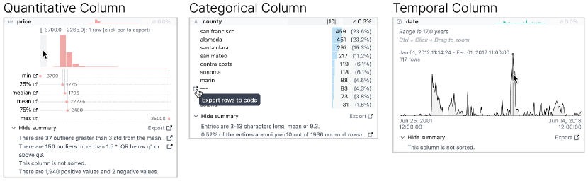
We use the Pandas datatype of the column to show corresponding charts and summary information. We categorize the Pandas datatypes into semantic datatypes of numeric, categorical, or timestamp columns similar to previous Pandas visualization systems [25, 9]. Column profiles for each of these three data types are shown in Figure 1. Each column profile has three core components:
-
1.
Column Overview which contains the name, data type, a small visualization, and the percentage of missing values.
-
2.
Column Distribution which is shown by clicking on the overview to reveal a larger, interactive visualization of column values.
-
3.
Column Summary that has extra facts about a column such as the number of outliers or duplicate values.
The overview, distribution, and summary shown depend on the data type of the column. Furthermore, the distribution and summary can be toggled on and off to show more details on demand [44]. This is important for large dataframes with many columns, or when there are many dataframes in memory to prevent unncessary scrolling. Many visual elements show hints on hover to further prevent visual clutter, providing further details on demand. Our core charting components were adapted from the open-source Rill Developer platform which shows data profiles for SQL queries [38]. We use the same visualizations in AutoProfiler with extra summary information and linked interactions to connect the profile to the notebook.
Quantitative Columns: For quantitative columns like integers and floats, we show a binned histogram so that users can get an overview of the distribution of the column. This histogram is shown in the column overview as a preview; a larger and interactive version is presented upon toggling the column open. On hover, users can see how many points are in each bin. We also show numerical summary information like the min, mean, median, and max of the column. This is similar to what is presented in the
describe()} function in Pandas to give a numeric summary of a column.
In \autoref
fig:column_details (left), we demonstrate this information for a price column where we can see that some of the prices in this distribution are negative, a potential error that should be inspected during analysis. If users want to see more information, they can toggle the summary to see potential outliers, whether the column is sorted, and the number of positive, zero, and negative values. We use two common heuristics to detect outlier values. The first is if a value is greater than 3 standard deviations from the mean; the second is if a point falls outside of away from the first or third quartile. Both forms of outlier detection code can be exported to code which allows users to investigate potential outliers more or change these thresholds for classifying the outliers with their code manually. Categorical Columns: For categorical or boolean columns, we first show the cardinality of the column in the overview to let users understand the total number of unique values. Once toggled open, the distribution view shows the frequency of the top 10 most common values. This is similar to the commonly used
value_counts()} function in Pandas which shows the count of all unique values.
In the categorical summary, we show extra information about the character lengths of the strings in the column along with a more detailed description of the column’s uniqueness.
This uniqueness fact can be exported to code which lets users inspect duplicated data points.
Once again, users can export a selection to code in the notebook to quickly filter their dataframe.
For example, in \autoref
fig:column_details (center) we show the information for the categorical column “county”. This column has some default values of
"---"} that seem like an error, so a user can click ‘‘Export rows to code’’ to have the code \mintinlinePythondf[df.county == "—"] written to their notebook and can investigate these rows further.
Once this new code is written to the notebook, the user can look at this subselection in AutoProfiler or with their own Pandas code.
Temporal Columns: Our last semantic data type is for temporal columns, where we also show a distribution overview so users can see the count of their records over time.
In the larger distribution view, users can hover over this chart to see the count of values at a particular point in time.
We also show the range of the column and if the column is sorted or not.
Users can drag over a selection of the column to zoom into the time range more in the visualization.
We plan on adding selection exports to temporal columns in the future.
In Figure 1 (right), we show the profiling information for a date column where a user can observe that the records in their dataset span 17 years, however are not evenly distributed with large spikes in certain years such as early 2012.
3.2 Live Data Profiles
Beyond showing useful data profiling information just once, AutoProfiler updates as the data in memory updates.
Once a new cell is executed, AutoProfiler recomputes the data profiles for all Pandas dataframes in memory and updates the charts and statistics as necessary in the interface.
With live updates, AutoProfiler always shows the current state of all dataframes currently in memory in the notebook, allowing users to quickly verify if transformations have expected or unexpected effects on their data.
§ 3.2 shows this update when a string column is parsed to numeric.
Here, Pandas initially parses this column as an object data type but when the user turns the column into an integer the distribution and summary information is updated.
Live updates help users verify a wide range of transforms.
For example, after updating the types of columns, applying filters, or dropping “bad” values.
AutoProfiler has several UI elements to help users track and assess changes after updates.
The first is that when a user hovers over a column in any dataframe, if other dataframes have columns with the exact same name they are highlighted.
For example, if a user takes the dataframe df}, filters it to \mintinlinePythondf_filtered, and then hovers on the Price column the linked highlights help the user make a visual connection between the two Price columns.
With automatic dataframe detection and visualization, there can potentially be many dataframes in memory as users manipulate their data over an analysis.
AutoProfiler supports sorting dataframe profiles to find those of interest.
By default, the most recently updated profiles are shown at the top of the sidebar.
A user can also sort alphabetically by the dataframe name.
Furthermore, users can pin any profile so that it always appears at the top of the sort order.
Dataframe profiles are typically only shown for dataframes explicitly assigned to a variable with one exception: if the output from the most recently executed cell is a Pandas dataframe we will compute a profile for it with the name “Output from cell [5]”.
On the next cell execution, these temporary profiles are removed.
This fits into a common notebook programming workflow where users display their dataframe after making a transformation to see how the data has changed.
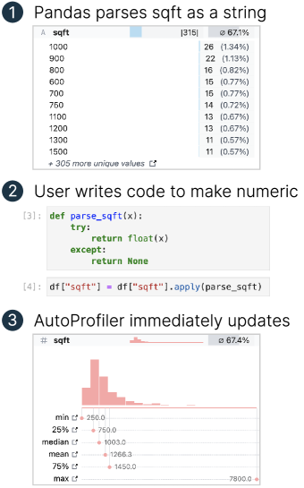
updates in memory, AutoProfiler will update the profile shown.
This way the user can see their transformation was successful, inspect the distribution of sqft, and even notice that the number of nulls increased by 0.3% after this parse.
3.3 Exports to code
In addition to interactive data profiles, AutoProfiler assists users in authoring code.
AutoProfiler facilitates code creation in two ways: selection and template code exports.
For both of these, a user clicks on a button or part of a chart and AutoProfiler writes code for them in the notebook below the user’s currently selected cell.
All code export snippets are pre-built into AutoProfiler and produce the same code snippet for each task with the dataframe and column names filled in so the code is ready to execute in the notebook.
Selection and template exports only differ in the kind of code they produce.
Selection exports allow users to export selections from charts to help them filter their data, as mentioned in § 3.1.
For example, Figure 1 (left and center) demonstrates how a user can export selections from categorical and numeric charts to quickly filter their data.
This helps users more quickly iterate on ideas during analysis to spend less time writing simple code and proved very popular in our user study.
AutoProfiler authors more complex code like charts or code to detect outliers with template exports.
Code exports for these tasks are still relatively simple, only exporting up to 10 lines of code.
However, this saves users from having to remember how to author a chart themselves or compute outliers.
Users can then easily edit this code, for example to customize their visualization or change the threshold for an outlier.
Prior work has discovered how data scientists often re-use snippets of code across analyses to help them speed up their workflows [10, 21].
AutoProfiler’s exports serve as a form of these pre-baked “templates” for analysis steps.
The other benefit of this type of export is that it helps preserve analysis in the notebook in the form of code, which supports more replicable analyses in notebooks, a common goal [35].
This linking between analysis in a visual analytics tool and notebook code has been introduced in previous systems such as Mage [22] and B2 [51].
Our goal here is similar: to support tight integration between GUI and code.
However, our approach differs slightly in that we only write code to the notebook when the user explicitly clicks a button to prevent polluting the user’s working environment.
3.4 Implementation and Architecture
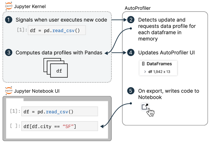 Figure 3: AutoProfiler profiling workflow. Data profiles are computed reactively when a user executes new code. Profiling is done in the kernel to speed up performance and avoid serializing the entire dataframe.
AutoProfiler is built as a Jupyter Lab extension to augment a normal interactive programming environment with a data profiling sidebar.
Figure 3 shows the components involved in a example live update loop.
When a user executes new code, the kernel sends a signal that a cell was executed (step 1).
AutoProfiler then interacts with the kernel to get all variables that are Pandas dataframes, and requests data profiles for each of these variables (steps 2 - 4).
When a user requests to export code, a new cell is created with the code (step 5).
This is only a UI interaction, and when the user executes the generated cell, the update loop will trigger again.
Whenever the kernel is restarted, the dataframes in memory are cleared so the profiles in AutoProfiler reset.
As a Jupyter extension, AutoProfiler can be easily installed as a Python package and included in a user’s Jupyter Lab environment.
This easy installation has proven very popular with users of our system.
The frontend code for AutoProfiler uses Svelte [46] for all UI components.
Our code is open-sourced and available for use111 https://github.com/cmudig/AutoProfiler.
All profiling functions are written in Python and execute code in Pandas.
Pre-binning distributions in python makes serialization faster to avoid serializing entire dataframes.
Since our profiling happens in Pandas, the performance of AutoProfiler generally scales with the capabilities of Pandas.
Anecdotally, we have used AutoProfiler during analyses with dataframes with hundreds of thousands of datapoints and updates remain responsive.
The scalability of our approach is primarily impacted by two main considerations: the number of columns in each dataframe and number of dataframes in memory.
Pandas can still execute a single query relatively quickly for dataframes with up to millions of datapoints, and we consider a full benchmarking of pandas queries outside the scope of this work.
Since requests to the Jupyter python kernel are currently executed serially, larger requests for dataframes with many columns or more dataframes in memory make updates slower.
The AutoProfiler UI is not affected by the size of the underlying data since the queries return binned data counts or summary statistics so the UI remains responsive, it simply takes longer to fetch new data for larger or more dataframes.
We have included several performance tweaks to make AutoProfiler usable for real workflows.
For example, we do not calculate updates when the AutoProfiler tab is closed to avoid unnecessary computation.
The scalability of AutoProfiler can be improved with further engineering.
For example, the requests for profiling queries could be executed in parallel by augmenting the Jupyter kernel.
Furthermore, faster query execution system like DuckDB [37] can speed up the response on individual queries over pandas.
For particularly large datasets, the distributions and statistics could be estimated from samples.
Figure 3: AutoProfiler profiling workflow. Data profiles are computed reactively when a user executes new code. Profiling is done in the kernel to speed up performance and avoid serializing the entire dataframe.
AutoProfiler is built as a Jupyter Lab extension to augment a normal interactive programming environment with a data profiling sidebar.
Figure 3 shows the components involved in a example live update loop.
When a user executes new code, the kernel sends a signal that a cell was executed (step 1).
AutoProfiler then interacts with the kernel to get all variables that are Pandas dataframes, and requests data profiles for each of these variables (steps 2 - 4).
When a user requests to export code, a new cell is created with the code (step 5).
This is only a UI interaction, and when the user executes the generated cell, the update loop will trigger again.
Whenever the kernel is restarted, the dataframes in memory are cleared so the profiles in AutoProfiler reset.
As a Jupyter extension, AutoProfiler can be easily installed as a Python package and included in a user’s Jupyter Lab environment.
This easy installation has proven very popular with users of our system.
The frontend code for AutoProfiler uses Svelte [46] for all UI components.
Our code is open-sourced and available for use111 https://github.com/cmudig/AutoProfiler.
All profiling functions are written in Python and execute code in Pandas.
Pre-binning distributions in python makes serialization faster to avoid serializing entire dataframes.
Since our profiling happens in Pandas, the performance of AutoProfiler generally scales with the capabilities of Pandas.
Anecdotally, we have used AutoProfiler during analyses with dataframes with hundreds of thousands of datapoints and updates remain responsive.
The scalability of our approach is primarily impacted by two main considerations: the number of columns in each dataframe and number of dataframes in memory.
Pandas can still execute a single query relatively quickly for dataframes with up to millions of datapoints, and we consider a full benchmarking of pandas queries outside the scope of this work.
Since requests to the Jupyter python kernel are currently executed serially, larger requests for dataframes with many columns or more dataframes in memory make updates slower.
The AutoProfiler UI is not affected by the size of the underlying data since the queries return binned data counts or summary statistics so the UI remains responsive, it simply takes longer to fetch new data for larger or more dataframes.
We have included several performance tweaks to make AutoProfiler usable for real workflows.
For example, we do not calculate updates when the AutoProfiler tab is closed to avoid unnecessary computation.
The scalability of AutoProfiler can be improved with further engineering.
For example, the requests for profiling queries could be executed in parallel by augmenting the Jupyter kernel.
Furthermore, faster query execution system like DuckDB [37] can speed up the response on individual queries over pandas.
For particularly large datasets, the distributions and statistics could be estimated from samples.
4 Evaluation: User Study
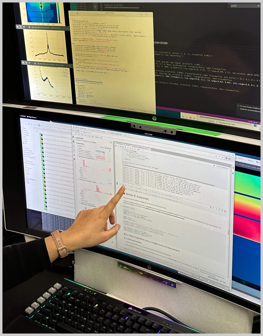 Figure 5: AutoProfiler integrated into a domain scientist’s analysis workflow during our case study. AutoProfiler is shown on the bottom screen in the Jupyter notebook.
5 Evaluation: Longitudinal Case Study
To address some of the limitations of our user study, we also evaluated how AutoProfiler helps data scientists in a real world environment by working with domain scientists at a US National Lab to integrate AutoProfiler into their workflows.
These scientists work with large-scale image data collected from beamline X-ray scattering experiments to understand the properties of physical materials [23].
Two different scientists installed AutoProfiler into their Jupyter Lab environments and used it over a three month period during their analyses as much as they liked.
We were unable to collect log data during this deployment for privacy reasons.
We periodically spoke with the scientists during the deployment to make sure the tool was working.
At the end of the 3-month period, we conducted in-person observations and interviews with the participants where they showed us the notebooks and datasets where they were using AutoProfiler and we asked about how they used the system, and which features they felt supported their workflows.
As a Jupyter Lab extension, AutoProfiler fits into the existing workflows of these scientists since they typically did data analysis with Python and had existing libraries for visualizing and manipulating their data.
AutoProfiler helped improve two different workflows they have for data analysis.
The first is for monitoring data outputs and quality while an experiment is running.
Their experiments last for multiple hours or even days while they collect image readings from a sensor and then process these images into tabular datasets with Python image processing pipelines.
As the scientists describe, during these experiments \sayreal-time feedback is important as it shows us whether the experiment is working.
The participants mentioned how AutoProfiler improved this type of monitoring since it works with any Python-based analysis and \sayallows [them] to easily notice any anomaly and observe a trend or correlation during experiments.
The second way the participants used AutoProfiler was to analyze their results after an experiment completed.
In this scenario, the scientists \sayiteratively sub-selected a relevant set of data, using AutoProfiler as a guide, and then analyzed this subset of data using existing analysis/plotting tools. Thus, AutoProfiler has shown its value in improving data triage, data organization, and serendipitous discovery of trends in datasets.
In the remainder of this section, we discuss two high-level patterns of use that emerged from interviews with the participants in our long-term deployment.
5.1 Finding and following up on trends
When using AutoProfiler to analyze their experimental results, our participants expressed how the tool facilitated finding interesting aspects in their data and then diving deeper into those subsets.
In this way, AutoProfiler facilitated a faster find-and-verify loop during analysis.
The automatic plotting in AutoProfiler presented interesting plots in their dataset that helped them find subsets to export and explore further such as by running other analysis code to plot the images corresponding to each data point.
They were especially excited about the possibility of incorporating bivariate charts into AutoProfiler so they would have to use even less of their own analysis code.
5.2 AutoProfiler facilitates serendipitous discovery
The scientists used the live version of AutoProfiler that updates whenever their data changes.
They mentioned that the combination of all three features (automatic visualization, live updates, and code authoring) supported one another to lower the friction of their data analysis and were not enthusiastic about using versions of the tool without all of these features (such as in StaticProfiler).
Furthermore, the participants mentioned that using AutoProfiler helped them discover trends or errors they might not have noticed otherwise:
{quoting}
“One of the things that I very often notice is if the histogram is completely flat. That means that either all the numbers are exactly the same, or that it’s some sort of sequential number. Sometimes that’s what I’m expecting, so great. But sometimes, if it’s not what I’m expecting, then that immediately stands out as being weird and it draws my attention to it. I would never have noticed if it were not plotted; I would never have thought to plot it.”
Our participants described how these unexpected, serendipitous, discoveries were primarily facilitated by the auto-updating and automatic visualizations of AutoProfiler and made the system a valuable part of their workflow.
6 Discussion and Future Work
Data science is messy.
There are a combinatorially large number of ways to slice a dataset, trying to find meaningful insights.
The goal of continuous data profiling is to augment a human’s sense-making ability by automating the analysis feedback loop to be as fast as possible.
Previous work has established that automated systems can best facilitate data understanding by automating the need for manual specification [15].
We found that two different versions of automatic profiling help speed up this feedback loop in our user study.
Furthermore, we found evidence that the combination of automatic visualization, live updates, and code handoff leads to a smoother, more thorough analysis loop in our long-term deployment where our participants credited AutoProfiler with helping them find “serendipitous discoveries” in their dataset.
In real-world tasks, encouraging critical engagement is challenging because analysts must trade off finding insights and errors quickly with a thorough and exhaustive analysis of their data.
AutoProfiler’s design removes friction by saving time and clicks to better facilitate continuous data profiling.
Since AutoProfiler works with any pandas dataframe, users do not have to write or copy and paste profiling code that might be tightly coupled to a specific dataset.
This makes notebooks cleaner and easier to maintain.
Future tools can leverage the benefits of both code and automated visualization for data analysis through linked and deeply integrated data profiles.
Automatically presenting a starting set of profiling information and supporting follow-up analysis by enabling code exports helps reduce the feedback time during analysis.
This approach differs from other profiling systems that aim to include as much information as possible in the interface without handing off to code [25, 30].
6.1 Guiding users towards unknown insights
Beyond making data analysis faster, automated systems like AutoProfiler can help users discover insights they might have otherwise missed.
These serendipitous discoveries present an interesting opportunity for tools to help users look at their data in new ways.
However, this process cannot be fully automated.
Automatically presenting data profiles to users gives them the opportunity to find insights.
Users must still take the time to look at and interpret if an insight or error is noteworthy.
Automated systems can augment human expertise, but do not replace it.
For example, in our user study, many participants missed important data quality issues like duplicate values, even though this information was readily available in either tool if one knew to check.
The most common types of unexpected errors discovered through AutoProfiler were strange distributions such as a totally flat distribution or weird frequent values.
The distribution information is very visually prominent in AutoProfiler, perhaps making it easier to discover in the interface.
Automated assistance in notebooks opens up the design space for further improvements toward guided analysis.
One exciting area for future work is the potential to integrate alerts into automatic data profiles to draw user attention to important errors.
For example, an alert could be displayed if a column has a number of null values or outliers greater than some threshold.
Alerts must be customizable and designed to minimize alert fatigue, or else a user may totally ignore them [43].
With existing inline, manual profilers [30] these alerts would be re-computed and displayed every time a user updates and re-profiles their data, quickly causing alert fatigue.
Tools like AutoProfiler present an opportunity for persistent alerts between profiles that can better support continuous data science.
6.2 Authoring more analysis code for users
Our export to code feature was very popular among participants, with many requests for even more ways to export to code.
Part of the benefit of AutoProfiler’s approach to exports is they are predictable: the system exports the same template code every time, with the dataframe and column names filled in.
This is in contrast to generative approaches to code authoring such as Github Copilot [13] where a model might produce different code for the same task depending on the prompt.
Users must then take time to understand this new code each time it is exported.
The downside to template approaches like ours is that it is less flexible for arbitrary analysis.
In our user study, we frequently observed participants needing to look up the documentation for how to write a certain command with the Pandas library, even if they were experienced users.
As tools continue to evolve to automatically write analysis code through text prompting, we think this will make data iteration even faster.
The linked, interactive outputs from systems like AutoProfiler becomes even more valuable to help users understand their data as the time it takes to write analysis code decreases, perhaps especially when users are not manually writing all of that code and need to understand its effect on their data.
7 Conclusion
In conclusion, we present AutoProfiler, a Jupyter notebook assistant that uses automatic, live, and linked data profiles to support continuous data profiling during data analysis.
In a controlled user study, we find users leverage two versions of our tool, dead or alive, to find the vast majority of insights during a data cleaning task.
Furthermore, we find that AutoProfiler easily fits into data scientists’ real-world workflows and helps them discover unexpected insights in their data during a longitudinal case study.
We discuss how tools like AutoProfiler open up the design space for automated assistants to support continuous data profiling during analysis.
Acknowledgements.
We would like to thank Venkat Sivaraman, Katelyn Morrison, Alex Cabrera and the members of the Data Interaction Group at CMU for their feedback on this work; Hamilton Ulmer and the Rill Data team for the initial implementation of our data profiling charts; Wei Xu, Kevin Yager, and Esther Tsai at Brookhaven National Laboratory for their feedback and use of AutoProfiler.
This research was supported by Brookhaven National Laboratory through New York State funding and the Human-AI-Facility Integration (HAI-FI) initiative.
References
Supplemental Materials
Additional tables and figures about our user study and StaticProfiler.
PID
Condition
Analysis Freq
Pandas Freq
Years DS exp
Job
P1
AutoProfiler
Monthly
Monthly
3
Data scientist
P2
StaticProfiler
Weekly
Weekly
5
Grad student
P3
AutoProfiler
Daily
Daily
7
Postdoc
P4
StaticProfiler
Weekly
Monthly
4
Grad student
P5
AutoProfiler
Daily
Daily
2
Data engineer
P6
StaticProfiler
Weekly
Weekly
10
Researcher
P7
StaticProfiler
Weekly
Monthly
4
Data journalist
P8
StaticProfiler
Daily
Daily
3
Data analyst
P9
AutoProfiler
Daily
Daily
3
Grad student
P10
AutoProfiler
Weekly
Weekly
12
Data journalist
P11
StaticProfiler
Weekly
Weekly
4
Data journalist
P12
AutoProfiler
Weekly
Daily
5
Data engineer
P13
AutoProfiler
Daily
Daily
5
Data engineer
P14
StaticProfiler
Daily
Daily
3
Data engineer
P15
AutoProfiler
Daily
Weekly
2
Grad student
P16
StaticProfiler
Weekly
Weekly
5
Grad student
Table 2: Background information on the participants for our user study.
Discovery Rate
No.
Description
AP
SP
Avg.
1
Small number of missing values in county, beds, title
50%
63%
56%
2
Mostly missing in baths, sqft, description
50%
63%
56%
3
City has values that are lower and upper case
75%
63%
69%
4
Negative prices
63%
75%
69%
5
Date could be parsed to DateTime format
63%
63%
63%
6