Explaining Groups of Points in Low-Dimensional Representations
Abstract
A common workflow in data exploration is to learn a low-dimensional representation of the data, identify groups of points in that representation, and examine the differences between the groups to determine what they represent. We treat this workflow as an interpretable machine learning problem by leveraging the model that learned the low-dimensional representation to help identify the key differences between the groups. To solve this problem, we introduce a new type of explanation, a Global Counterfactual Explanation (GCE), and our algorithm, Transitive Global Translations (TGT), for computing GCEs. TGT identifies the differences between each pair of groups using compressed sensing but constrains those pairwise differences to be consistent among all of the groups. Empirically, we demonstrate that TGT is able to identify explanations that accurately explain the model while being relatively sparse, and that these explanations match real patterns in the data.
1 Introduction
A common workflow in data exploration is to: 1) learn a low-dimensional representation of the data, 2) identify groups of points (i.e., clusters) that are similar to each other in that representation, and 3) examine the differences between the groups to determine what they represent. We focus on the third step of this process: answering the question “What are the key differences between the groups?”
For data exploration, this is an interesting question because the groups often correspond to an unobserved concept of interest and, by identifying which features differentiate the groups, we can learn something about that concept of interest. For example, consider single-cell RNA analysis. These datasets measure the expression levels of many genes for sampled cells. Usually the cell-type of each of those cells is unknown. Because gene expression and cell-type are closely related, the groups of points that can be seen in a low-dimensional representation of the dataset often correspond to different cell-types (Figure 1). By determining which gene expressions differentiate the groups, we can learn something about the connection between gene expression and cell-type.
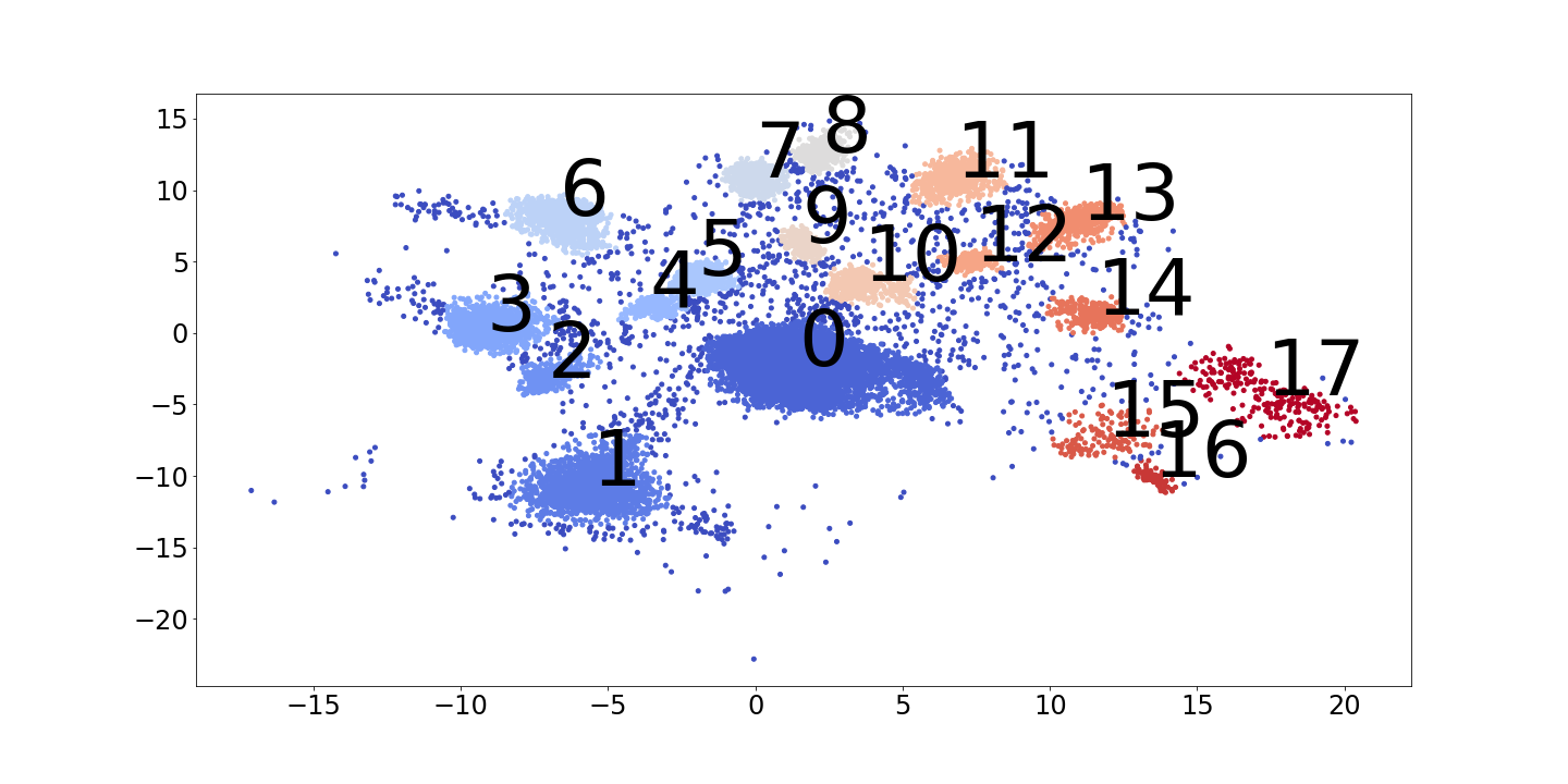
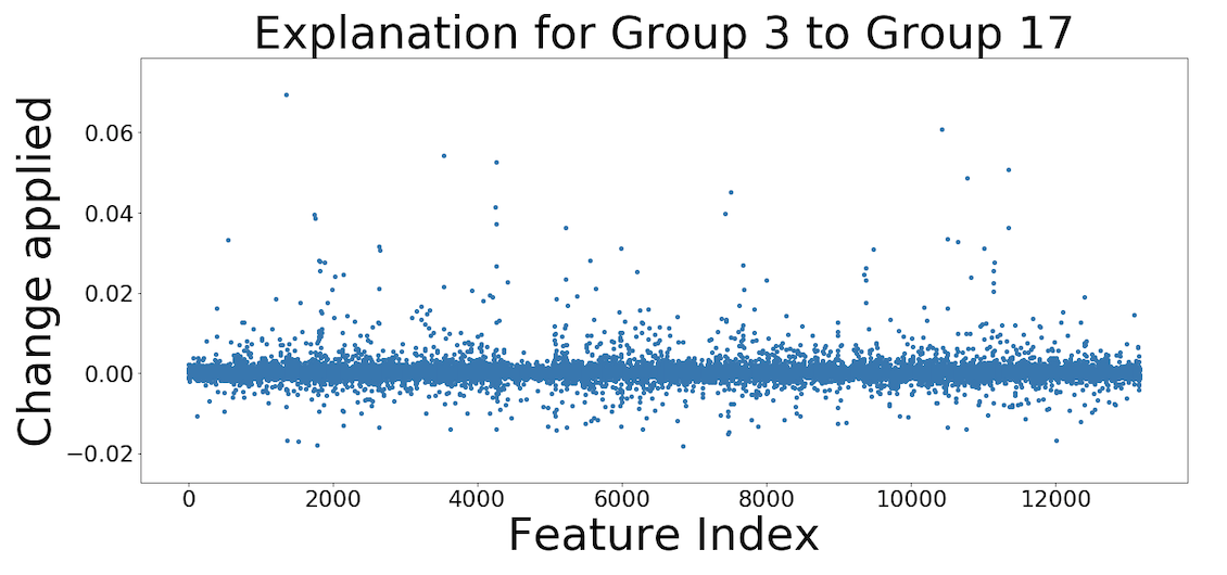
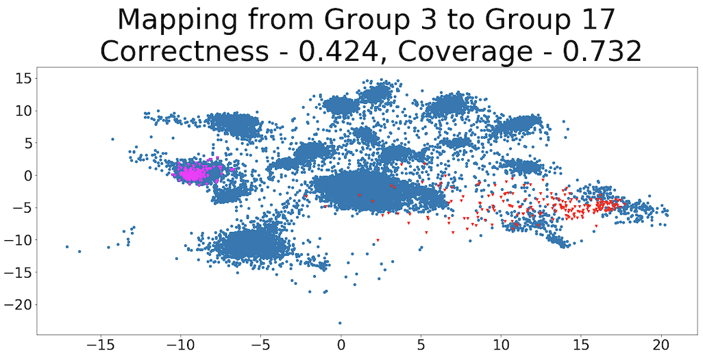
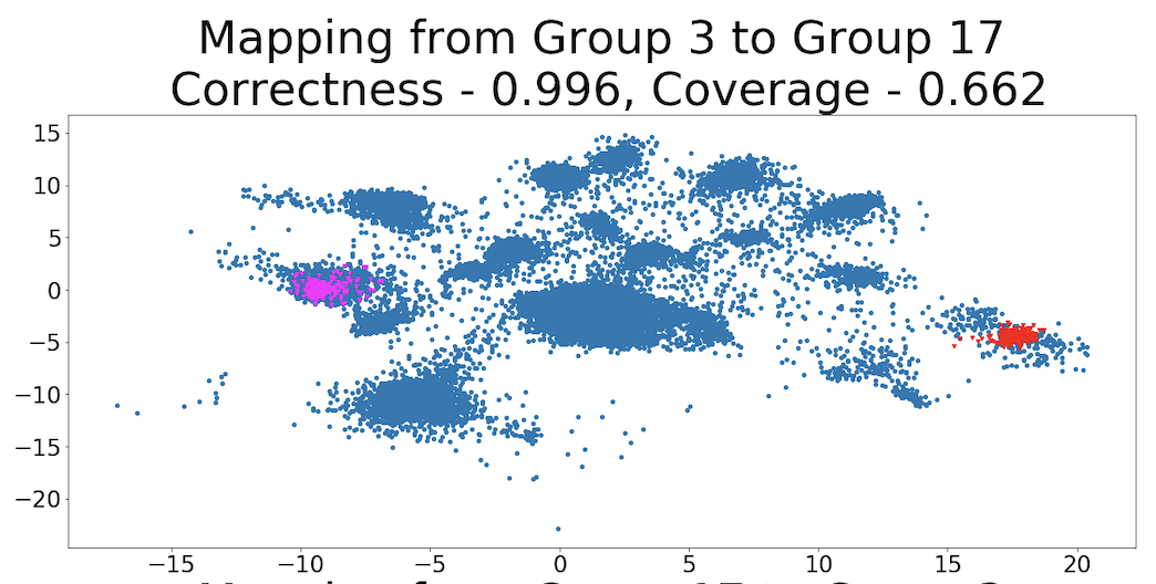
One common approach for answering this question is manual interpretation. One simple way to do this, that we will use as a naive baseline, is to calculate the Difference Between the Mean (DBM) value of each feature in the original input space between a pair of groups. For example, consider using DBM to explain the differences between the cells in Group 3 and Group 17 from Figure 1. In this case, DBM’s explanation contains many hundreds of non-zero elements, which is far too many to be understood by a person (Figure 3). If we make DBM’s explanation sparse by thresholding it to include only the largest changes, it is no longer an effective explanation because it no longer reliably maps points from Group 3 to Group 17 (Figure 3). More generally, manual interpretation can be time-consuming and typically ad-hoc, requiring the analyst to make arbitrary decisions that may not be supported by the data.
Another, more principled, method is statistical hypothesis testing for the differences between features across groups (Shaffer, 1995). However, the trade-off between the power of these tests and their false positive rate becomes problematic in high-dimensional settings.
Both manual interpretation and statistical testing have an additional key shortcoming: they do not make use of the model that learned the low dimensional representation that was used to define the groups in the first place. Intuitively, we would expect that, by inspecting this model directly, we should be able to gain additional insight into the patterns that define the groups. With this perspective, answering our question of interest becomes an interpretable machine learning problem. Although there are a wide variety of methods developed in this area (Ribeiro et al., 2016; Lundberg & Lee, 2017; Wang & Rudin, 2015; Caruana et al., 2015; Ribeiro et al., 2018; Zhang et al., 2018), none of them are designed to answer our question of interest. See Section 2 for further discussion.
To answer our question of interest, we want a counterfactual explanation because our goal is to identify the key differences between Group A and Group B using the low-dimensional representation and the most natural way to do this is to find a transformation that causes the model to assign transformed points from Group A to Group B. Additionally, we want a global explanation because we want to find a explanation that works for all of the points in Group A and because we want the complete set of explanations to be consistent (i.e., symmetrical and transitive) among all the groups. See Section 3.2 for further discussion of our definition of consistency in this context. Hence, our goal is to find a Global Counterfactual Explanation (GCE). Although the space of possible transformations is very large, we consider translations in this work because their interpretability can be easily measured using sparsity.
Contributions: To the best of our knowledge, this is the first work that explores GCEs. Motivated by the desire to generate a simple (i.e., sparse) explanation between each pair of groups, we derive an algorithm to find these explanations that is motivated by compressed sensing (Tsaig & Donoho, 2006; Candès et al., 2006). However, the solutions from compressed sensing are only able to explain the differences between one pair of groups. As a result, we generalize the compressed sensing solution to find a set of consistent explanations among all groups simultaneously. We call this algorithm Transitive Global Translations (TGT).
We demonstrate the usefulness of TGT with a series of experiments on synthetic, UCI, and single-cell RNA datasets. In our experiments, we measure the effectiveness of explanations using correctness and coverage, with sparsity as a proxy metric for interpretability, and we compare the patterns the explanations find to those we expect to be in the data. We find the TGT clearly outperforms DBM at producing sparse explanations of the model and that its explanations match domain knowledge. 111Code for all algorithms and experiments is available at https://github.com/GDPlumb/ELDR
2 Related Work
Most of the literature on cluster analysis focuses on defining the clusters; the interpretation methods discussed in that literature are primarily manual inspection/visualization or statistical testing (Jiang et al., 2004). Consequently, the focus of our related work will be on interpretable machine learning. Although interpretability is often loosely defined and context specific (Lipton, 2016), we categorize existing methods along two axes in order to demonstrate how a GCE differs from them. Those axes are the explanation’s level and its form.
The first axis used to categorize explanations is their level: local or global. A local explanation explains a single prediction made by the model (Ribeiro et al., 2016; Lundberg & Lee, 2017; Plumb et al., 2018). Kauffmann et al. (2019) studies a problem closely related to ours of explaining why a point was assigned to its cluster/group. A global explanation will explain multiple predictions or the entire model at once (Wang & Rudin, 2015; Caruana et al., 2015; Ribeiro et al., 2018).
The second axis we use to categorize explanations is their form: feature attribution, approximation, or counterfactual. A feature attribution explanation assigns a value measuring how each feature contributed to the model’s prediction(s) (Lundberg & Lee, 2017; Sundararajan et al., 2017). Importantly, it is necessary to define a baseline value for the features in order to compute these explanations. An approximation explanation approximates the model being explained using a function that is simple enough to be considered directly interpretable (e.g., a sparse linear model or a small decision tree) across some neighborhood, which could be centered around a point or could be the entire input space (Ribeiro et al., 2016; Plumb et al., 2018; Wang & Rudin, 2015; Caruana et al., 2015; Ribeiro et al., 2018). A counterfactual explanation finds a transformation of the input(s) such that the transformed version of the input is treated in a specific way by the model (Zhang et al., 2018; Dhurandhar et al., 2018; Goyal et al., 2019; Dhurandhar et al., 2019).
For various reasons, it would be challenging to use other types of explanations to construct a GCE. Local explanations would have to be aggregated in order to produce an explanation that applies to a group of points and it would be nontrivial to ensure that the resulting “aggregated group explanations” are consistent (i.e., symmetrical and transitive). For feature attribution and local approximation explanations, it is difficult to guarantee that the baseline value or neighborhood they consider is defined broadly enough to find the transformation we want. For global approximation explanations, we might not be able to approximate a complex model well enough to find the transformation we want because of the accuracy-interpretability trade-off that stems from the complexity constraint on the explanation model (Lipton, 2016). For a concrete example of these difficulties, see the Appendix A.1. This example uses Integrated Gradients (Sundararajan et al., 2017) which is a local feature attribution method that produces symmetrical and transitive explanations with respect to a single class.
3 Global Counterfactual Explanations
We will start by introducing our notation, more formally stating the goal of a GCE, and defining the metrics that we will use to measure the quality of GCEs. We do this under the simplifying assumption that we have only two groups of points that we are interested in. Then, in Section 3.1, we will demonstrate the connection between finding a GCE and compressed sensing. We use that connection to derive a loss function we can minimize to find a GCE between a single pair of groups of points. Finally, in Section 3.2, we will remove our simplifying assumption and introduce our algorithm, TGT, for finding a set of consistent GCEs among multiple groups of points.
Notation: Let denote the function that maps the points in the feature space into a lower-dimensional representation space. The only restriction that we place on is that it is differentiable (see the Appendix A.2 for more discussion on ). Suppose that we have two regions of interest in this representation: . Let and denote their pre-images. Then, our goal is to find the key differences between and in and, unlike manual interpretation or statistical testing, we will treat this as an interpretable machine learning problem by using to help find those key differences.
Defining the Goal of GCEs: At a high level, the goal of a GCE is to find a transformation that takes the points in and transforms them so that they are mapped to by ; in other words, treats the transformed points from as if they were points from . Formally, the goal is to find a transformation function such that:
| (1) |
Because we are using as an explanation, it should be as simple as possible. Since they are very simple and their complexity can be readily measured by their sparsity, we limit to a translation:
| (2) |
Measuring the Quality of GCEs: To measure the quality of a GCE we use two metrics: correctness and coverage. Correctness measures the fraction of points mapped from into . Coverage measures the fraction of points in that transformed points from are similar to. Mathematically, we define correctness as:
|
|
(3) |
And coverage as:
|
|
(4) |
Clearly, correctness is a necessary property because an explanation with poor correctness has failed to map points from into (Equation 1). However, coverage is also a desirable property because, intuitively, an explanation with good coverage has captured all of the differences between the groups.
Defining these metrics requires that we pick a value of .222We use an indicator based on distance and the points themselves for two reasons. First, it is necessary for the definition of coverage. Second, it makes it easier to define for representations that are more than two-dimensional. Observe that, if and , then and we have a measure of how similar a group of points is to itself. After has been learned, we increase until this self-similarity metric for each group of points in the learned representation is between 0.95 and 1.
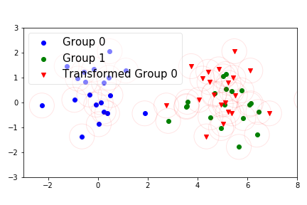
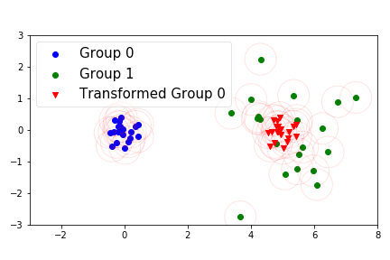
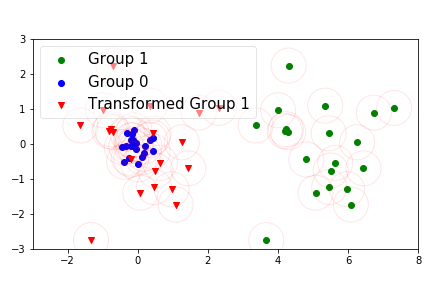
A Simple Illustration: We will now conclude our introduction to GCEs with a simple example to visualize the transformation function and the metrics. In Figures 6, 6, and 6, the data is generated from two Gaussian distributions with different means and . We use DBM between Group 1 and Group 0 to define the translation/explanation. In Figure 6, the two distributions have an equal variance and, as a result, the translation is an effective explanation with good correctness and coverage. In Figures 6 and 6, Group 0 has a smaller variance than Group 1. Because a simple translation cannot capture that information333This is true regardless of how the translation is found (e.g., TGT or DBM). So this example also motivates the usefulness of more complex transformation functions., the translation has poor coverage from Group 0 to Group 1 while its negative has poor correctness from Group 1 to Group 0. This illustrates the connection between correctness and coverage that we will discuss more in Section 3.2.
3.1 Relating GCEs and Compressed Sensing
We will now demonstrate how the problem of finding a GCE between a pair of groups is connected to compressed sensing. We start with an “ideal” loss function that is too difficult to optimize and then make several relaxations to it.
In principle, Equations 1, 3, or 4 define objective functions that we could optimize, but they are discontinuous and hence difficult to optimize. To progress towards a tractable objective, first consider a continuous approximation of correctness (Equation 3):
|
|
(5) |
This loss could be optimized by gradient descent using auto-differentiation software, although doing so might be difficult because of the operation. Consequently, we consider a simplified version of it:
|
|
(6) |
where . 444Note that clearly optimizes for correctness and it does not directly penalize coverage. However, because encourages to be close to , it is optimizing for correctness at the expense of coverage. In Section 3.2, we will discuss why this is not as harmful as it seems in our setting where is a symmetrical translation.
Next, we are going to make use of our restriction of to a translation, , and assume, for now, that is a linear mapping: for . Although this assumption about will not be true in general, it allows us to connect a GCE to the classical compressed sensing formulation. Under these constraints, we have that:
|
|
(7) |
By setting its derivative to zero, we find that solving yields an optimal solution to Equation 7. Observe that this is an undetermined linear system, because , and so we can always find such a .
Recall that, in general, we want to find a sparse . This is partially because we need the explanation to be simple enough to be understood by a person, but also because the explanation is hopefully modeling real world phenomena and these phenomena often have nice structure (e.g., sparsity). Then, because we are finding a GCE by solving 555Note that DBM solves this but does not consider sparsity. , we can see that is the model’s low-dimensional measurement that we are trying to reconstruct using the high-dimensional but sparse underlying signal, . This is exactly the classical compressed sensing problem formulation. As a result, we will add regularization to as an additional component to the loss function as is done in both linear and non-linear compressed sensing (Blumensath, 2013).
Consequently, we could consider finding a GCE by minimizing the linear compressed sensing loss:
| (8) |
where . Or, by removing the assumption that , minimizing the more general version that we use for our experiments:
| (9) |
3.2 Computing GCEs
We have thus far limited ourselves to explaining the differences between groups of points labeled as (“initial”) and (“target”), and focused on learning an explanation from to . However, this is not a realistic setting because this labeling was arbitrary and because we usually have .
Unfortunately, the naive solution of using compressed sensing to independently produce explanations for all O() pairs of groups will fail to satisfy two desirable properties related to the internal consistency of the explanations. For instance, we would like to agree with , a property we call symmetry. Additionally, we would like to agree with the combined explanations and ; we call this transitivity. Formally, symmetry requires that and transitivity requires that for any .
Our approach to finding a consistent (i.e., symmetrical and transitive) set of explanations is to enforce the consistency constraints by-design. We do this by computing a set of explanations relative to a reference group. We assume that is the reference group and find a set of basis explanations , where . We then use this set of basis explanations to construct the explanation between any pair of the groups of points.666Importantly, the transitivity constraint also ensures that our choice of how we label the groups or which group is the reference group does not influence the optimal solution of our algorithm. Algorithm 2 describes how can be constructed from .
Overview of TGT. We now have all of the pieces necessary to actually compute a GCE: a differentiable loss function to measure the quality of , regularization to help us find the simplest possible explanation between and , and a problem setup to ensure that our explanations are consistent across . At a high level, TGT will proceed to sample random “initial” and “target” groups from the set of all groups, construct that explanation from the set of basis explanations (Algorithm 2), and then use Equation 9 as a loss function to use to update the explanation using gradient descent (Algorithm 3). Pseudo-code for this process is in Algorithm 1.777The pseudo-code leaves out some of the details of the optimization process such as how often we sample new “initial” and “target” groups and how convergence is defined. For those details, see the code on GitHub. The main hyper-parameter that requires tuning is the strength of the regularization, .
Why can we prioritize correctness in Equation 9? In the previous subsection, we noted that the Equation 9 prioritizes correctness over coverage. Because Algorithm 1 randomly chooses the “initial” and “target” groups many times, it updates the basis explanations based on both and . When is a translation and the explanations are symmetrical, we can see that is closely related to . This is because they only differ in whether they add to a point in or subtract from a point in in their respective indicator functions. Further, if we consider , then they are identical metrics (this is consistent with the example from Figure 6). Collectively, this means that Algorithm 1 implicitly considers both and while computing the explanations.
3.3 Controlling the Level of Sparsity
Because neither TGT nor DBM is guaranteed to produce a -sparse explanation, we will threshold each of the explanations to include only the most important features (i.e., the features with the largest absolute value) for our experiments. This is done after they have been calculated but before their quality has been evaluated. Importantly, TGT has a hyper-parameter, , which roughly controls the sparsity of its explanations; as a result, we will tune to maximize correctness for each value of .
The fact that is tuned for each value of raises an interesting question: “Does TGT use a subset of the features from its -sparse explanation for its -sparse explanation when ?”. Naturally, we would like for the answer to be “yes” because, for example, it does not seem like a desirable outcome if a 2-sparse explanation uses Features A and B but a 1-sparse explanation uses Feature C.
Suppose we have two explanations between Group and Group : which is -sparse and which is -sparse with . To address this question, we define the similarity of and as:
| (10) |
This metric captures how much of ’s explanation uses features that were also chosen by .888Note that this metric also includes the run to run variance of TGT. So a score of 1 indicates that uses a subset of the features of and a score of 0 indicates that it uses entirely different features. Because DBM does not solve a different optimization problem to achieve each level of sparsity, its similarity measure is always 1. When we run experiments with a list of sparsity levels , we will plot to measure how similar TGT’s explanations are as the level of sparsity increases.
4 Experimental Results
Our experimental results are divided into two sections. In the first section, we demonstrate that TGT is better at explaining the model than DBM is when we restrict the explanations to varying degrees of sparsity. In the second section, we move beyond assessing whether or not TGT explains the model and demonstrate that it also appears to capture real signals in the data.
4.1 TGT’s Efficacy at Explaining the Model
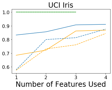
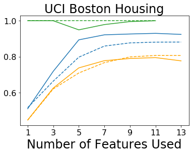
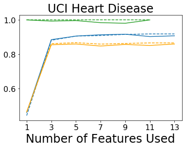
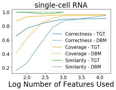
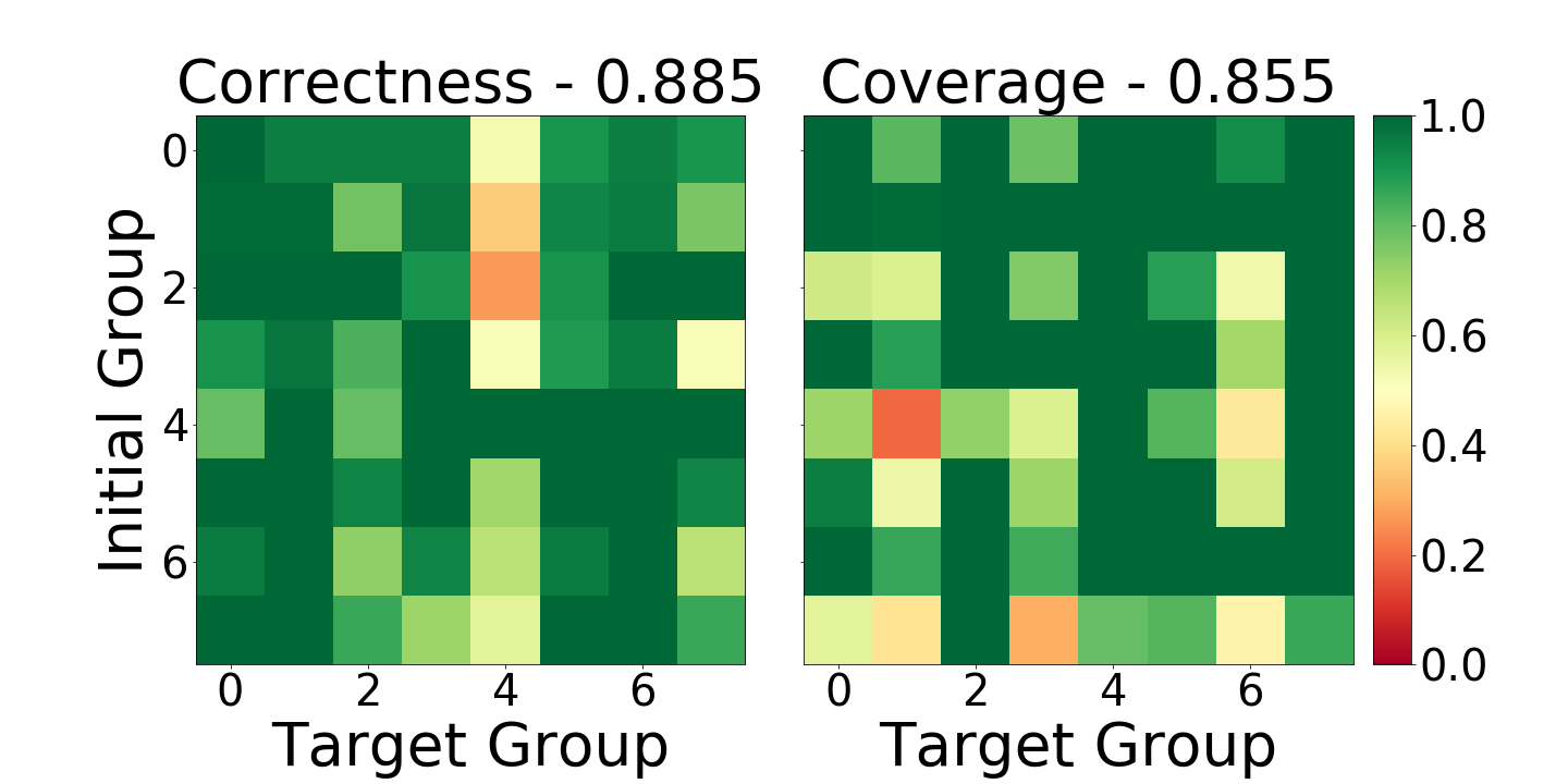
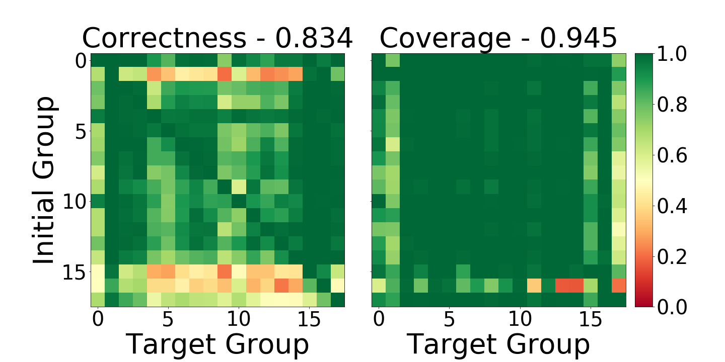
From an interpretable machine learning perspective, our goal is help practitioners understand the dimensionality-reduction models they use in the data exploration process. We measure the quality of GCEs using correctness (Equation 3) and coverage (Equation 4) at varying degrees of sparsity (Figure 7).
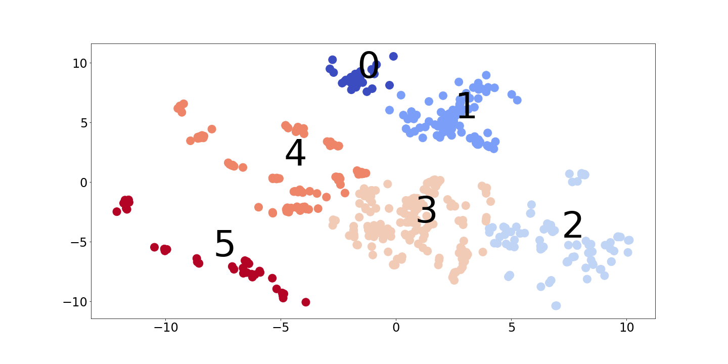
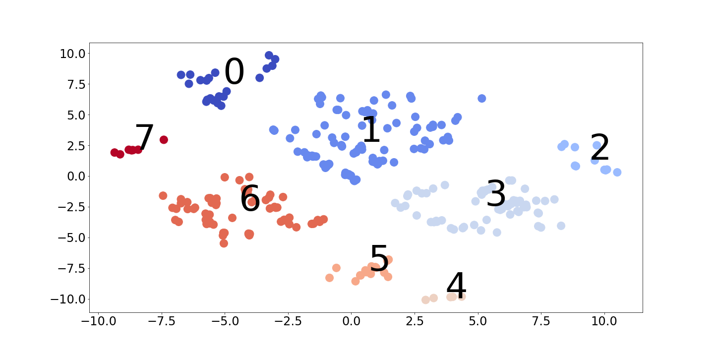
We use the model from (Ding et al., 2018)999We use this model because previous analysis showed that its representation identifies meaningful groups on the single-cell RNA dataset (Ding et al., 2018).on the UCI Iris, Boston Housing, and Heart Disease datasets (Dua & Graff, 2017) and a single-cell RNA dataset (Shekhar et al., 2016) and use its a visualization of its two-dimensional representation to define the groups of points. Figure 1 shows this representation and grouping for the single-cell RNA dataset; similar plots for all of the datasets are in the Appendix A.3. This model learns a non-linear embedding using a neural network architecture which is trained to be a parametric version of t-SNE (Maaten & Hinton, 2008) that also preserves the global structure in the data (Kobak & Berens, 2018).
Next, because the acceptable level of complexity depends on both the application and the person using the explanation, we measure the effectiveness of the explanations produced by TGT and DBM at explaining the model across a range of sparsity levels.
Explanation effectiveness at different levels of sparsity. Figure 7 shows the results of this comparison. We can see that TGT performed at least as well as DBM and usually did better. Further, we can see that TGT’s explanations are quite similar to each other as we ask for sparser explanations. Note that all of these metrics are defined for a single pair of groups and so these plots report the average across all pairs of groups.
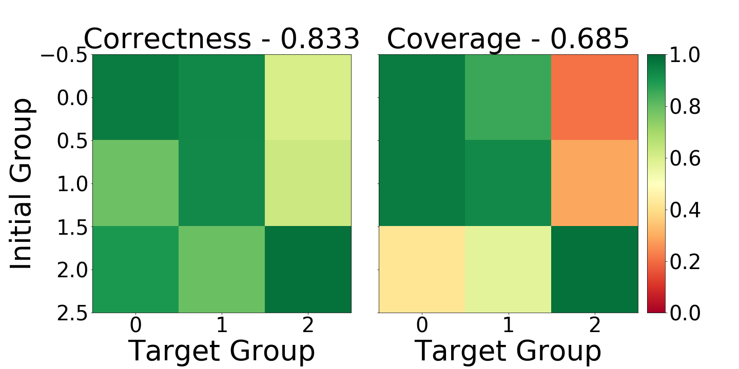
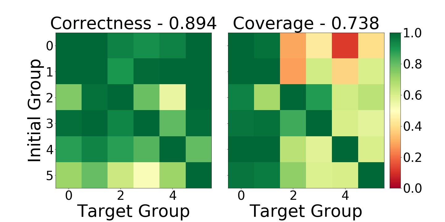
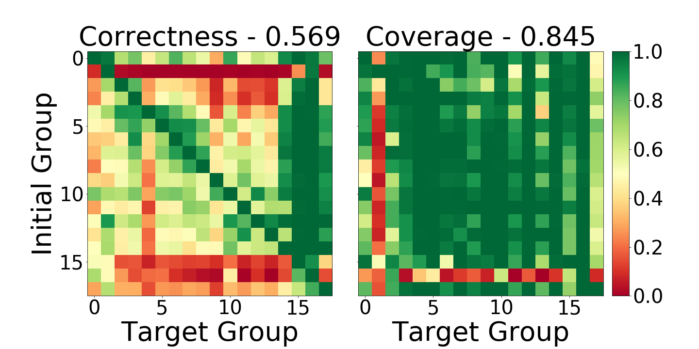
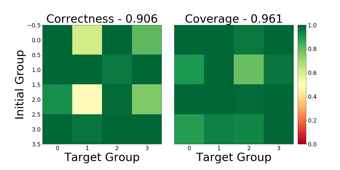
Exploring a Specific Level of Sparsity. Figure 7 shows that TGT’s performance: is almost as good when as when on Iris, drops off sharply for on Boston Housing, and drops off sharply for on Heart Disease. Further, on the single-cell RNA dataset, it shows that TGT significantly outperforms DBM when (Appendix A.4 Figure 18) and that this comparison becomes more favorable for TGT for smaller . The level of sparsity where the metrics drop off indicates the minimum explanation complexity required for these methods to explain the model. See Figure 4.1 for an example of the pairwise correctness and coverage metrics for these levels of sparsity.
Figure 3 shows that DBM does not produce a good 250-sparse explanation for the difference between Group 3 and Group 17 from Figure 1. For the sake of an easy comparison, Figure 9 shows a similar plot that uses TGT’s 250-sparse explanation; it is clearly a much better explanation.
4.2 TGT’s Efficacy at Capturing Real Signals in the Data
In the previous section, we demonstrated that TGT provides accurate explanations of the model that learned the low-dimensional representation. However, in practice, there could be a mismatch between what the model itself learns and the true underlying structure in the data. In this section, we evaluate empirically whether or not TGT provides explanations that match underlying patterns in the data.
We begin with an experiment on a synthetic dataset with a known causal structure and demonstrate that TGT correctly identifies this structure. This also serves as an intuitive example of why a sparser explanation can be as effective as a less-sparse explanation. Next, we leverage the labels that come with the UCI datasets to compare TGT’s explanations to some basic domain knowledge. Finally, we modify the UCI datasets and demonstrate that TGT is able to identify those modifications. Together, these results indicate that TGT is identifying real patterns in the data.
Synthetic Data with a Known Causal Structure. By specifying the causal structure of the data, we can know which differences are necessary in the explanation, since they are the casual differences, and which differences are unnecessary, since they are explained by the causal differences. We find that TGT correctly identifies the causal structure of this dataset and that DBM does not.
We use the following procedure to generate each point in our synthetic dataset: , , and . The causal structure of this dataset is simple. and jointly cause 4 different groups of points. The explanation for the differences between these groups must include these variables. is a noise variable that is unrelated to these groups and, as a result, should not be included in any explanation. is a variable that is correlated with those groups, since it is caused by , but does not cause those groups. As a result, it is not necessary to include it in any explanation.
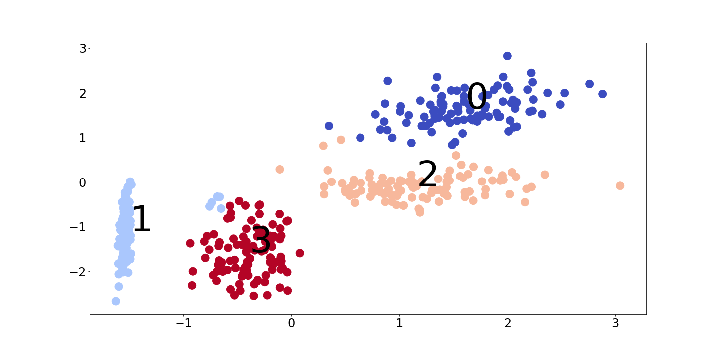
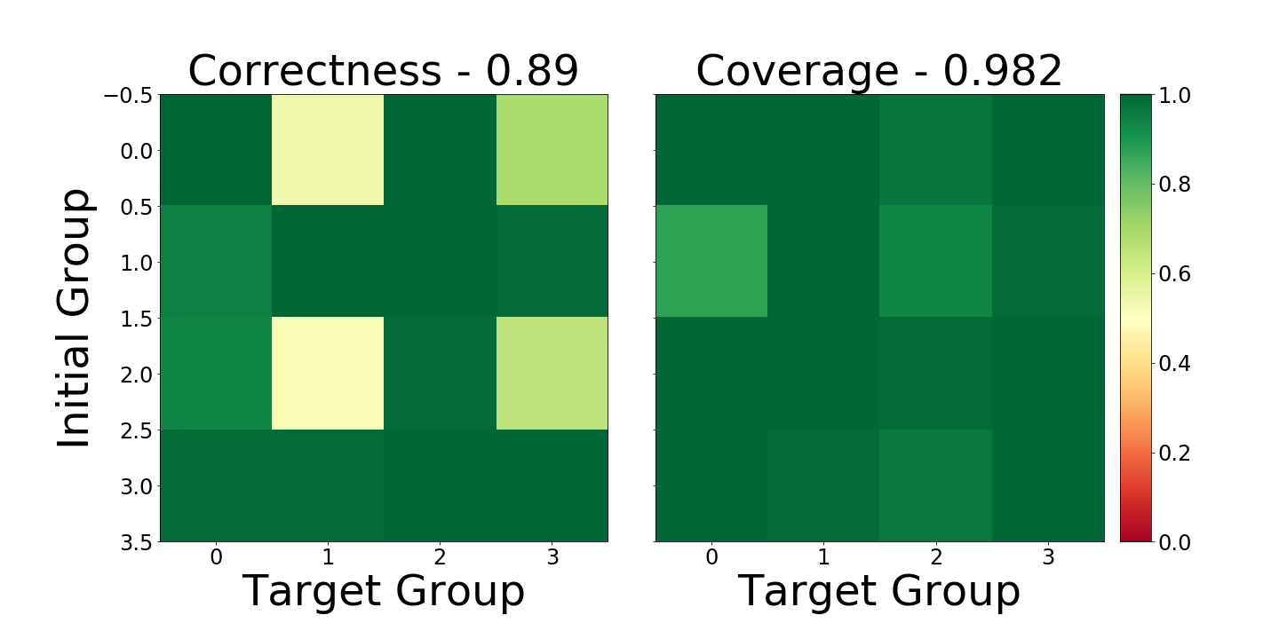
We generate a dataset consisting of 400 points created using this process and train an autoencoder (Kramer, 1991) to learn a two dimensional representation of the dataset. A visualization of this learned representation is in the Appendix A.3 Figure 14; as expected, there are four distinct groups of points in it. Then, we use TGT and DBM to calculate the GCEs between these groups. The pairwise and average correctness and coverage metrics for these solutions are in the Appendix A.4 Figures 18 and 18; observe that the two methods are equally effective at explaining the model.
When we inspect the explanations ()Table 4.2), we see that both TGT and DBM use and , neither use , and that DBM uses while TGT does not. This shows that, even in a very simple setting, there is good reason to believe that an explanation that is simpler (i.e., sparser) than the DBM explanation exists and that TGT might be able to find it.
| Explanation | Method | ||||
|---|---|---|---|---|---|
| TGT | -1.09 | 0.01 | 0.03 | 0.00 | |
| DBM | -1.02 | 0.04 | 0.01 | -1.03 | |
| TGT | 0.00 | 0.88 | 0.00 | 0.00 | |
| DBM | -0.01 | 0.97 | 0.06 | -0.03 | |
| TGT | -0.99 | 0.71 | 0.00 | 0.00 | |
| DBM | -1.02 | 1.03 | -0.01 | -1.03 |
Qualitative Analysis of the UCI Datasets using the Labels. Qualitatively, we find that TGT’s explanations agree with domain knowledge about these datasets. Specifically: On the Iris dataset, its explanations agree with a simple decision tree because they both rely mostly on the Petal Width to separate the groups. On the Boston Housing dataset, it identifies the differences between a set of inexpensive urban houses vs expensive suburban houses as well as equally priced groups of houses that differ mainly in whether or not they are on the Charles River. Finally on the Heart Disease dataset, it finds that the difference between a moderate and a low risk group of subjects was that the low-risk group’s symptoms are explained by something other than heart disease and the difference between the moderate and high risk group of subjects is that the former is made up of men and the later of women. For full details, see the Appendix A.5.
Quantitative Analysis of Modified Versions of the UCI Datasets. In order to perform a more quantitative analysis, we artificially add a known signal to the dataset by choosing one of the groups of points, creating a modified copy of it by translating it, and adding those new points back into the dataset. We then ask two important questions about TGT’s behavior. First, does TGT correctly identify the modifications we made to the original dataset? Second, do TGT’s explanations between the original groups change when the modified group is added to the dataset? Details of how we setup these experiments and their results are in the Appendix A.6.
We find that TGT does identify the modifications we made and that, in doing so, it does not significantly change the explanations between the original groups. Importantly, this result remains true even if we retrain the learned representation on the modified dataset.
These results are a strong indicator that TGT finds real patterns in the data because it recovers both the original signal and the artificial signal even when the algorithm is rerun or the representation is retrained.
5 Conclusion
In this work, we introduced a new type of explanation, a GCE, which is a counterfactual explanation that applies to an entire group of points rather than a single point. Next, we defined reasonable metrics to measure the quality of GCEs (i.e., correctness and coverage) and introduced the concept of consistency (i.e., symmetry and transitivity), which is an important additional criteria that GCEs must satisfy. Given that, we defined an algorithm for finding consistent GCEs, TGT, that treats each pairwise explanation as a compressed sensing problem. Our first experiments empirically demonstrated that TGT is better able to explain the model than DBM across a range of levels of sparsity. Our next experiments showed that TGT captures real patterns in the data. This was done using a synthetic dataset with a known causal structure and by comparing TGT’s explanations to background knowledge about the UCI datasets. As an additional test, we then added a synthetic signal to the UCI datasets and demonstrated that TGT can recover that signal without changing its explanations between the real groups. Importantly, this result remains true even when the representation is retrained.
Although we focused on data exploration in this work, similar groups arise naturally whenever the model being trained uses an encoder-decoder structure. This technique is ubiquitous in most areas where deep learning is common (e.g., semi-supervised learning, image classification, natural language processing, reinforcement learning). In these settings, identifying the key differences between the groups is an interesting question because we can observe that “The model treats points in Group A the same/differently as points in Group B”, determine that “The key differences between Group A and Group B are X”, and then conclude that “The model does not/does use pattern X to make its decisions”. We believe that exploring these applications is an important direction of future work that will require more sophisticated transformation functions, optimization procedures, and definitions of the groups of points of interest.
Acknowledgments
This work was supported in part by DARPA FA875017C0141, the National Science Foundation grants IIS1705121 and IIS1838017, an Okawa Grant, a Google Faculty Award, an Amazon Web Services Award, a JP Morgan A.I. Research Faculty Award, and a Carnegie Bosch Institute Research Award. Any opinions, findings and conclusions or recommendations expressed in this material are those of the author(s) and do not necessarily reflect the views of DARPA, the National Science Foundation, or any other funding agency. We would also like to thank Joon Kim, Jeffrey Li, Valerie Chen, Misha Khodak, and Jeremy Cohen for their feedback while writing this paper.
References
- Bello & Mosca (2004) Bello, N. and Mosca, L. Epidemiology of coronary heart disease in women. Progress in cardiovascular diseases, 46(4):287–295, 2004.
- Blumensath (2013) Blumensath, T. Compressed sensing with nonlinear observations and related nonlinear optimization problems. IEEE Transactions on Information Theory, 59(6):3466–3474, 2013.
- Candès et al. (2006) Candès, E. J. et al. Compressive sampling. In Proceedings of the international congress of mathematicians, volume 3, pp. 1433–1452. Madrid, Spain, 2006.
- Caruana et al. (2015) Caruana, R., Lou, Y., Gehrke, J., Koch, P., Sturm, M., and Elhadad, N. Intelligible models for healthcare: Predicting pneumonia risk and hospital 30-day readmission. In Proceedings of the 21th ACM SIGKDD International Conference on Knowledge Discovery and Data Mining, pp. 1721–1730. ACM, 2015.
- Dhurandhar et al. (2018) Dhurandhar, A., Chen, P.-Y., Luss, R., Tu, C.-C., Ting, P., Shanmugam, K., and Das, P. Explanations based on the missing: Towards contrastive explanations with pertinent negatives. In Advances in Neural Information Processing Systems, pp. 592–603, 2018.
- Dhurandhar et al. (2019) Dhurandhar, A., Pedapati, T., Balakrishnan, A., Chen, P.-Y., Shanmugam, K., and Puri, R. Model agnostic contrastive explanations for structured data, 2019.
- Ding et al. (2018) Ding, J., Condon, A., and Shah, S. P. Interpretable dimensionality reduction of single cell transcriptome data with deep generative models. Nature communications, 9(1):2002, 2018.
- Dua & Graff (2017) Dua, D. and Graff, C. UCI machine learning repository, 2017. URL http://archive.ics.uci.edu/ml.
- Goyal et al. (2019) Goyal, Y., Wu, Z., Ernst, J., Batra, D., Parikh, D., and Lee, S. Counterfactual visual explanations. In International Conference on Machine Learning, pp. 2376–2384, 2019.
- Jiang et al. (2004) Jiang, D., Tang, C., and Zhang, A. Cluster analysis for gene expression data: a survey. IEEE Transactions on knowledge and data engineering, 16(11):1370–1386, 2004.
- Kauffmann et al. (2019) Kauffmann, J., Esders, M., Montavon, G., Samek, W., and Müller, K.-R. From clustering to cluster explanations via neural networks. arXiv preprint arXiv:1906.07633, 2019.
- Kobak & Berens (2018) Kobak, D. and Berens, P. The art of using t-sne for single-cell transcriptomics. bioRxiv, pp. 453449, 2018.
- Kramer (1991) Kramer, M. A. Nonlinear principal component analysis using autoassociative neural networks. AIChE journal, 37(2):233–243, 1991.
- Lipton (2016) Lipton, Z. C. The mythos of model interpretability. arXiv preprint arXiv:1606.03490, 2016.
- Lundberg & Lee (2017) Lundberg, S. M. and Lee, S.-I. A unified approach to interpreting model predictions. In Advances in Neural Information Processing Systems, pp. 4765–4774, 2017.
- Maaten & Hinton (2008) Maaten, L. v. d. and Hinton, G. Visualizing data using t-sne. Journal of machine learning research, 9(Nov):2579–2605, 2008.
- Plumb et al. (2018) Plumb, G., Molitor, D., and Talwalkar, A. S. Model agnostic supervised local explanations. In Advances in Neural Information Processing Systems, pp. 2515–2524, 2018.
- Ribeiro et al. (2016) Ribeiro, M. T., Singh, S., and Guestrin, C. Why should i trust you?: Explaining the predictions of any classifier. In Proceedings of the 22nd ACM SIGKDD International Conference on Knowledge Discovery and Data Mining, pp. 1135–1144. ACM, 2016.
- Ribeiro et al. (2018) Ribeiro, M. T., Singh, S., and Guestrin, C. Anchors: High-precision model-agnostic explanations. AAAI, 2018.
- Shaffer (1995) Shaffer, J. P. Multiple hypothesis testing. Annual review of psychology, 46(1):561–584, 1995.
- Shekhar et al. (2016) Shekhar, K., Lapan, S. W., Whitney, I. E., Tran, N. M., Macosko, E. Z., Kowalczyk, M., Adiconis, X., Levin, J. Z., Nemesh, J., Goldman, M., et al. Comprehensive classification of retinal bipolar neurons by single-cell transcriptomics. Cell, 166(5):1308–1323, 2016.
- Spall (1998) Spall, J. C. An overview of the simultaneous perturbation method for efficient optimization. Johns Hopkins apl technical digest, 19(4):482–492, 1998.
- Sundararajan et al. (2017) Sundararajan, M., Taly, A., and Yan, Q. Axiomatic attribution for deep networks. In Proceedings of the 34th International Conference on Machine Learning-Volume 70, pp. 3319–3328. JMLR. org, 2017.
- Szegedy et al. (2013) Szegedy, C., Zaremba, W., Sutskever, I., Bruna, J., Erhan, D., Goodfellow, I., and Fergus, R. Intriguing properties of neural networks. arXiv preprint arXiv:1312.6199, 2013.
- Tomsett et al. (2019) Tomsett, R., Harborne, D., Chakraborty, S., Gurram, P., and Preece, A. Sanity checks for saliency metrics, 2019.
- Tsaig & Donoho (2006) Tsaig, Y. and Donoho, D. L. Extensions of compressed sensing. Signal processing, 86(3):549–571, 2006.
- Wang & Rudin (2015) Wang, F. and Rudin, C. Falling rule lists. In Artificial Intelligence and Statistics, pp. 1013–1022, 2015.
- Zhang et al. (2018) Zhang, X., Solar-Lezama, A., and Singh, R. Interpreting neural network judgments via minimal, stable, and symbolic corrections. In Advances in Neural Information Processing Systems, pp. 4874–4885, 2018.
Appendix A Appendix
A.1 An Example of the Difficulty of Using Existing Methods
For this example, we are going to consider Integrated Gradients (IG) (Sundararajan et al., 2017) which produces local feature attribution explanations. Because IG is a supervised method, we start by training a classifier on top of the learned representation to get a multi-class classification model that predicts which group a point belongs to. Because our goal is to explain the difference between Group A and Group B with IG, we average IG’s explanation for each point in Group B relative to each possible baseline value of a point in Group A for ’s Class B label. To be more precise:
| (11) |
We will refer to this as ‘group Integrated Gradients’ or gIG.
Challenge 1: Comparing Explanation Types. Because IG produces feature attributions and TGT produces counterfactuals, there is no reliable metric in the literature to directly compare them. On the one hand, most feature attributions are the ‘correct explanation’ for their specific definitions for ‘attribution’ and the ‘baseline’ value; this has made measuring their quality challenging (Tomsett et al., 2019). On the other hand, we cannot treat a feature attribution as a transformation function/translation, so our metrics and other metrics for counterfactual explanations cannot be applied.
As a result, we compare TGT to gIG on the same synthetic dataset we used earlier. We found that gIG identifies the causal variables as being significant and ignores the noise variable, but that it also identifies the correlated variable as being significant. This indicates that it is likely to be unable to find sparse explanations as well as TGT can.
Challenge 2: Consistency of Aggregated Local Explanations. One of the reasons we chose IG as a baseline method to aggregate is because its attributions are symmetrical and transitive with respect to a fixed class. In other words, if all we cared about was explaining the differences between all of the groups of points with respect to a single reference group, say Group C, then IG would produce consistent explanations. However, explaining the features that separate Group A from Group B relative to Group C is not the problem we are trying to solve.
When we use Equation 11 to calculate we found that the resulting explanations were not consistent. This does not violate the theory of IG because each is calculated with reference Group and so the assumption that we have a single reference group is not satisfied.
When we considered modifying Equation 11 to aggregate over the reference ‘class/group’ and potentially gain consistency that way, we either got uniform zero attributions (if we averaged over all reference groups) or inconsistent explanations (if we excluded any subset of from the averaging).
Conclusion. As suggested in Section 2, using existing explanation methods to find GCEs is going to be challenging because it is not what they are designed to do. We found that IG, a method that theoretically looked promising, was unable to be extended in a simple way to this setting.
A.2 Representation Function
Differentiability. TGT assumes that is a differentiable function. Hidden in this assumption is the assumption that is a function that we can evaluate on an arbitrary point. Although most methods for learning a low-dimensional representation satisfy this assumption, t-SNE does not. Fortunately there are parametric variations of t-SNE such as the one we used in our experiments (Ding et al., 2018). The assumption that is differentiable can be relaxed by using a finite-difference optimization method, such as SPSA (Spall, 1998), at the expense of computational cost.
Learning Meaningful Structure. One assumption that every analysis (whether that is manual inspection, statistical testing, or interpretable ML) of the representation learned by is that this function learned meaningful structure from the data. Because practitioners are already relying on these representations and, in some situations, have verified that they are meaningful, this concern is largely orthogonal to our work.
However, from an interpretable ML perspective, our goal is to explain . So, if identifies different structure when it is retrained or when it is trained with a different algorithm or structure, we expect TGT to produce different explanations since the embedding itself has changed.
Our experimental results show that the representation learned by (Ding et al., 2018) is stable to being retrained and to modifications to the dataset and that TGT produces stable explanations for these representations.
Identifying that Structure with Explanations. It is possible to have a model that learned the true structure of the data and to have an explanation that is technically true (as measured by some proxy metric for interpretability) about the model but that also fails to capture meaningful patterns. For example, adversarial examples (Szegedy et al., 2013) are technically local counterfactual explanations but they usually look like random noise and, as a result, do not tell a person much about the patterns the model has learned. TGT’s design, which calculates the explanation between each pair of groups as if it were a compressed sensing problem but constrains those solutions to be symmetrical and transitive among all groups, was chosen as a prior to prevent this type of behavior.
A.3 Learned Representations
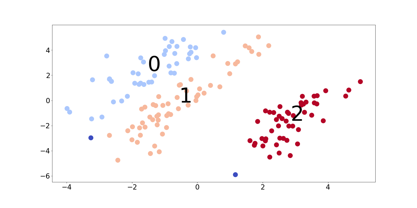
The learned representations and the corresponding groups of points for the datasets we studied are in Figures A.3, A.3, A.3, A.3, and 14.

A.4 Pairwise Correctness and Coverage Plots
TGT is much better than DBM for finding 250-sparse explanations on the single-cell RNA dataset (Figures 18 and 18). On the synthetic dataset, TGT and DBM are equally effective explanations of the model (Figures 18 and 18). However, TGT only relied on the two causal variables while DBM included the correlated variable as well.

A.5 Qualitative Analysis of the UCI Datasets using the Labels
Although the representations we learned for these datasets were trained in an unsupervised manner, the groups that they find often have strong connections to the labels for the datasets; see Table 2, Figure 21, and Table 3. By using the connection between the groups and labels, we will be able to qualitatively assess whether or not TGT is finding real patterns in the data.
Iris Dataset. Looking at Table 2, we can see that the groups in this representation match very closely with the class labels. As a result, we would like to know whether or not the explanations TGT finds are consistent with a model trained directly to predict the labels. For this comparison, we used a simple decision tree, which is shown in Figure 19. Looking at TGT’s explanations (Figure 20), we can see that they largely agree with the decision tree since both primarily use Petal Width to separate the classes/groups.
| Iris Setosa | Iris Versicolour | Iris Virginica | |
| 0 | 0 | 5 | 38 |
| 1 | 0 | 44 | 12 |
| 2 | 48 | 0 | 0 |
![[Uncaptioned image]](/html/2003.01640/assets/Figures/labels/iris-tree.png)
![[Uncaptioned image]](/html/2003.01640/assets/Figures/explanations/iris-0to1.png)
![[Uncaptioned image]](/html/2003.01640/assets/Figures/explanations/iris-0to2.png)
Boston Housing Dataset. Looking at Figure 21, we can see that two comparisons between the groups stand out: Group 0 to Group 2, which shows a significant increase in the price, and Group 3 to Group 5, which has relatively little effect on the price. As a result, we would like to determine what the differences between these groups of houses are that influence their price.
![[Uncaptioned image]](/html/2003.01640/assets/Figures/labels/housing-labels.png)
Looking at Figure 22, we see that TGT found that the key differences between Group 0 and Group 2 appears to be the difference between a house being in an urban area vs being in a suburb: the proportion of land zoned for large residential lots and B101010This is a unusually defined feature that is related to the racial demographics of a town. Determining what it means to change this feature depends on a measurement that is not in the dataset. both increase while access to radial highways and tax rates both decrease. It also found that the key differences between Group 3 and Group 5 are, first, moving the house onto the Charles river and, second, decreasing B.
![[Uncaptioned image]](/html/2003.01640/assets/Figures/explanations/housing-0to2.png)
![[Uncaptioned image]](/html/2003.01640/assets/Figures/explanations/housing-3to5.png)
Heart Disease Dataset. Looking at Figure 3, we see that there are three large groups that stand out: Group 1, which has a balanced risk of heart disease, Group 3, which has a relatively low risk, and Group 6, which has a relatively high risk. As a result, we would like to determine what the differences between these groups of subjects are that influence their risk of heart disease.
| No Heart Disease | Heart Disease | |
| 0 | 6 | 15 |
| 1 | 46 | 62 |
| 2 | 10 | 1 |
| 3 | 52 | 14 |
| 4 | 4 | 1 |
| 5 | 10 | 7 |
| 6 | 8 | 59 |
| 7 | 2 | 5 |
Looking at Figure 23, TGT found that the key differences between Group 1 and Group 3 are a moderate decrease in chest pain along with having exercised induced angina; these are subjects whose symptoms are explained by exercise induced angina rather than heart disease. It also found that the key difference between Group 1 and Group 6 is that Group 1 is made up of men while Group 6 is made up of women; this is consistent with the fact that heart disease is the leading cause of mortality in women (Bello & Mosca, 2004).
![[Uncaptioned image]](/html/2003.01640/assets/Figures/explanations/heart-1to3.png)
![[Uncaptioned image]](/html/2003.01640/assets/Figures/explanations/heart-1to6.png)
A.6 Quantitative Analysis of Modified Versions of the UCI Datasets.
Because the UCI datasets are not synthetic datasets, we do not know the underlying process that generated the data and, as a result, it is difficult to quantitatively determine whether or not an explanation is “correct” in the way that we could with the synthetic dataset. Consequently, we performed a series of experiments on modified versions of the original datasets in order to answer two important questions:
-
•
Does TGT correctly identify the modifications we made to the original dataset?
-
•
Do TGT’s explanations between the original groups change when the modified group is added to the dataset?
We found that TGT does identify the modifications we made and that, in doing so, it does not significantly change the explanations between the original groups. Importantly, this result remains true even if we retrain the learned representation on the modified dataset. These results are a strong indicator that TGT is finding real patterns in the data.
How do we modify the datasets? We create a modified version of the original dataset by: picking one of the groups of points in the original dataset, modifying that group of points in some way, and adding that new modified group of points to the original dataset. We will call the original dataset and the modified dataset , where and is the modified version of some group of points .
The critical choice to make during this process is to determine what modification to apply to to get . We chose to add random noise to some of the features of the points in and used the following two criteria when defining this modification for a particular dataset:
-
•
should be approximately within the range/distribution of .
-
•
should form it’s own (approximately) distinct group. Intuitively, if does not form its own group, then thinks is similar to some other group in the dataset and, as a result, we would not expect TGT to be able to explain the differences between and that group of points.
The modifications we used are in Table 4.
| Dataset | Group Modified | Feature | Perturbation Applied |
|---|---|---|---|
| Iris | 0 | Sepal Width | -0.4 + Uniform(-0.1, 0.1) |
| Housing | 1 | ZN | 0.9 + Uniform(-0.1, 0.1) |
| TAX | -0.5 + Uniform(-0.1, 0.1) | ||
| Heart | 1 | restecg | -0.9 + Uniform(-0.1, 0.1) |
| exang | 0.6 + Uniform(-0.1, 0.1) |
Experimental Setup: We now have two versions of each dataset: and . We also have the original learned representation , which was trained on , and a new learned representation , which is trained on . As a result, we have three sets of explanations:
-
•
Original: These explain when applied to
-
•
Modified: These explain when applied to
-
•
Retrained: These explain when applied to
The visualization of the representation for the first setting is in the Appendix A.3 and the later two these settings is in Figures 24, 25, and 26. Note that applying to looks the same as applying to except for the fact that there is an additional group from adding to and that applying to often shows that has learned to separate from the other groups better than did.
![[Uncaptioned image]](/html/2003.01640/assets/Figures/representations/iris-rep-corrupted.png)
![[Uncaptioned image]](/html/2003.01640/assets/Figures/representations/iris-retrained-rep.png)
![[Uncaptioned image]](/html/2003.01640/assets/Figures/representations/housing-rep-corrupted.png)
![[Uncaptioned image]](/html/2003.01640/assets/Figures/representations/housing-retrained-rep.png)
![[Uncaptioned image]](/html/2003.01640/assets/Figures/representations/heart-rep-corrupted.png)
![[Uncaptioned image]](/html/2003.01640/assets/Figures/representations/heart-retrained-rep.png)
Does TGT correctly identify the modifications we made to the original dataset? In Figure Figures 27, 28, and 29, we can see the explanations TGT found for the difference between and for each of the datasets. If we compare the explanations to the modifications from Table 4, we can see that they identified which features we changed and, approximately, by how much. The error in the estimation of “by how much” is due to the regularization used to find a simple explanation.
![[Uncaptioned image]](/html/2003.01640/assets/Figures/recovery/iris-t2c.png)
![[Uncaptioned image]](/html/2003.01640/assets/Figures/recovery/iris-retrained-t2c.png)
![[Uncaptioned image]](/html/2003.01640/assets/Figures/recovery/housing-t2c.png)
![[Uncaptioned image]](/html/2003.01640/assets/Figures/recovery/housing-retrained-t2c.png)
![[Uncaptioned image]](/html/2003.01640/assets/Figures/recovery/heart-t2c.png)
![[Uncaptioned image]](/html/2003.01640/assets/Figures/recovery/heart-retrained-t2c.png)
Do TGT’s explanations between the original groups change when the modified group is added to the dataset? In Figures 30, 31, and 32, we can see a comparison of the explanations for the differences between the original groups for the Original vs the Modified and the Original vs the Retrained explanations. Adding to did not cause TGT to find significantly different explanations between the groups in . Explaining resulted in explanations that were generally similar, but adding another layer of variability (i.e., training ) did add some noise.
![[Uncaptioned image]](/html/2003.01640/assets/Figures/stability/iris-corrupted-similarity.png)
![[Uncaptioned image]](/html/2003.01640/assets/Figures/stability/iris-retrained-similarity.png)
![[Uncaptioned image]](/html/2003.01640/assets/Figures/stability/housing-corrupted-similarity.png)
![[Uncaptioned image]](/html/2003.01640/assets/Figures/stability/housing-retrained-similarity.png)
![[Uncaptioned image]](/html/2003.01640/assets/Figures/stability/heart-corrupted-similarity.png)
![[Uncaptioned image]](/html/2003.01640/assets/Figures/stability/heart-retrained-similarity.png)