Visus: An Interactive System for Automatic Machine Learning Model Building and Curation
Abstract.
While the demand for machine learning (ML) applications is booming, there is a scarcity of data scientists capable of building such models. Automatic machine learning (AutoML) approaches have been proposed that help with this problem by synthesizing end-to-end ML data processing pipelines. However, these follow a best-effort approach and a user in the loop is necessary to curate and refine the derived pipelines. Since domain experts often have little or no expertise in machine learning, easy-to-use interactive interfaces that guide them throughout the model building process are necessary. In this paper, we present Visus, a system designed to support the model building process and curation of ML data processing pipelines generated by AutoML systems. We describe the framework used to ground our design choices and a usage scenario enabled by Visus. Finally, we discuss the feedback received in user testing sessions with domain experts.
1. Introduction
Machine Learning (ML) models are increasingly being adopted in many applications. However the supply of data scientists capable of building such models has not kept up with the demand (Columbus, [n. d.]). Recent approaches to automatic machine learning (AutoML) help address this problem by automating not only model fitting, but also the synthesis of end-to-end ML data processing pipelines, from data loading, data cleaning, and feature engineering to model fitting and selection, and hyper-parameter tuning (Olson et al., 2016; Drori et al., 2018; Gil et al., 2018). Commercial solutions such as Google’s Cloud AutoML (Li and Li, [n. d.]) and Microsoft’s Azure Machine Learning Studio (Microsoft, [n. d.]) are also available. AutoML systems require as input only the training data and a well-defined problem specification that describes the target variables to be predicted, the data attributes to be used as features, and the performance metric to be optimized. By automating many of the steps of the ML model building process, AutoML systems allow data scientists to solve problems more efficiently.
However, AutoML systems are not sufficient to democratize ML to wider audiences. To empower domain experts, who have little or no expertise in ML, to develop ML pipelines easy-to-use interactive interfaces are needed that guide them throughout the model building process (Cashman et al., 2018; Gil et al., 2019). Additionally, AutoML systems put their best effort to generate pipelines that optimize a given performance metric, which often result in black-box models that cannot easily be understood by humans. This, coupled with the ever-increasing concerns about the societal impact of data-driven decision making (Zliobaite, 2015; Zafar et al., 2017; Hardt et al., 2016), underscores the importance of bringing the human in the loop of the model building process. Enabling domain-experts to build ML models not only has the potential to lessen the demand for data scientists, but it also enables experts that possess domain knowledge to assess, validate, and potentially improve model outcomes.
Prior research in the field of visual analytics — which has been regarded as a grand challenge (J Thomas et al., 2005) — has proposed multiple frameworks and systems that integrate ML models and interactive visual interfaces to facilitate analytical reasoning (Cashman et al., 2018). However, these systems typically have to integrate tightly with the model they use to provide insights about the model behavior. With the inclusion of an AutoML system, we cannot assume any prior knowledge about inner-workings of the returned models because of the large variety of components present in the derived ML pipelines.
In this work, we propose a new framework to support the model building process and curation of automatically generated predictive data processing pipelines. Similar to prior work (Cashman et al., 2018), our framework is iterative and includes multiple components that support exploratory data analysis (EDA), problem specification, model generation and selection, and confirmatory data analysis (CDA). Additionally, we propose new components that allow users to 1) search the Web for new relevant datasets to augment the input data, and 2) summarize, compare, and explain models generated by AutoML systems. The first component enhances the original data by adding new records (through union operations) or new attributes (through joins) that can potentially improve the model performance. The second component allows users to better understand the automatically generated pipelines and to select the one that best fulfills their intent. Finally, we present Visus, a system that implements our proposed framework and integrates visual analytics techniques in the model building and curation process. We also describe a usage scenario that illustrates the use of Visus to support data analysis and decision-making processes and discuss the feedback received in user testing sessions.
Our contributions can be summarized as follows:
-
•
We propose a new visual analytics framework to support the process of building and curating ML pipelines automatically generated by AutoML systems;
-
•
We propose new components for 1) searching datasets on the Web to augment the original dataset, and 2) support model selection through model summarization, comparison, and explanation;
-
•
We present Visus, an interactive system that implements our proposed framework. We describe usage scenarios enabled by Visus that show how a domain-expert can build a regression model to support decision-making.
Outline
The remainder of this paper is structured as follows. We discuss related work in Section 2. In Section 3, we describe our proposed visual analytics framework. In Section 4, we describe Visus and our design choices. We present a usage scenario in Section 5, discuss the user feedback in Section 6, and conclude in Section 7, where we outline directions for future work.
2. Related Work
This paper explores a problem that lies at the intersection of Automatic Machine Learning (AutoML) and Human Guided Machine Learning (HGML). In what follows, we briefly describe the state of the art in these two fields and how they can be connected to achieve our goal. For a comprehensive literature review, see Hutter et al. (2019) and Gil et al. (2019).
Creating machine learning pipelines is a time consuming task that demands domain expertise and machine learning knowledge. These pipelines usually contain many steps, including data pre-processing, algorithm selection and hyper-parameter tuning. AutoML aims to automate the design and implementation of ML pipelines, reducing the time and level of expertise necessary to deploy solutions for real world problems (Hutter et al., 2019). Some examples of state of the art AutoML methods include Autosklearn (Feurer et al., 2015), TPOT (Olson et al., 2016), and AlphaD3M (Drori et al., 2018). Autosklearn and TPOT are able to automatically generate pipelines for classification, and AlphaD3M can tackle both classification and regression problems. As for the pipeline search strategies, Autosklearn uses Bayesian optimization combined with meta-learning, TPOT uses genetic programming and tree-based pipelines, and AlphaD3M uses reinforcement learning together with Monte-Carlo Tree Search and self play.
While AutoML speeds up the pipeline generation process and helps to democratize machine learning, humans still have an important role to play: by interacting with the AutoML system, humans can provide additional knowledge to the algorithm and constrain the space of possible models so that they are more suitable for a specific problem. For example, experts can specify important features or pre-processing steps that need to be applied in the data (Hutter et al., 2019; Gil et al., 2019). To this end, HGML systems combine AutoML with specialized Visual Analytics (VA) systems, enabling humans to interact with the pipeline search and improve the model prediction results. Gil et al. (2019) presented a task analysis and desiderata for HGML and assessed how current AutoML and VA systems attempt to solve these tasks. The authors grouped desired features for HGML systems under three major categories: data use, specifying how features and samples should be used, and augmenting the data with new features, model development, constraining the search space of possible models, and model interpretation, interpretation, diagnosis and comparison of machine learning models. Implementing the HGML desired features individually is possible, and described by the authors. However, implementing a VA system that combines all requirements remain a challenge, given the iterative and nonlinear nature of the interactions.
Two recent implementations of HGML systems are Snowcat (Cashman et al., 2018) and Two Ravens (Honaker and D’Orazio, 2014; Gil et al., 2019). Both systems enable data exploration and visualization. Furthermore, they allow the basic data use specification, such as setting which features to use to solve a problem, and a rudimentary comparison of the generated ML models using traditional metrics and visualizations, such as accuracy and confusion matrix. Comparing the capabilities of these systems with the desiderata proposed by Gil et al. (2019), we note two major gaps. First, neither system supports the augmentation of data, a feature that can increase the amount of information the models have access to and potentially improve the performance of the generated pipelines. Second, they lack support for model interpretation beyond simple ML metrics. Our system, Visus, aims to fill this gap in the current HGML systems. In the next session, we describe how we integrated data search and automatic joins in our framework (Chapman et al., 2019), as well as model interpretation based on rule visualization (Ming et al., 2019).
3. Proposed Framework
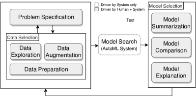
Figure 1 shows the main components of our visual analytics framework. Each rounded box denotes a task and the connecting arrows denote the user workflow. In what follows, we describe each of the components in detail.
Problem Specification
The first challenge we address in our framework is the translation of a problem in the user domain (e.g., What are the important factors that lead to traffic accidents?, or What genes or environmental conditions influence a plant’s growth?) to a machine-readable problem specification that can be fed to an AutoML system. A problem specification consists of a set of well-defined properties that describe the users’ analysis goal: a problem type (e.g., classification, regression, clustering, time series forecasting, etc.), a target attribute to be predicted (e.g., a categorical attribute containing classes, a numerical attribute with values), a performance metric to be optimized (e.g., precision, recall, F1, mean squared error, etc.), and a list of data attributes to be used as features. Additionally, it may contain other parameters such as time constraints (i.e., for how long the pipeline search should run), the maximum number of pipelines to be generated, the performance metrics to be reported and the evaluation method for computing them (e.g., -fold cross-validation, hold-out test set).
Data Selection
In order to create a problem specification, the user first needs to select the data required to solve the problem. There are three data-related components that support the problem specification task: data exploration, data preparation, and data augmentation. We arrange them in a group, namely “Data Selection”, because they are intertwined, in the sense that not only they support the problem specification task, but also are influenced by problem specification. For example, consider the data exploration and preparation components. In order to specify a problem, a user might need to first perform an exploratory data analysis to better understand the data. During the course of exploration, the user may realize that an attribute contains outliers which need to be removed, or that an attribute contains missing data that should be filled out with a default value. The user may also decide to update the problem specification to indicate that some attributes should be excluded from the model.
The data augmentation component allows the user to search for relevant datasets that could potentially supplement the original data with new records or attributes and, thus, improve the model performance. Describing in details the inner-workings of the dataset search engine we use to support augmentation is out of the scope of this paper. However, it is important to note that it is critical that the search results returned by the dataset search engine should not only be relevant to the domain of interest, but also should be appropriate for integration (via join or union operations) with the original dataset. The main role of the visual interface is then to allow the user to interact with the search results and facilitate dataset relevance prediction (i.e., the search interface should display effective dataset summaries that allow for the user to decide whether the dataset discovered is relevant and should be merged to the original dataset).
Model Search
After the data is selected and the problem is specified, the AutoML system can be invoked to carry out the pipeline search phase. Note that this is the only task in our framework which there is no human engagement.
Model Selection
AutoML systems aim to generate a model that optimizes a given performance metric in the training dataset. However, the best-scoring model learned using the training set is not always the best model. When the training examples are not diverse and are not good representatives of the real sample distribution, the learned models may not generalize well for samples observed in real-world, and thus the performance might drop in a held-out validation set. Additionally, some evaluation metrics may have trade-offs. For instance, consider the pipelines generated for a binary classification problem. The best pipeline in terms of precision may have a low recall score. Instead of blindly selecting only the best performing pipeline — and given that often a large number of models is evaluated during the optimization process — a better approach for model selection could be to collect a sample of the best-performing pipelines and then present them to a domain-expert to pick the best one. Unlike traditional visual analytics approaches, a system that includes an AutoML component must be able to handle a large number of ML pipelines. Therefore, in order to support model selection, the user interface should provide visualizations to facilitate exploration, comparison, and explanation of multiple models. Our framework includes three components to assist in this task as detailed next.
Model summarization. Since AutoML systems create many pipelines, the end goal of model summarization should be to facilitate the selection of a smaller set of pipelines for further inspection. Visualizations should aim to provide concise representations of a set of pipelines and the ability to easily select the best-performing ones.
Model comparison. Once a sample of the best-performing pipelines is selected, the user is able to compare them in detail. Visualizations should highlight the commonalities and differences between two or more pipelines. More specifically, pipelines may differ not only in performance metric scores but also in their data processing steps, and how they make correct or wrong predictions.
Model explanation. The user might also want to gain a better insight into how models make predictions and how the prediction accuracy is distributed conditioned to specific attributes or the target variable. For instance, one might be interested in understanding what is the impact of certain feature combinations to a prediction outcome. Therefore, explanations might help not only to validate whether the model is making correct predictions for the right reasons but also to learn about data relationships that were not known a priori.
4. The Visus System
With Visus, we aim to aid domain experts to interactively formulate prediction problems, build models, and select a suitable model among a set of automatically generated models. Visus provides an easy-to-use interface where users can 1) define a problem, 2) explore summaries of their input dataset, 3) perform data augmentation, 4) explore and compare models with respect to their performance scores and prediction outputs.
Define Problem and Explore Dataset
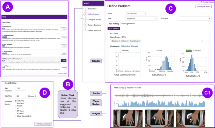
As Figure 2 illustrates, the operations for problem specification and data selection are implemented in four screens (views) in Visus: Select Dataset, Select Task, Define Problem, and Configure Search.
Select Dataset. Allows the user to select or load a dataset (Figure 2(A)).
Select Task. Users can either create a new problem specification or select one of the existing problems specifications that have been created previously (Figure 2(B)).
Define Problem. To construct good predictive models, it is important to identify data attributes (features) that lead to accurate predictions. For this, Visus profiles the data and displays visualizations that summarize the information, helping users to obtain insights about the features. Visus supports multiple types of datasets, including tabular data, time series, audio, and images (see Figure 2(C1)). For all of them, Visus provides a select input control for adding/removing data on demand with auto-complete and multi-select functionalities to help users to easily find data attributes or files.
For tabular data, Visus generates visualizations that adapt to different attribute data types. For instance, for numerical and categorical attributes, Visus generates descriptive statistics and summarizes data values using a histogram. When visualizing time series datasets, Visus provides a stacked time series plots along with an interactive brushing tool to help users to explore and visualize different time ranges. For audio, Visus lets users reproduce the audio and display its waveform, and for images, it uses thumbnails to show a sample of the images present in the dataset.
Configure Search. In this screen, users set up additional parameters of the model search such as a maximum number of solutions (pipelines) to be generated by the AutoML system, a maximum wait time to conclude the model search. Furthermore, users can also specify the performance metrics they want to use for evaluating the solutions generated.
Inspect Model Summaries
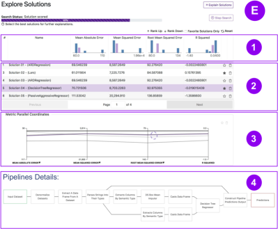
To allow exploration of the pipelines generated by the Model Search, Visus displays them in a solution table as shown in Figure 3(E2). In this table, users can see the different solutions and their associated performance metrics. Users can also sort solutions by metric, allowing them to quickly identify the best solutions according to each metric. Additionally, Visus provides a histogram of the scores associated with each performance metric, which allows the users to visualize the distribution of scores of all generated solutions (see Figure 3(E1)). When the user hovers over a solution in the table, the bin associated with the score of the hovered solution changes its color, allowing quick comparison of its performance against all other solutions. Furthermore, Visus provides a parallel coordinates chart, as shown in Figure 3(E3). Each vertical line corresponds to a performance metric and each horizontal line corresponds to a pipeline. Such a visualization allows for quick identification of metric trade-offs. If the user hovers over a pipeline, he/she can see how its performance measures compare to those of other pipelines. Finally, users can also inspect the actual data processing steps of each pipeline, including their learning algorithms and pre-processing primitives (see Figure 3(E4)).
Examine Model Explanations
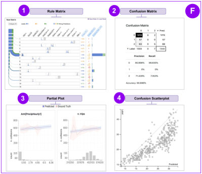
To better understand how a given pipeline performs, Visus generates more detailed explanations. For classification problems, Visus currently supports two visualizations: a standard confusion matrix and rule matrix (Ming et al., 2019). The confusion matrix shows the predicted classes as columns and the true classes as rows as shown in Figure 4(F2). The rule matrix uses a surrogate model to learn classification rules that explain the behavior of the model. It displays rules as rows and features as columns (see Figure 4(F1)). To explain regression problems, Visus supports two visualizations: a partial dependence plot (Hastie et al., 2009) and a confusion scatter plot. The partial dependence plots show on the bottom the distribution of samples for each attribute value range, and on the top the predictions and ground truths for these values (see Figure 4(F3)). The confusion scatter plot encodes each data sample as a dot, the predictions in the -axis, and the value in the -axis. Figure 4(F4) shows an example.
Data Augmentation
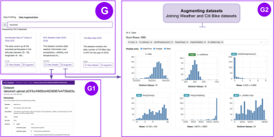
In the Define Problem view (see Figure 2(C)), the user can navigate to the data augmentation tab, where he/she can search for related datasets that could be joined with (join operation) or appended (union operation) to the original data (see Figure 5(G)). Before performing augmentation, users can view details about the suggested datasets by pressing the View Details button, as shown in Figure 5(G1).
5. Use Case
In this section, we describe a data analysis scenario that Visus enables. Consider the following example. As part of the New York City Vision Zero Initiative (nyc-vision-zero, [n. d.]), an expert from the Department of Transportation is trying to devise policies to reduce the number of traffic fatalities and improve safety in NYC streets.
Data exploration and model search specification
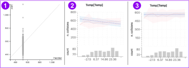
Initially, the expert loads a dataset about traffic collisions and taxi trips. Her goal is to create a model that predicts the number of collisions; such a model can allow her to explore what-if scenarios. After loading her dataset, Visus profiles it and displays visualizations that summarize the data. She will see a screen similar to Figure 2(C) which displays the different features, namely the date, number of trips, and the number of collisions, and how their values are distributed. In this same screen, she can also select the target variable she wants to predict and the type of model she wants to build (e.g., classification, regression). After pressing the “Configure Search” button, she is presented another screen where she can specify additional parameters of the model search specification (e.g., the maximum running time, evaluation metrics). The next step (”Start Solution Search”) triggers the execution of the AutoML system and a new screen is shown to display the results (“Explore Solutions”). As soon as models are generated by the AutoML system, Visus displays them in the “Solutions Table”, shown in Figure 3, which displays the generated pipelines and summarizes their evaluation scores in a histogram. To get more insight into the behavior of the different solutions, she moves to the next step, “Explain Solutions”, which produces explanatory visualizations such as the confusion scatter plot as seen in Figure 6(1). Analyzing the confusion scatter plot she notices that, for the pipeline with the smallest error, all instances are being predicted with the same values (all are in the same position on the -axis). Clearly, this model is not very useful. Thus, she takes a step back and returns to the “Define Problem” screen to refine the problem.
Augmenting the data to increase performance
Now she hypothesizes that the unsatisfactory performance may be a result of insufficient predictive power of her data attributes. She then clicks on the tab “Data Augmentation”, to search for additional data. Intuitively, weather information, such as bad weather conditions can potentially increase the number of collisions. She uses the search form to find datasets that have the keyword “weather” and that are related to her input data, i.e., that can be joined with it, and then selects a matching dataset. Because many collisions also involve cyclists, she also searches for datasets related to her input data using the keyword “citi bike”, hoping to find a dataset containing information about the number of cyclists in the streets. Because both weather and citi bike datasets contain temporal attributes, as has her original data, Visus is able to automatically perform a temporal join of these datasets. After doing the augmentations with weather and Citi Bike data, her data increased from 3 to 7 features. She now re-runs the solution search to generate solutions using the augmented data and finds that the best pipeline has now improved from 71.29 to 61 in terms of mean absolute error, a significant improvement.
After picking her new favorite pipelines on the “Explore Solution” screen, she inspects them in more detail. She notices that now her best pipeline’s predictions improved and the confusion scatter plot shows a more diagonal pattern (see Figure 4(F4)), which is the desired behavior. By using the partial dependency plot, she inspects the impact of the features in different models. She notices that, for pipeline A, the temperature has a strong negative correlation with the number of collisions (Figure 6(2)), while the pipeline B seems not to use temperature, as indicated by a flat line (Figure 6(3)) showing no correlation. Both pipelines use different versions of the Lasso algorithm and have similar performance in terms of error, she uses her domain knowledge, and decides to choose the model B which does not take temperature into account, even though its performance according to evaluation metrics is inferior when compared to A.
6. User Feedback
All our design decisions discussed previously have been grounded on feedback from domain-experts — with little or no data science knowledge — who interacted with earlier versions of our system. In this section, we discuss the feedback received from users in more recent sessions. All users interacted with the system using data that comes from their area of expertise and that they were already familiar with. For instance, one of the users has a Ph.D. in Biology who is interested in plant genetics and phenotyping and another is a manager at a U.S. agency who works with forward operators, soldiers, and analysts who want to analyze their data.
Users were generally satisfied with the system design, and were keen to start making connections to additional augmented data, wanted to overlay weather, add genetic information, and even geolocation. However, we noticed that there is still a gap in the communication of machine learning concepts to domain experts. For instance, it may not be clear for the users the meaning of evaluation metrics. What is the difference between , mean absolute error, and mean squared error? When should one choose one over the other?
Users also had some difficulty to understand and read the classification model explanations. For example, visual explanations like the Rule Matrix (Ming et al., 2019) summarize complex Bayesian classification rules derived from a surrogate model in a single visualization. In order to understand them properly, details had to be explained, including the meaning of a rule and statistical concepts such as fidelity and evidence. Although users claimed to understand the visualization after verbal explanations from an expert, it was not intuitive for them at first glance. This suggests that while such visualizations may be suitable for data scientists with machine learning knowledge, further research is necessary towards visual explanations geared towards non-expert audiences.
7. Conclusion
In this paper, we presented Visus, an interactive system that allows users to build and curate end-to-end machine learning pipelines. We described the framework and design choices that ground our step-by-step interface design and system workflow. We also introduced new components that allow users to perform interactive data augmentation and visual model selection. Finally, we conducted user testing sessions with domain experts with little machine learning expertise to evaluate our system. The results suggest that while users were satisfied with the overall system design, more research is necessary towards bridging the communication gap between machine learning concepts and users with little knowledge of machine learning. As future work, we plan to explore new, intuitive visual explanations that are able to explain how ML models make predictions to wider audiences. Additionally, there are many open questions that need to be investigated to design interfaces for data augmentation that support users in deciding which datasets are relevant for their problem.
Acknowledgments. This work was partially supported by the DARPA D3M program, and NSF award CNS-1229185. Any opinions, findings, and conclusions or recommendations expressed in this material are those of the authors and do not necessarily reflect the views of NSF and DARPA.
References
- (1)
- Cashman et al. (2018) Dylan Cashman, Shah Rukh Humayoun, Florian Heimerl, Kendall Park, Subhajit Das, John Thompson, Bahador Saket, Abigail Mosca, John T. Stasko, Alex Endert, Michael Gleicher, and Remco Chang. 2018. Visual Analytics for Automated Model Discovery. CoRR abs/1809.10782 (2018). arXiv:1809.10782 http://arxiv.org/abs/1809.10782
- Chapman et al. (2019) Adriane Chapman, Elena Simperl, Laura Koesten, George Konstantinidis, Luis Daniel Ibáñez-Gonzalez, Emilia Kacprzak, and Paul T. Groth. 2019. Dataset search: a survey. CoRR abs/1901.00735 (2019). arXiv:1901.00735 http://arxiv.org/abs/1901.00735
- Columbus ([n. d.]) Louis Columbus. [n. d.]. IBM Predicts Demand For Data Scientists Will Soar 28% By 2020. https://www.forbes.com/sites/louiscolumbus/2017/05/13/ibm-predicts-demand-for-data-scientists-will-soar-28-by-2020/.
- Drori et al. (2018) Iddo Drori, Yamuna Krishnamurthy, Remi Rampin, Raoni Lourenço, Jorge Ono, Kyunghyun Cho, Claudio Silva, and Juliana Freire. 2018. AlphaD3M: Machine Learning Pipeline Synthesis. In Proceedings of Machine Learning Research, ICML 2018 AutoML Workshop.
- Feurer et al. (2015) Matthias Feurer, Aaron Klein, Katharina Eggensperger, Jost Springenberg, Manuel Blum, and Frank Hutter. 2015. Efficient and robust automated machine learning. In Advances in neural information processing systems. 2962–2970.
- Gil et al. (2019) Yolanda Gil, James Honaker, Shikhar Gupta, Yibo Ma, Vito D’Orazio, Daniel Garijo, Shruti Gadewar, Qifan Yang, and Neda Jahanshad. 2019. Towards Human-guided Machine Learning. In Proceedings of the 24th International Conference on Intelligent User Interfaces (IUI ’19). ACM, New York, NY, USA, 614–624. https://doi.org/10.1145/3301275.3302324
- Gil et al. (2018) Yolanda Gil, Ke-Thia Yao, Varun Ratnakar, Daniel Garijo, Greg Ver Steeg, Rob Brekelmans, Mayank Kejriwal, Fanghao Luo, and I-De Huang. 2018. P4ML: A Phased Performance-Based Pipeline Planner for Automated Machine Learning. In Proceedings of Machine Learning Research, ICML 2018 AutoML Workshop.
- Hardt et al. (2016) Moritz Hardt, Eric Price, , and Nati Srebro. 2016. Equality of Opportunity in Supervised Learning. In Advances in Neural Information Processing Systems 29, D. D. Lee, M. Sugiyama, U. V. Luxburg, I. Guyon, and R. Garnett (Eds.). Curran Associates, Inc., 3315–3323. http://papers.nips.cc/paper/6374-equality-of-opportunity-in-supervised-learning.pdf
- Hastie et al. (2009) T. Hastie, R. Tibshirani, and J.H. Friedman. 2009. The Elements of Statistical Learning: Data Mining, Inference, and Prediction. Springer. https://books.google.com/books?id=eBSgoAEACAAJ
- Honaker and D’Orazio (2014) James Honaker and Vito D’Orazio. 2014. Statistical Modeling by Gesture: A graphical, Browser-based Statistical Interface for Data Repositories.. In HT (Doctoral Consortium/Late-breaking Results/Workshops).
- Hutter et al. (2019) Frank Hutter, Lars Kotthoff, and Joaquin Vanschoren. 2019. Automatic machine learning: methods, systems, challenges. Challenges in Machine Learning (2019).
- J Thomas et al. (2005) J J Thomas, K A Cook, Institute Electrical, and Electronics Engineers. 2005. Illuminating the path: The research and development agenda for visual analytics.
- Li and Li ([n. d.]) Fei-Fei Li and Jia Li. [n. d.]. Cloud AutoML: Making AI accessible to every business. https://www.blog.google/products/google-cloud/cloud-automl-making-ai-accessible-every-business/.
- Microsoft ([n. d.]) Microsoft. [n. d.]. Microsoft Azure Machine Learning Studio. https://studio.azureml.net/.
- Ming et al. (2019) Y. Ming, H. Qu, and E. Bertini. 2019. RuleMatrix: Visualizing and Understanding Classifiers with Rules. IEEE Transactions on Visualization and Computer Graphics 25, 1 (Jan 2019), 342–352. https://doi.org/10.1109/TVCG.2018.2864812
- nyc-vision-zero ([n. d.]) nyc-vision-zero [n. d.]. NYC Vision Zero. https://www1.nyc.gov/site/visionzero/index.page.
- Olson et al. (2016) Randal S. Olson, Nathan Bartley, Ryan J. Urbanowicz, and Jason H. Moore. 2016. Evaluation of a Tree-based Pipeline Optimization Tool for Automating Data Science. In Proceedings of the Genetic and Evolutionary Computation Conference 2016 (GECCO ’16). ACM, New York, NY, USA, 485–492. https://doi.org/10.1145/2908812.2908918
- Zafar et al. (2017) Muhammad Bilal Zafar, Isabel Valera, Manuel Gomez Rodriguez, and Krishna P. Gummadi. 2017. Fairness Beyond Disparate Treatment & Disparate Impact: Learning Classification Without Disparate Mistreatment. In Proceedings of the 26th International Conference on World Wide Web (WWW ’17). International World Wide Web Conferences Steering Committee, Republic and Canton of Geneva, Switzerland, 1171–1180. https://doi.org/10.1145/3038912.3052660
- Zliobaite (2015) Indre Zliobaite. 2015. A survey on measuring indirect discrimination in machine learning. CoRR abs/1511.00148 (2015). arXiv:1511.00148 http://arxiv.org/abs/1511.00148