acmlicensed \isbn978-1-4503-6708-0/20/04 \acmPrice$15.00
Truncating the Y-Axis: Threat or Menace?
Abstract
Bar charts with y-axes that don’t begin at zero can visually exaggerate effect sizes. However, advice for whether or not to truncate the y-axis can be equivocal for other visualization types. In this paper we present examples of visualizations where this y-axis truncation can be beneficial as well as harmful, depending on the communicative and analytic intent. We also present the results of a series of crowd-sourced experiments in which we examine how y-axis truncation impacts subjective effect size across visualization types, and we explore alternative designs that more directly alert viewers to this truncation. We find that the subjective impact of axis truncation is persistent across visualizations designs, even for designs with explicit visual cues that indicate truncation has taken place. We suggest that designers consider the scale of the meaningful effect sizes and variation they intend to communicate, regardless of the visual encoding.
doi:
https://doi.org/10.1145/3313831.XXXXXXXkeywords:
Information visualization; Deceptive Visualization<ccs2012> <concept> <concept_id>10003120.10003145</concept_id> <concept_desc>Human-centered computing Visualization</concept_desc> <concept_significance>500</concept_significance> </concept> <concept> <concept_id>10003120.10003145.10003147.10010923</concept_id> <concept_desc>Human-centered computing Information visualization</concept_desc> <concept_significance>500</concept_significance> </concept> </ccs2012>
[500]Human-centered computing Visualization \ccsdesc[500]Human-centered computing Information visualization
1 Introduction
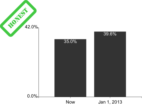
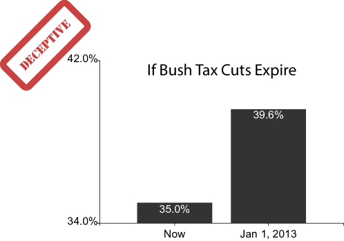
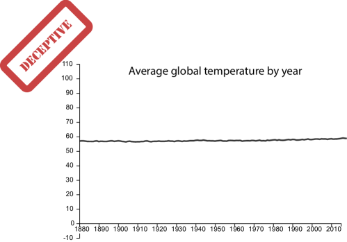
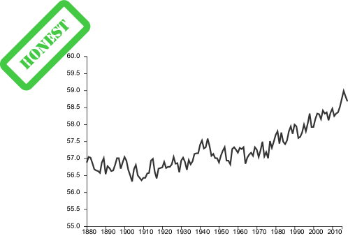
Satirical headlines with “threat or menace” are used to satirize topics about which the people appear to have already made up their minds [9]. Starting the quantitative axis of a bar chart from a value other than zero appears to be one such anathema, and is considered one of the cardinal sins of information visualization. By starting the axis from a value other than zero, the designer truncates the range of y-values, over-emphasizing minute differences between values that would otherwise appear very similar in a zero-baseline chart. Bar charts truncated in this manner have been called “biased” [35], “dishonest,” [32], “deceptive” [26, 28], “lying with statistics” [17], and “the worst of crimes in data visualisation” [23], with this exaggeration quantified in Tufte’s “lie factor” [37]. Prior work has shown that truncation and exaggeration in axes results in quantifiable differences in how people interpret the size and significance of effects [26, 28, 40], affects judgments of correlation [7], and makes trends appear more subjectively “threatening” [3]. A prescription against non-zero baselines for bar charts is encoded as a hard constraint in automated visualization design tools like Draco [24].
In many guidelines concerning y-axes, bar charts are specifically mentioned as being vulnerable to truncation. By contrast, the injunction against truncating the y-axis is often considered less pressing for line charts (compare the examples in Fig. 1). Bar charts use length to encode value, and are often used to afford the quick comparison of individual values. Truncating the y-axis of a bar chart breaks the visual convention that the difference in the height of the bars is proportional to the difference in values, and so is misleading from an encoding standpoint [11]. By contrast, when trends, rather than individual values, are important components of the intended messages, there are some cases where not truncating the y-axis is perceived as deceptive (Fig. 1c).
Despite this negativity, there is relatively little empirical work on how y-axis truncation inflates judgments across different visual encodings [28, 31, 40]. In this paper, we summarize the current debate over y-axis truncation. We also present the results of a crowd-sourced experiment investigating the impact of y-axis truncation on subjective assessments of data across different visualization designs. We find that the ability of y-axis truncation to exaggerate effect sizes is not limited to typical bar charts, but extends to designs proposed specifically for indicating that truncation has taken place. Our results suggest that the designer therefore has a great deal of control over the perceived effect size in data. There is therefore not a clear binary distinction between “deceptive” versus “truthful” y-axis presentations: designers must take into account the range and magnitude of effect sizes they wish to communicate at a per-data and per-task level.
2 Existing Guidelines About Y-Axis Truncation

When it is permissible to truncate the y-axis is a subject of continuous and active debate. Much of this debate occurs in the pages of books, or in informal channels like Twitter and blog posts, rather than in academic articles. In this section we summarize major positions in this debate, with the intent of synthesizing the major rationales behind existing guidelines.
Huff’s [17] How to Lie With Statistics calls out charts with non-zero axes as “Gee Whiz Graphs.” After y-axis truncation:
The figures are the same and so is the curve. It is the same graph. Nothing has been falsified– except the impression that it gives. But what the hasty reader sees now is a national-income line that has climbed halfway up the paper in twelve months, all because most of the chart isn’t there any more… a small rise has become, visually, a big one.
Huff’s advice is that therefore all charts of positive values should begin at 0, lest the designer deceive by making a trend appear more “impressive” than it ought to be (see Fig. 2).
Brinton’s [5] chapter on “Standards for Time Series Charts” in Graphic Presentation similarly claims:
The amount scale should normally include the zero value or other principle point of reference. Departure from this rule should never be made except where there is a special reason for so doing.
Although he includes an exception, and suggests using visual indicators (such as a “torn paper” metaphor [2]) to indicate when an axis has been adjusted:
When the interest of the reader is in the absolute amount of change rather than in the relative amount of change, it may be safe to omit the principal point of reference and the accompanying horizontal line[… w]hen the zero value or other principal point of reference is omitted the fact should be clearly indicated in a manner that will attract notice.
More recent discussion on the issue has been less dogmatic, and focuses on how different graphs encode data in different ways, and for different purposes. Alberto Cairo, in How Charts Lie [6], proposes the following rule:
I usually advise a baseline of zero when the method of encoding is height or length. If the method of encoding is different, a zero baseline may not always be necessary. The encodings in a line chart are position and angle, and these don’t get distorted if we set a baseline that is closer to the first data point.
Similarly, Carl Bergstrom and Jevin West in their critical thinking website “Calling Bullshit” [4] hold that their principal of “proportional ink” (somewhat analogous to Tufte’s “lie factor” [37]) does not apply for line charts:
[…]unlike bar charts, line graphs need not include zero on the dependent variable axis. Why not? The answer is that line charts don’t use shaded volumes to indicate quantities; rather, they use positions that indicate quantities. The principle of proportional ink therefore does not apply, because the amount of ink is not used to indicate the magnitude of a variable. Instead, a line chart should be scaled so as to make the position of each point maximally informative, usually by allowing the axis to span the region not much larger than the range of the data values.
Tufte himself, in a posting on his website [37], seems to take a similar view, but narrows his exception to time series data rather than line charts in general:
In general, in a time-series, use a baseline that shows the data, not the zero point. If the zero point reasonably occurs in plotting the data, fine. But don’t spend a lot of empty vertical space trying to reach down to the zero point at the cost of hiding what is going on in the data line itself.



However, Chad Skelton believed that line graphs should not be a special category of exemption from truncation guidelines, and proposed the following [34]:
Most line charts should start at zero. BUT not using baseline zero is OK if:
a) Zero on your scale is completely arbitrary (ie. temperature) OR
b) A small, but important, change is difficult or impossible to see using baseline zero.
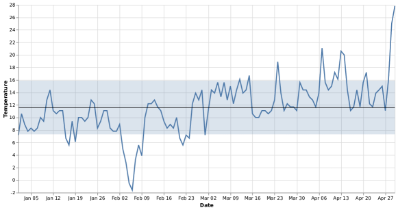
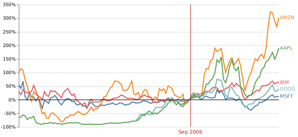
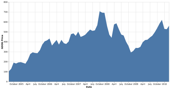
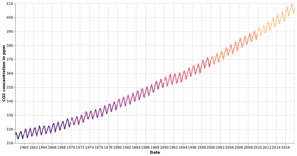
Related to these more permissive guidelines, Ben Jones specifically collected examples of common genres of line charts where non-zero baselines are not only accepted but are integral parts of the message of the chart (see Fig. 3). These charts are examples where the analytical goals entail highlighting change from some baseline other than , and in fact would mislead or confuse the viewer if they had non-truncated axes. These examples suggest that, for line charts at least, a -baseline is not always appropriate.
Moreover, existing guidelines for the design of line graphs and scatterplots focus on making the overall trend as visible (and decodable with the least error) as possible [8, 16, 36, 38]. These optimizations to chart aspect ratio typically assume that the chart covers the range of the data, rather than necessarily beginning at 0.
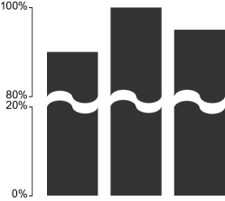
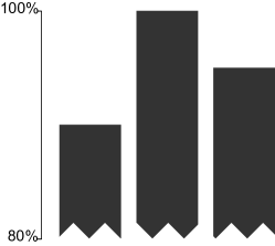
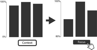
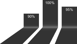
There are also competing design considerations to consider, across both encodings and visual metaphors. The visual metaphors in charts impact how data are structured and interpreted [42, 43, 44]. Y-axis truncation breaks the visual conventions of bar charts, as the relative ratio of heights between two bars is no longer proportional to their difference in value (a bar that is twice as high may not represent a value that is twice as large). However, simply representing the same data as a line chart may not resolve this broken convention. Line charts have a continuous encoding of position on the x-axis, and so employ a metaphor of continuity. For data with discrete categories on the x-axis, a line chart may therefore be inappropriate. Highlighting changes in narrow ranges of a bar chart when the y-axis starts at 0 is challenging, and many existing solutions (such as those in Fig. 4) have not been empirically vetted. Designers may not have an ideal solution to the problem of depicting differences in small dynamic ranges of categorical data without violating some expectation or encoding practice in their visualization.
Many existing guidelines in visualization lack rigorous empirical basis [22]. The results of graphical perception studies specifically on the impact of axes on graphical perception tasks are somewhat mixed. Pandey et. al [28] find that people rate differences in data as subjectively being greater in bar charts when the y-axis does not begin at 0. Witt [40], by contrast tested truncation on both line charts and bar charts and find the least error in categorizing effect sizes when the range of the y-axis is 1.5 standard deviations. Witt also does not report any significant differences in truncation between visualization types.
While not examining truncation specifically, Berger [3] finds that line charts with higher slopes are perceived as more threatening than those with shallower slopes. As line graphs with truncated axes have steeper slope than those beginning at 0, this points to a potential bias in subjective assessment. However, Cleveland et al. [7] find that expanding scales (that is, making the axes extend far past the domain of the data, and as a consequence “compressing” the interior data distribution) results in higher estimates of correlation in scatterplots.
These empirical results point to two, interpretations of the impact of truncation. Pandey et al. [28] and Berger et al. [3] point to a “bias” in subjective perception of effects as a result of truncation. However, Witt [40] and Cleveland et al. [7] point to errors in estimation when the axes of a chart are extended past the range of the data.
2.1 Research Questions
In summary, truncating a y-axis may or may not always be dishonest, and so to be avoided. This anathema may or may not extend to line charts or time series data, or it could just be the case for bar charts. Even if line charts are an exception, whether it is permissible to truncate may depend on task (relative versus absolute change, trends versus values) and on data semantics (meaningful versus non-meaningful baselines). These ambiguities suggest the following questions for designers seeking to decide whether or not to truncate the y-axis in their chart:
-
•
Do the differences in visual design and framing behind line and bar charts result in different subjective effect sizes when the y-axis is altered? That is, is the impact of y-axis truncation different between bar charts and line charts?
-
•
Does explicitly indicating that y-axis truncation has taken place (as in Fig. 4) reduce the bias introduced by truncation? That is, can visual designs alleviate the exaggeration caused by truncation?
These questions motivated our experiments on how people interpret the perceived severity of effect sizes across visual designs, data metaphors, and indications of truncation.
3 Experiment
In order to assess how different visual presentations and analytical frames affect the inflation of perceived effect size introduced by truncating the y-axis, we conducted a series of two crowd-sourced experiments using the prolific.ac platform, approved by the IRB of Tableau Software. Experimental data from Prolific is comparable in quality to those from Amazon’s Mechanical Turk platform [29]. The Prolific crowd-working platform is focused on studies rather than more general micro-tasks, and enforces minimum compensation rates of at least $6.50/hour compared to the extremely low average earnings of workers on MTurk [15].
As per Huff, the major impact of y-axis truncation is not to misrepresent the values: “nothing has been falsified;” [17] rather, truncation inflates the subjective perception of the rate of change of the values (Fig. 2). Therefore, while we investigate quantitative judgments in Experiment Three, the core of our experimental design is based on assessing qualitative changes brought about by truncation. The design of our experiments was influenced by Pandey et al. [28], who use a rating scale to assess the effect of various sorts of “deceptive” visualization practices, including y-axis truncation. Rating scales of statistical effect size have been in the context of assessing the impact of y-axis manipulations in Pandey et al. and Witt [40], but in general the use of rating scales to detect biases in statistical graphics have been used more widely, e.g., in Correll & Gleicher [10]. Our central measure of interest was therefore the response to the 5-point rating item that related to how severe or important the differences in the data series were (the exact question text depended on the intended framing of the question). Higher ratings indicate a higher Perceived Severity of the effect size. Our experimental design extends Pandey et al.’s work to a wider range of visual designs and task framings, and includes repeated within-subject trials on an array of different graphs (rather than just single exemplar pairs of deceptive and non-deceptive charts).
We also asked the participants if they thought the values were increasing or decreasing (in the trend framing), or if the first value was smaller or larger than the last value (in the values framing). We used this binary response as an engagement check and to test for comprehension of the chart data. Participants with unacceptably low accuracy at the engagement questions (more than three standard deviations lower than the mean performance) were excluded from analysis, but were compensated for their participation.
Since the main experimental measure was a subjective rating, we presented an initial set of 8 stimuli with every combination of slope and truncation level in order to present participants with the full range of visual effect sizes and so provide initial grounding for their ratings. These initial stimuli were discarded from analysis.
After the main rating task, we gave the participants a 13-item graphical literacy scale developed by Galesic and Garcia-Retamero [14]. Galesic and Garcia-Retamero reported a Cronbach’s of 0.85 for this scale, with some evidence of its utility as a cross-cultural measure of facility in interpreting charts and graphs. The scale does include one item that specifically tests for whether the participant noticed truncation of the y-axis. We collected the answer to this question separately, as well as collecting the overall scale value.
Lastly, we collected demographics data. In addition to standard items such as age and gender, we asked for three free-text responses, the first two of which were required to be non-empty:
-
•
What strategy or procedure did you use to complete the tasks?
-
•
Did you notice anything odd or unusual about the charts you saw during the task?
-
•
Any additional comments or feedback?
Using these free text responses, a paper author and two third party researchers (one for experiments one and two, and another for experiment three) qualitatively coded whether or not the participants’ free text responses specifically indicated that they noticed that the y-axes of some of the charts in the experiment were truncated. The coders then discussed mismatches ( of codes), which were rectified into a final binary value.
Materials, data and analyses are available in our supplemental materials as well as https://osf.io/gz98h/.
3.1 Experiment One: Framing Interventions
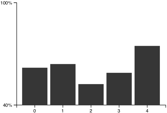
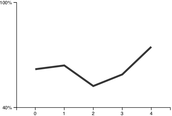
In unconstrained settings, line charts and bar charts can produce different sorts of judgments about the same backing data [42]. Speculatively, one reason for this difference is that bar charts encourage the comparison of individual bars (and thus individual values), whereas line charts encourage an assessment of the entire shape (and thus overall trend). That is, the bar chart and line chart induce different framings of the same data, based on their visual design and resulting visual metaphors [43].
While truncation of the y-axes of equally sized line and bar charts both result in magnification of trend (and other measures such as correlation [7]), we were interested in whether or not the differing framings associated with bar charts and line charts would result in differing impacts on judgments when the y-axis is truncated. If so, we were also interested if other strategies to promote different framings (such as text) could have this same impact, without the potential cost or inflexibility of switching visual designs.
3.1.1 Methods
As we were interested in a subjective measure with presumably wide person-to-person variance, we used a within-subjects design. To provide a wide variety of different visual effect sizes (in terms of differing bar heights or line slopes) while maintaining a relatively small number of trials to avoid fatigue, we had the following factors:
-
•
Visualization type (2 levels): whether the data were visualized in a bar chart or line graph. See Fig. 5 for examples of these designs.
-
•
Question framing (2 levels): either a value-based or trend-based task frame. For the value-based framing, the engagement question was “Which value is larger, the first value or the last value?” and the effect size severity question was “Subjectively, how different is the first value compared to the last value?” with the labels “Almost the Same,” “Somewhat Different,” and “Extremely Different” for the first, third, and fifth items on our five-point rating scale. For the trend-based framing, the engagement question was “Are the values increasing or decreasing?”, the effect size severity question was “Subjectively, how quickly are the values changing?”, and the rating labels were “Barely,” “Somewhat,” and “Extremely Quickly.”
-
•
Truncation Level (3 levels): where the y-axis of the visualization began: either at , , or .
-
•
Slope (2 levels) : How much increase (or decrease) there was between the first and last values in the data, either or .
-
•
Data Size (2 levels): whether there were two or three data values in the visualization. If there were three data values, the center value was at the midpoint of the first and last items, with a uniform random jitter between .
Participants saw one of each combination of factors, for a total of stimuli, presented in a randomized order. Whether the values were increasing or decreasing was an additional random factor.
3.1.2 Hypotheses
As with Pandey et al. [28] for bar charts, and Berger [3] for line charts, we expected that charts with more axis truncation would be perceived as having more severe effect sizes than those with less truncation.
While there has been some initial work on the impact of framing in visualization [18, 20, 41], and how different visual metaphors can impact how we make use of information in charts [43, 44], there is relatively little empirical work on how different visual designs impact framing. Therefore our hypotheses about framing were weakly held. In particular, based on the misleading visual metaphor introduced by truncation in bar charts (where the relative size of the bars is not a proxy for the relative difference in values) we expected that Bar charts would be more greatly impacted by truncation than line charts in terms of amplifying perceived severity of effect sizes. Similarly, we believed that the values framing would be more greatly impacted by truncation than the trend framing, as comparison of individual values in a truncated graph is fraught and potentially misleading (especially if the axis legend is ignored).
3.1.3 Results
We recruited 40 participants for this task (21 male, 18 female, 1 with a non-binary gender identity, , ). We paid participants $4 for this task, for an empirical effective hourly rate of $12/hour. On average, participants scored well on the 13-item Galesic and Garcia-Retamero graphical literacy scale (, ). In particular, 31 (78%) participants correctly answered the scale item associated with y-axis truncation. Additionally, of participants explicitly mentioned y-axis manipulation in their post-task free responses. Participants also scored highly on our engagement question, correctly labeling the direction of the effect (, ), with the exception of one participant, whose performance was more than three standard deviations from the mean (). The data from this participant was excluded from our analysis.
We conducted a repeated measures ANOVA testing the effect of truncation level, visualization type, and question framing, and their interactions on perceived severity.
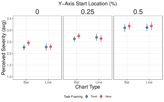
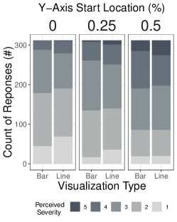
Our results support our first hypothesis: increased y-axis truncation results in increased perceived severity (, ). A post-hoc pairwise t-test with a Bonferroni correction confirmed that the perceived severity of all three levels of truncation were significantly different from each other. Fig. 6 illustrates this result, broken out by visualization type.
Our results fail to support our second hypothesis. There was no significant effect of visualization design on perceived effect size (, ). Fig. 6 shows similar responses to different visualizations across all levels of truncation.
Our results only weakly support our last hypothesis. While there was a significant effect of framing on perceived effect size ((, ), a post-hoc pairwise t-test with a Bonferroni correction did not find a significant difference between the value and trend question framings. Additionally, this effect was quite small: an average decrease in perceived severity of for responses using the trend framing (based on a rating scale), compared to an increase of for starting the y-axis at rather than . Fig. 6 shows this result, broken out by visualization design.
3.2 Experiment Two: Visual Design Interventions
The results of our first experiment show no robust difference in the impact of truncation on bar charts and line charts: truncation results in largely qualitatively assessed effect sizes in both types of graphs. This result suggests that designers may have to employ other methods to indicate that a y-axis has been truncated. A common solution to this problem is to employ the visual metaphor of the “broken” or “continued” axis. Wikipedia recommends indicating truncated axes with glyphs [39] that convey a break from 0 to the start of the truncated axis. To our knowledge, there is no empirical work on whether or not these indications of breaks alter judgments about values. As such, we performed an experiment with similar methodology to our first experiment in order to assess the impact of visual design elements in bar charts that indicate truncation or continuation on perceived effect size.
3.2.1 Methods
Our results from Experiment One were initial evidence that subtle framing effects were not sufficient to reliably impact estimations. As such, we excluded that factor, sticking with the trend framing from the first experiment. Instead, we focused on a narrower set of designs that have been proposed to ameliorate the impact of y-axis truncation in bar charts.
There are many possible designs that have been proposed to indicate y-axis breaks (see 4). However, we were interested in cases where there is an indication of an axis break per se, without any additional alteration of the (truncated) height of the bars, screen space dedicated to the chart, or additional required user interaction, limiting us to a subset of the solutions proposed in prior work.
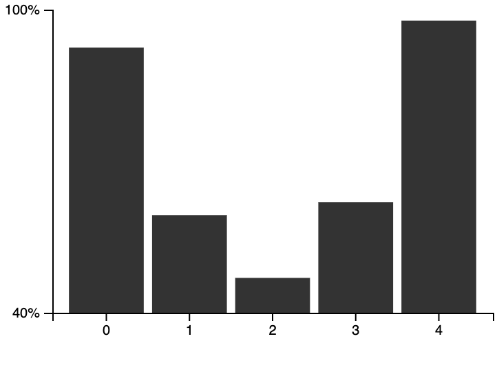
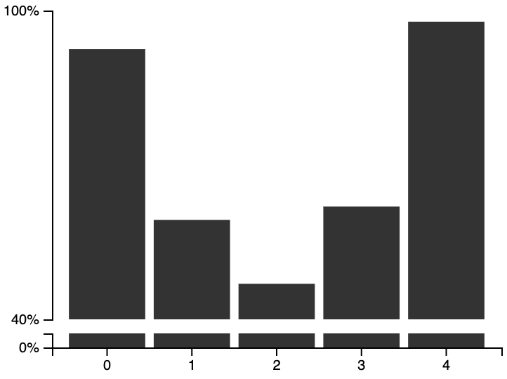
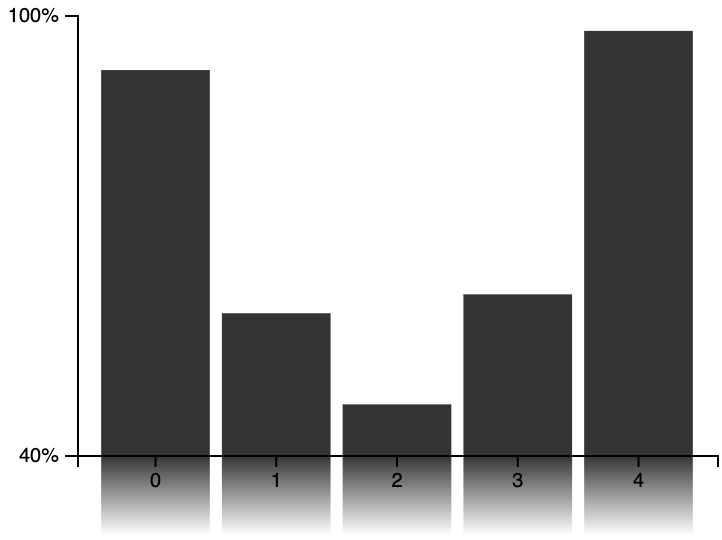
We therefore modified two of the proposed fixes as exemplars of designs where the truncation of the y-axis is not only visible in reading the y-axis labels, but is an integral component of the visual metaphor of the chart (see Fig. 7). Bar charts with broken axes are a common choice to indicate a truncated axis. In Fig. 7b we use a broken axis design with both a break on the y-axis as well as a break in the bars themselves to reinforce the metaphor across the entire chart. Bar charts with irregular shapes on the bottom have been reported as complicating decoding [33], so we use rectangular glyphs to indicate breakage rather than the “wavy” or “jagged” glyphs commonly uses to indicate breaks [39](as in Fig. 4b). Our second design, a bar chart with a gradient bottom (Fig, 7c), has been empirically considered for other scenarios by both Skau et al. [33] and Diaz et al. [12]. Skau et al. in particular were investigating the case where the gradient is an artistic embellishment (mean to convey e.g., sitting on a reflective surface) rather than conveying continuation. They found that the gradient caused overestimation of value in their task setting, which is potentially advantageous for our task (where visual exaggeration of value might counteract the effect of truncation). For both conditions, the heights of the bars above the break (for the broken axis chart) and above the y-axis (for the gradient bottom chart) were equal to the height of the bars in the standard truncated bar chart. The pre-break axes and under-bar gradients were therefore constrained to a narrow area underneath the chart. We include code for additional potential designs in our study materials.
For this experiment, reused the factors and factor levels from the previous experiment, but used only the trend-based question framing, and new visualizations:
-
•
Visualization type (3 levels): whether the data was visualized in a bar chart, broken axis bar chart, or gradient bar chart. See Fig. 7 for examples of these designs.
Participants saw one of each combination of factors, for a total of stimuli, in a random order. As with the previous experiment, we included an initial set of stimuli illustrating the full range of effect sizes in order to assist in calibrating the participants’ subjective judgments, for a total of total stimuli, but these calibration stimuli were excluded from analysis.
3.2.2 Hypotheses
We had only a single hypothesis for this experiment: visual designs with non-zero axes that indicate y-axis breaks or continuations would be perceived as having smaller effect sizes than standard bar charts. We believed that these visual indications would make the truncation harder to ignore or overlook, and promote caution or reflection in judgments.
3.2.3 Results
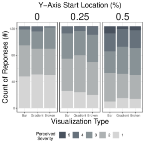
We recruited 32 participants for this task (20 female, 12 male, , ). We paid participants $4 for this task, for an empirical effective hourly rate of $16/hour. Participants scored well on the Galesic and Garcia-Retamero graphical literacy scale (, ). Similar to the previous study, () participants correctly answered the scale item connected with y-axis truncation. Participants also scored highly on our engagement question, correctly labeling the direction of the effect (, ). One participant had performance more than three standard deviations from the mean (). The data from this participant was excluded from our analysis.
We conducted a repeated measures ANOVA testing the effect of truncation level, visualization type, data size, and their interactions on perceived severity. We built our model on the subset of trials where the truncation level was , as those were the trials with visual differences between designs.
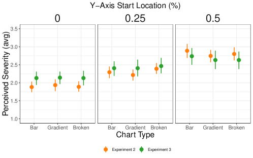
Our results fail to support our first hypothesis: there was no significant difference between perceived severity among visualization designs (, ). A post-hoc pairwise t-test with a Bonferroni correction failed to find any significant difference between visualization designs. Fig. 8 illustrates the performance of all three designs across different truncation levels.
We only coded of participants as having specifically mentioned y-axis truncation in their post-task free text responses, compared to in the first experiment. It is possible that the alternative conditions made the truncation of the axis so “obvious” that it was not felt necessary to comment upon, but we had no specific hypothesis to this effect.
3.3 Experiment Three: Bias in Value Estimation
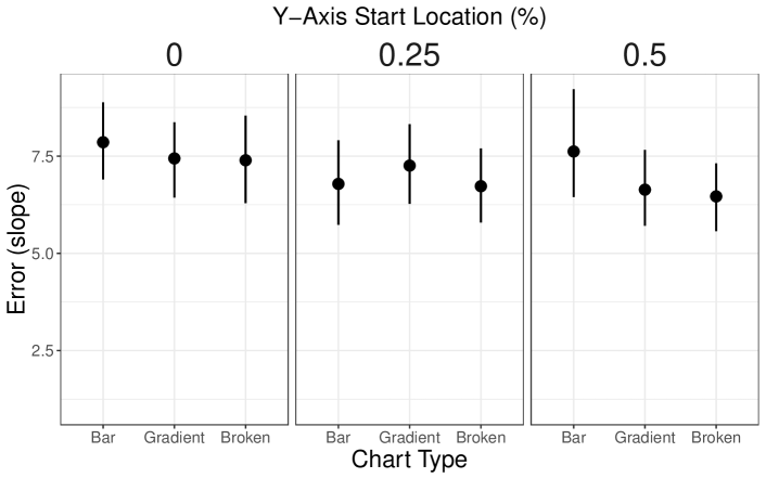
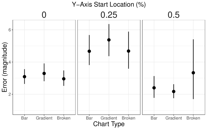
The second experiment indicates that even designs that explicitly call attention to axis breaks do not have a noticeable impact on reducing the subjectively assessed trend. However, the relative unfamiliarity of the designs we chose, along with our decision to use crowd-sourced participants, suggests an alternative explanation: that our subject pool, regardless of design, simply ignores, discounts, or otherwise misreads the information on the y-axis. While we reiterate here that we do not believe that the effect of y-axis truncation is primarily a misreading of values (but is rather a visual exaggeration of an effect size), truncation has the side effect that a viewer inattentive to the axis labels would incorrectly decode the values in the chart. Even if the participants are aware of the values, it is possible that by forcing participants to attend more closely to specific numerical values would reduce the impact of the visual impact of the truncation as they consider the numerical difference between values.
In order to assess these possibilities, as well as disambiguate a bias in trend from a misreading of trend, we conducted a further experiment where we supplemented our existing qualitative rating task with a quantitative value task.
3.3.1 Methods
In this experiment we were interested in whether or not y-axis truncation results not just in qualitative increase in effect sizes but also misreading of values or if, conversely, attending to the specific value of numbers reduces this exaggeration. Therefore, we repeated the experimental design from Experiment Two, but included two additional tasks for each trial. Before the subjective rating task, participants were asked:
-
1.
“What is the value of the first bar (0-100%)”
-
2.
“What is the value of the last bar (0-100%)”
Participants entered their guesses in text boxes. We did not directly ask for a numerical estimate of the slope to avoid an entangling between numerical guesses and the rating scale.
Using the answers to these estimation questions and compared to the actual values and , we calculated two different error metrics roughly corresponding to errors in slope or magnitude. An error in slope would assert that truncation of the y-axis would cause participants to overestimate the slope of the resulting trend, and was calculated as the difference in estimated versus actual slope, . An error in magnitude would assume that the participants correct assessed the slope, but ignored the amount of truncation, inflating the size of the individual values, and was calculated as the average per-value estimation error, .
The experiment had the same factorial design as Experiment Two, for validation total stimuli.
3.3.2 Hypotheses
We believed that explicitly soliciting value estimations would encourage participants to read the axis labels and therefore be more mindful of y-axis manipulations. If inattention to axis labels was a primary driver of the truncation bias, then our quantitative task, assuming good performance, would reduce it. Our second hypothesis was therefore that severity would not differ across levels of truncation; that is, the bias we observed would be reduced or eliminated in this version of the experiment.
Also under the assumption that participants would read the axis labels, and thus adjust their estimates accordingly, we assumed that estimation error would also be similar across levels of truncation, for both of the error metrics we calculated.
3.3.3 Results
We recruited 25 participants for this task (14 female, 11 male, , ). We paid participants $4 for this task, for an effective hourly rate of /hour. Participants had similar scores on the Galesic and Garcia-Retamero graphical literacy scale (, ), and a similar proportion answered the y-axis truncation item correctly (). All participants met the inclusion criteria for accuracy on our engagement task, and we coded 56% of participants as explicitly mentioning the y-axis manipulation.
We conducted an identical repeated measures ANOVA as the previous experiment, testing the effect of truncation level, visualization type, data size, and their interactions on perceived severity using the subset of trials where the y-axis truncation was . We also performed identically structured repeated measures ANOVA but where the response variable were our two value-estimation metrics and
Our results fail to support our first hypothesis: as with the prior two experiments, perceived severity was significantly different across levels of truncation (,). A post-hoc pairwise t-test with a Bonferroni correction found that all three levels of truncation had average perceived severity levels that were significantly different from each other; Fig. 8 shows this result, also revealing a similar pattern of responses between this experiment and experiment two.
Our results also fail to support our second hypotheses, with one exception. Error in estimating trend was not significantly different across levels of truncation (, ). However, Error in estimating individual values was significantly different across truncation levels (, ). A post-hoc pairwise t-test with a Bonferroni correction found that graphs with axes starting at had significantly higher error rates than other truncation levels, but no other differences. Participants specifically remarked upon the difficulty of this condition: P1:“I found out I had a much more difficult time interpreting charts when the scale was from 25 to 100, compared to any other scale” and P9: “Charts starting with 25% are odds [sic] in my opinion.” This is potentially due to the relative difficulty in anchoring and converting values (for instance, half way up an axis that begins at is , which can be used to anchor other estimates; halfway up a truncated axis is , a far less convenient anchor point), but does not suggest that y-axis truncation creates a monotonic increase in error.
4 Discussion
Our experimental results suggest that truncating the y-axis has a consistent and significant impact on the perceived importance of effect sizes. This qualitative bias occurs in both line charts and bar charts, as well as in bar charts that visually indicate either broken axes or the continuation of bars beyond the bounds of the chart. This bias is not merely a misreading of values, but seems to be connected to the visual magnification of differences.
These results suggest that, regardless of differences in the visual metaphors or encodings of line charts, there does not appear to be a significant practical difference in the impact of truncation across different visualizations: the type of chart alone is not sufficient to shape guidelines around how to define charts. For the same data, the narrower the range of values in the y-axis, the larger the visual effect size and so the larger the subjective effect size. Different designs might provide more visual indications that this exaggeration is occurring, but did not substantially alter the reported impact of the exaggeration.
Moreover, we cannot rely on visual indicators of broken or truncated axes to counteract the exaggeration caused by y-axis truncation. Subjective judgments about effect size appear to be visual rather than mathematical or statistical judgments. Merely indicating that truncation has occurred, even in a prominent and unambiguous way, may not be sufficient to “de-bias” viewers of truncated charts. Surprisingly, The accurate estimation of values does not seem to counteract the visual magnification of difference.
However, we resist the interpretation of our experimental results to mean that, as Huff suggests [17], all charts with quantitative axes should include 0. The designer of the visualization, by selecting a y-axis starting point, has control over the subjective importance of the resulting differences [40]. There is no a priori, domain-agnostic ground truth for how severe, important, or meaningful an effect size ought to be. We interpret our results as meaning that there is no obvious way for designers to relinquish the responsibility of considering effect size in their charts. We reject the unequivocal dichotomy of “honest” and “dishonest” charts (for instance, as presented in Fig. 1).
4.1 Limitations & Future Work
Our experiments focus on a limited set of designs to assess the impact of truncation on perceived effect size. We also focus on detecting the relative difference in subjective effect size across a few different levels of truncation, rather than attempting to fully model the complex relationship between slope, axis truncation, and perceived severity. It falls to future work to further explore the interplay of these variables.
Similarly, we tested only two potential designs for indicating axis truncation in bar charts as representatives of common classes of design interventions. Even of the designs we considered, we focused only on methods for static charts. Other methods using animation or interaction (such as in Ritchie et al. [31]) could result in different patterns of subjective judgments by allowing the viewer to switch between truncated and non-truncated axes.
Wishing to avoid the complications involved in narrative or domain-focused crowdsourced studies (as discussed in Dimara et al. [13]) our designs were presented in a relatively context-free manner. We believe that analysts in different domains have different internal models of effect size severity that would therefore not be captured in our results. We anticipate that different data domains and analytical contexts can impact the perceived importance or severity of effect sizes.
Connected with the issue of domain relevance is that of authority: visualizations from different sources or presented with different levels of perceived expertise or authority could produce differing patterns of judgment in different audiences. While there is ongoing work on understanding how visualizations persuade, and the rhetorical strategies that designers use to increase the persuasive power of visualization [27, 20], a quantitative study of the persuasive power of y-axis truncation (especially for decision-making tasks) falls to future work.
4.2 Conclusion
Experts in information visualization and statistical graphics have produced conflicting advice on how harmful it is to start the y-axis of a chart from values other than 0. This conflict has often centered on the distinction between line graphs and bar charts, or on best practices for depicting axis breaks. Despite the claims that y-axis truncation is only “deceptive” for certain kinds of charts, or that explicit indication of axis breaks can ameliorate this “deception,” we find that the exaggeration introduced through truncation appears to persist across chart types and chart designs, and even when participants make accurate reports of the numbers they observe.
5 Acknowledgments
This work was supported by NSF awards CHS-1901485 and CHS-1900941. Thanks to Elsie Lee and Evan Anderson for assistance in qualitative coding.
References
- [1]
- [2] R J Andrews. 2019. Tear Up Your Basline. (2019). https://medium.com/data-visualization-society/tear-up-your-baseline-b6b68a2a60f1.
- [3] Charles R Berger. 2005. Slippery Slopes to Apprehension: Rationality and Graphical Depictions of Increasingly Threatening Trends. Communication Research 32, 1 (2005), 3–28.
- [4] Carl Bergstrom and Jevin West. 2017. The Principle of Proportional Ink. (2017). https://callingbullshit.org/tools/tools_proportional_ink.html.
- [5] Willard Cope Brinton. 1939. Graphic Presentation. Brinton Associates.
- [6] Alberto Cairo. 2019. How Charts Lie. W.W. Norton.
- [7] William S Cleveland, Persi Diaconis, and Robert McGill. 1982. Variables on Scatterplots Look More Highly Correlated When the Scales are Increased. Science 216, 4550 (1982), 1138–1141.
- [8] William S Cleveland, Marylyn E McGill, and Robert McGill. 1988. The Shape Parameter of a Two-Variable Graph. J. Amer. Statist. Assoc. 83, 402 (1988), 289–300.
- [9] Wikipedia Contributors. 2019. Threat or menace. (2019). https://en.wikipedia.org/wiki/Threat_or_menace.
- [10] Michael Correll and Michael Gleicher. 2014. Error Bars Considered Harmful: Exploring Alternate Encodings for Mean and Error. IEEE Transactions on Visualization and Computer Graphics 20, 12 (2014), 2142–2151.
- [11] Michael Correll and Jeffrey Heer. 2017. Black Hat Visualization. In Workshop on Dealing with Cognitive Biases in Visualisations (DECISIVe), IEEE VIS.
- [12] Jose Díaz, Oscar Meruvia-Pastor, and Pere-Pau Vázquez. 2018. Improving Perception Accuracy in Bar Charts with Internal Contrast and Framing Enhancements. In 2018 22nd International Conference Information Visualisation (IV). IEEE, 159–168.
- [13] Evanthia Dimara, Steven Franconeri, Catherine Plaisant, Anastasia Bezerianos, and Pierre Dragicevic. 2018. A Task-based Taxonomy of Cognitive Biases for Information Visualization. IEEE Transactions on Visualization and Computer Graphics (2018).
- [14] Mirta Galesic and Rocio Garcia-Retamero. 2011. Graph Literacy: A Cross-Cultural Comparison. Medical Decision Making 31, 3 (2011), 444–457.
- [15] Kotaro Hara, Abigail Adams, Kristy Milland, Saiph Savage, Chris Callison-Burch, and Jeffrey P Bigham. 2018. A Data-Driven Analysis of Workers’ Earnings on Amazon Mechanical Turk. In Proceedings of the 2018 CHI Conference on Human Factors in Computing Systems. ACM, 449.
- [16] Jeffrey Heer and Maneesh Agrawala. 2006. Multi-Scale Banking to 45 Degrees. IEEE Transactions on Visualization and Computer Graphics 12, 5 (2006), 701–708.
- [17] Darrell Huff. 1993. How to Lie with Statistics. WW Norton & Company.
- [18] Jessica Hullman and Nick Diakopoulos. 2011. Visualization Rhetoric: Framing Effects in Narrative Visualization. IEEE Transactions on Visualization and Computer Graphics 17, 12 (2011), 2231–2240.
- [19] Ben Jones. 2015. (2015). https://twitter.com/DataRemixed/status/671832482279395328.
- [20] Ha-Kyung Kong, Zhicheng Liu, and Karrie Karahalios. 2018. Frames and Slants in Titles of Visualizations on Controversial Topics. In Proceedings of the 2018 CHI Conference on Human Factors in Computing Systems. ACM, 438.
- [21] Robert Kosara. 2016a. 3D Bar Charts Considered Not That Harmful. (2016). https://eagereyes.org/blog/2016/3d-bar-charts-considered-not-that-harmful.
- [22] Robert Kosara. 2016b. An Empire Built on Sand: Reexamining What We Think We Know about Visualization. In Proceedings of the sixth workshop on beyond time and errors on novel evaluation methods for visualization. ACM, 162–168.
- [23] Sarah Leo. 2019. Mistakes, we’ve drawn a few. (2019). https://medium.economist.com/mistakes-weve-drawn-a-few-8cdd8a42d368.
- [24] Dominik Moritz, Chenglong Wang, Greg L Nelson, Halden Lin, Adam M Smith, Bill Howe, and Jeffrey Heer. 2019. Formalizing Visualization Design Knowledge as Constraints: Actionable and Extensible Models in Draco. IEEE Transactions on Visualization and Computer Graphics 25, 1 (2019), 438–448.
- [25] National Review. 2015. The only #climatechange chart you need to see. (2015). https://twitter.com/nro/status/676516015078039556?lang=en.
- [26] Shaun O’Brien and Claire Lauer. 2018. Testing the Susceptibility of Users to Deceptive Data Visualizations When Paired with Explanatory Text. In Proceedings of the 36th ACM International Conference on the Design of Communication. ACM, 7.
- [27] Anshul Vikram Pandey, Anjali Manivannan, Oded Nov, Margaret Satterthwaite, and Enrico Bertini. 2014. The Persuasive Power of Data Visualization. IEEE Transactions on Visualization and Computer Graphics 20, 12 (2014), 2211–2220.
- [28] Anshul Vikram Pandey, Katharina Rall, Margaret L Satterthwaite, Oded Nov, and Enrico Bertini. 2015. How Deceptive are Deceptive Visualizations?: An Empirical Analysis of Common Distortion Techniques. In Proceedings of the 2015 CHI Conference on Human Factors in Computing Systems. ACM, 1469–1478.
- [29] Eyal Peer, Laura Brandimarte, Sonam Samat, and Alessandro Acquisti. 2017. Beyond the Turk: Alternative Platforms for Crowdsourcing Behavioral Research. Journal of Experimental Social Psychology 70 (2017), 153–163.
- [30] Jon Peltier. 2011. Broken Y Axis in an Excel Chart. (2011). https://peltiertech.com/broken-y-axis-in-excel-chart/.
- [31] Jacob Ritchie, Daniel Wigdor, and Fanny Chevalier. 2019. A Lie Reveals the Truth: Quasimodes for Task-Aligned Data Presentation. In Proceedings of the 2019 CHI Conference on Human Factors in Computing Systems. ACM, 193.
- [32] David Shere and Hannah Groch-Begley. A History of Dishonest Fox Charts. (????). https://www.mediamatters.org/research/2012/10/01/a-history-of-dishonest-fox-charts/190225.
- [33] Drew Skau, Lane Harrison, and Robert Kosara. 2015. An evaluation of the impact of visual embellishments in bar charts. In Computer Graphics Forum, Vol. 34. Wiley Online Library, 221–230.
- [34] Chad Skelton. 2018. Bar charts should always start at zero. But what about line charts? (2018). http://www.chadskelton.com/2018/06/bar-charts-should-always-start-at-zero.html.
- [35] Danielle Albers Szafir. 2018. The Good, the Bad, and the Biased: Five Ways Visualizations can Mislead (and How to Fix Them). interactions 25, 4 (2018), 26–33.
- [36] Justin Talbot, John Gerth, and Pat Hanrahan. 2011. Arc Length-Based Aspect Ratio Selection. IEEE Transactions on Visualization and Computer Graphics 17, 12 (2011), 2276–2282.
- [37] Edward R. Tufte. 2001. The Visual Display of Quantitative Information. Graphics Press; 2nd edition, Cheshire, CT, USA.
- [38] Yunhai Wang, Fubo Han, Lifeng Zhu, Oliver Deussen, and Baoquan Chen. 2018. Line Graph or Scatter Plot? Automatic Selection of Methods for Visualizing Trends in Time Series. IEEE Transactions on Visualization and Computer Graphics 24, 2 (2018), 1141–1154.
- [39] Wikipedia contributors. 2019. Misleading graphs. https://en.wikipedia.org/wiki/Misleading_graph#Truncated_graph. (2019).
- [40] Jessica Witt. 2019. Graph Construction: An Empirical Investigation on Setting the Range of the Y-Axis. Meta-Psychology (2019). to appear.
- [41] Cindy Xiong, Lisanne van Weelden, and Steven Franconeri. 2017. The Curse of Knowledge in Visual Data Communication. In DECISIVe: Workshop on Dealing with Cognitive Biases in Visualizations. IEEE VIS.
- [42] Jeff Zacks and Barbara Tversky. 1999. Bars and Lines: A Study of Graphic Communication. Memory & Cognition 27, 6 (1999), 1073–1079.
- [43] Caroline Ziemkiewicz and Robert Kosara. 2008. The Shaping of Information by Visual Metaphors. IEEE Transactions on Visualization and Computer Graphics 14, 6 (2008).
- [44] Caroline Ziemkiewicz and Robert Kosara. 2009. Preconceptions and Individual Differences in Understanding Visual Metaphors. In Computer Graphics Forum, Vol. 28. Wiley Online Library, 911–918.