INKA: An Ink-based Model of Graph Visualization
Abstract
Common quality metrics of graph drawing have been about the readability criteria, such as small number of edge crossings, small drawing area and small total edge length. Bold graph drawing considers more realistic drawings consisting of vertices as disks of some radius and edges as rectangles of some width. However, the relationship that links these readability criteria with the rendering criteria in node-link diagrams has still not been well-established.
This paper introduces a model, so-called INKA (Ink-Active), that encapsulates mathematically the relationship between all common drawing factors. Consequently, we investigate our INKA model on several common drawing algorithms and real-world graphs.
Index Terms:
ink model, readability, drawing factors, bold drawing, graph-ink
1 Introduction
Drawing graphs has been extensively studied [7, 24] and have been successfully applied in cross domains including social, business, and biology.
Readability criteria are the most common measures for the quality of graph drawings and have been aimed in many layout algorithms [7, 20, 18, 24]. They include, for example,
-
•
edge crossing(few edge crossings),
-
•
edge length (small total edge length),
-
•
area (small area of a grid drawing).
These readability criteria are shown effective and algorithms built-in with these criteria have been successfully applied in many domains. There have been a number of empirical evaluation of readability measures for graph drawing [20, 18, 28]. Previous work has shown that improving multiple aesthetics can produce better graph drawing in terms of human perception [13].
A more realistic view of graph drawing considers rendering factors, such as node size and edge width [27]. Bold graph drawing draws every vertex of a graph by a disk of radius , and every edge by a rectangle of width , for some non-negative numbers and [27, 17].
Here, we distinguish drawing factors into two categories: layout factors and rendering factors. The layout factors include, for examples, edge crossing, edge length and drawing area. The rendering factors include, for example, node size, edge width, node / edge colors, shading and transparency.
Despite a plethora of studies of the abstract graph readability concepts and the rendering of graphs as node-link diagrams, previous work has focused only on each quality type. There is not much research that has studied the relationship between these two types of quality. As such, optimized drawings for abstract graph readability do not consider actual rendered results; while rendering criteria alone are not sufficient with the absence of some readability criteria.
In this paper, we are interested in studying the relationship between the two types of drawing quality (the abstract graph readability and the rendering of the graphs) in node-link diagrams. In particular, we will investigate a relationship of the most common layout factors (edge length, edge crossings and drawing area) with the most common rendering factors (node size and edge width). These drawing factors are crucial for a good graph drawing.
Specifically, we introduce a model, so-called INKA (Ink-Active), which mathematically addresses the relationship between the common drawing factors. We explore the relationship with the two criteria using the expression of the amount of ink. Intuitively, the new model has been built based on the well-known concept of ink-data ratio by Tufte [26].
With the INKA model, our aim is to determine the relationship for selected common drawing factors in graph drawing. The INKA model also leads to some guidelines for choosing drawing factors in graph layout algorithms.
We must stress that we do not aim in this paper for an algorithm to optimize for both quality types, nor to compare between the importance of these criteria. Instead, these will be considered in our future work.
In summary, the paper makes the following contributions:
-
•
We have proposed a new model, called INKA, for expressing the relationship between the important layout factors (edge crossings, edge length and the drawing area) with the rendering factors (node size, edge width).
-
•
We examine our INKA model and evaluate it using several common graph drawing algorithms.
-
•
We also evaluate INKA model using real-world graphs and standard multi-level force-directed graph layouts.
The rest of the paper is organized as follows. Section 2 gives related work. Section 3 describes our INKA model. Section 4 gives some examples of optimization of rendered results using INKA model; Section 5 gives several studies of INKA on common drawing approaches. Section 6 gives some evaluation of the INKA model using real-world graphs. Section 7 gives some diskussions and Section 8 concludes.
2 Related work
2.1 Graph drawing quality metrics
Criteria for ‘good’ graph visualization have been investigated extensively [7]. Graph drawing algorithms over the years typically take into account one or more aesthetic criteria for better readability of the drawing. These aesthetic criteria include, for example,
-
1.
minimizing the number of edge crossings [21];
-
2.
minimizing the total area [25];
-
3.
edge lengths should be short but not too short [3].
Amongst these aesthetics, small number of edge crossings is one of the most common criterion from previous user studies [18]. Besides, the amount of ink and minimum total edge length has been used in many layout algorithms; for example, [23, 16, 10, 11]. Achieving small total area is another common approach [25]. Overall, improving multiple aesthetics can produce better graph drawings [13].
However, there is not much research to model and understand the relationship between the drawing factors.
2.2 Ink model and data-ink
Tufte’s principle of ’maximizing data-ink’ is well-known for data visualization [26]. The data-ink is the non-erasable ink that presents data; removing a data-ink from the display would cause information loss. The data-ink ratio measures the ratio of data-ink to the total ink used. For a fixed piece of information, maximizing the ratio corresponds to minimizing the amount of ink.
A number of graph drawing algorithms have aimed for a minimum total edge length, or more precisely, a minimum amount of ink. This criterion has been studied [23, 16, 10, 11].
In this paper, we denote the concept of ink effectiveness, which is the inverse of data-ink ratio. This is equivalent to the ratio of ink over data. Given the pictures to visualize the same data (graph), the picture using less ink is more ink-effective.
3 INKA: Ink-Active model
This section presents our INKA model that formally shows relationship between the abstract graph readability and the rendering of graphs. Specifically, the model aims to draw a connection between the most common drawing factors of the two types. The new model is based on the amount of ink used in drawing graphs.
3.1 Problem definitions and notations
We first define several criteria for ’proper’ drawings of graphs. Some notations are borrowed from bold graph drawing [27].
Given a graph , a layout algorithm decides a mapping of each node in to a location in 2D. Vertices then are drawn as solid disks of a radius and edges are represented by straight-line segments to connect adjacent nodes. Edges are often considered as having zero or negligible width, but realistically they are drawn by rectangles with a width . The values of disk radius and edge width are non-negative. A bold drawing of is the union of these disks and rectangles.
In this paper, a bold drawing is proper if the following conditions are met:
-
1.
No two disks intersect.
-
2.
Any point in the drawing belongs to at most two edges.
-
3.
Any pair of edges can cross each other at most once.
Throughout this paper, we only consider proper bold graph drawing, those that satisfy the above conditions.
Next, we present the INKA model, which models mathematically the ink requirements from layout specifications.
3.2 INKA-total
The total ink used in a bold drawing of is given in the following INKA-total equation:
| (1) |
where
-
•
is the total ink for all vertices;
-
•
is the total ink for all edges (minus the intersection between disks and rectangles); and
-
•
is the total ink that is saved from overlapping between the edges.
Additional notations are given as follows:
-
•
Let denote the length of an edge .
-
•
Let be the sum of all edge length .
-
•
Let denote the number of edge crossing in .
-
•
Let () denote the total number of edges (nodes).
From the INKA-total equation in Equation 1, the total ink in the drawing can be computed as follows:
Lemma 1.
| (2) |
Proof.
Each disk representing a vertex takes pixels. The total amount of ink for the disks are .
Each rectangle representing an edge has length of and width of . After subtracting the intersections of the two adjacent disks (vertices), the rectangle has length of ; thus, the remaining rectangle takes pixels. The total amount of ink for the disks is .
The value of is equal to the total amount of ink that is saved from rectangle-rectangle crossing. That is, is proportional to the total number of edge crossings in the drawing . Thus, can be approximated by .
Thus, the total amount of ink in can be written precisely as . ∎∎
Note that, the above approximation of ink is quite simplistic. However, this can give a quick estimation of the amount of ink for a graph layout before actual rendering of the graph.
3.3 INKA-area
Here, we present a mathematical model of the relationships for drawing area and drawing density.
The drawing density defines the proportion of total ink over total drawing area. Intuitively, this approach aims for a drawing that requires small drawing area but at the same time the drawing is not too dense. In fact, small drawing area is a common criterion in graph drawing [25].
Then the drawing density satisfies the condition
where
-
•
is the drawing area.
-
•
is the maximum drawing density that is good for drawing.
Generally, the value of is specified by users. The default value of is 1.
The below INKA-area inequality captures the relationship of the most common drawing factors, given by:
Lemma 2.
| (3) |
Proof.
From , we can deduce that . Then we use the evaluation of in equation 2. ∎∎
4 Drawing optimization
From the INKA-area inequality, we can compute the bounds for selected drawing factors.
4.1 Disk radius
Given a fixed maximum density, one can find a hard upper bound of node radius.
The radius of a disk is given by . The equality holds when edge width is 0. For example, with a 10x10 drawing ( = 100) and drawing density = 0.5, drawing 4 nodes would require the radius of each node no greater than = 1.99.
In general, the inequality can be rewritten as: . Hence, . So the radius is bounded by: where .
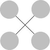
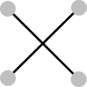
In general, a larger radius requires more ink and thus it leads less ink-effective drawing. Figures 1(a)-(b) depict drawings of the same graph using different disk radius.




4.2 Edge width
Similarly, we can find bounds for edge width. For a fixed radius , the edge width satisfies: . Refactoring gives us
Thus, it gives For example, when radius is 0, it gives us .
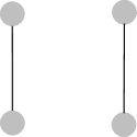
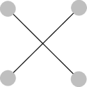
From the INKA-total equation, the larger the edge width , the more ink is used. Therefore, it leads larger edge width results in lower ink-effectiveness. Figures 1(c)-(d) depict drawings of the same graph using different edge width.

4.3 Edge crossing
Now let us consider edge crossings. Figure 2 depicts three different drawings of two pairs of nodes (, ), (, ) connected by two straight-line edges. Edges have thickness of 0.1.
For Figure 2(a) and (b), the nodes of radius of 1 are located at the square (0,0), (0,10), (10,0), (10,10). Two edges (u,v) and (w,z) are non-crossing in in Figure 2(a); the total ink used is . In Figure 2(b), the edges (u,v) and (w,z) are crossing. The ink used is . Thus, in this example drawing with parallel edges is better, i.e., less ink and no crossing. This is an expected result.
Figure 2(c) differs from Figure 2(a) by an edge crossing. The ink . Thus, compared with Figure 2(b), Figure 2(c) has the same number of crossings (1), but is more ink-effective. Overall, Figure 2(c) is the most ink-effective of the three, despite the crossing.
In the INKA-total equation 2, when , , and are constants, the total of ink is proportional to . Thus, to be more ink effective, the total edge length is small (e.g., reducing readability) and the number of edge crossings may be high (e.g., increasing ambiguity).
4.4 Amount of ink
The equation for total ink in the drawing can be written as . That is,
Hence, the minimum ink amount is
The minimum value of is achieved when the radius , where is the graph density .
4.5 Remarks
Here, we give some remarks of the INKA model in the context of scaling and zooming.
4.5.1 Scaling
A common method to improve readability of a drawing is to scale the node positions. This is useful in many cases, especially when the nodes are placed too close to one another.
Consider a simple scaling that simply scales (up) node positions without changing neither node sizes nor edge thickness. Let be the scale factor ( is greater than 1).
Each edge length is scaled to . The total edge length becomes . The total area required becomes . So the total ink used in the scaled drawing is given by:
The ink difference between the scaled drawing and the original drawing becomes:
This gives the following lemma:
Lemma 3.
The amount of ink difference between a scaled drawing and the original one is proportional to the total edge length and edge width in the original drawing.
4.5.2 Zooming
Now let us consider zooming. Zooming is different from scaling, in that scaling only scales node positions, whereas zooming scales the node positions, node sizes and edge thickness.
For a zooming of times, all nodes and edges are enlarged by times.
The total ink becomes:
The amount of ink difference is
Intuitively, we can deduce that zoom requires more ink than scaling.
Furthermore, . Thus, this gives the following lemma:
Lemma 4.
If the original drawing satisfies a drawing ratio , the zoomed drawing also satisfies the drawing ratio.
5 Layout examples
We now evaluate the INKA model using three common graph drawing approaches, which are chosen to demonstrate the usefulness of INKA. We use our INKA model to show the underlying intuitions of these approaches.
5.1 Example 1: Planar graph drawing
Planar graph drawing has been extensively studied [24]. Planar drawings have no edge-edge crossings; that is, is 0. Thus, the total ink used becomes:
This gives us several interesting results.
First, the total ink is proportional to the total edge length . This is because the values of , , and are often considered as constants in planar graph drawing algorithms. Thus, improving ink effectiveness for planar graph drawing is equivalent to minimizing the total edge length .
Lemma 5.
The ink effectiveness for planar graph drawing is equivalent to the minimization of total edge length .
This is a remarkable result. Many force-directed algorithms that draw planar or near-planar graphs can indirectly achieve the minimum total edge length.
Second, given a planar drawing of a graph , the edge width is constrained by:
When is 0, then .
Third, another interesting result is that is bounded by 3 - 6 for planar graphs. For maximal planar graph, the INKA-area inequality gives
. Thus, the total edge length is bounded by:
This gives the maximum edge length is for maximal planar graphs. For example, when =1 and =1, then .
5.2 Example 2: Equal-edge-length drawing
This section presents the INKA model for a special class of graph drawing, which all edges have the same length. Several force-directed algorithms implicitly optimize for equal (fixed) edge length, via so-called ’preferred edge length’. Examples include, for example, the work of [14, 9, 8, 5].
Now, let consider a drawing in which all edges have the same length of . The total edge length becomes for edges. Our INKA-area inequality in Equation 3 gives:
One can determine some bounds. First, when is 0, the inequality gives the neccessity condition for : . Thus, the length is bounded by: Second, the number of crossing in an equal-length drawing is bounded by Often the values and are fixed, the number of crossings is satisfied:
Lemma 6.
The number of crossings in an equal-length drawing is bounded by the number of edges.
These conditions must be met in order to achieve a drawing in which all edges have equal length.
5.3 Example 3: Partial edge drawing
Now we diskuss our INKA model for partial edge drawing [1]. Partial edge drawing avoids crossings by dropping the middle part of edges and showing only the remaining edge parts.
Let is the partial edge ratio, which specifies the proportion of edges are still displayed; for example, can be 0.1, 0.2, 0.5 to 1. When is 1, this is equal to the normal drawing (full edges).
From INKA model, the total ink for a partial drawing of is approximated by:
where is the partial drawing with the same disk radius and edge width .
For partial drawings, it is believed that the amount of ink of the partial drawing is smaller than the amount of ink in . Also the number of crossings in a partial drawing is often expected to be smaller than the number of crossing in the normal drawing.
In fact, our INKA model gives the ink difference . Thus, only if . This gives the necessity condition of . Remarkably, in realistic settings the total edge length and thus the necessity condition always holds. This is the reason for .
Another interesting result of using INKA model is that one can work out the bounds for . For example, when is 0, the inequality gives the bounds for the number of crossings : Besides, .
In general, partial edge drawing reduces ambiguity and edge readability at the same time.
6 Evaluation
This section presents our evaluation of the INKA model using real-world graphs. The aim is to have an approximation of the ink used for various graphs using different layout algorithms.
6.1 Data sets
Here, we use several “benchmark” data sets, which are from the Hachul library, Walshaw’s Graph Partitioning Archive, the sparse matrices collection [6] and the network repository [22]. These data sets include commonplace types of graphs: grid-like graphs and scale-free graphs. Table I shows the graphs used in our experiment.
| graph | ||
|---|---|---|
| can_144 | 144 | 576 |
| G_2 | 4970 | 7400 |
| G_3 | 2851 | 15093 |
| G_4 | 2075 | 4769 |
| G_15 | 1785 | 20459 |
| mm_0 | 3296 | 6432 |
| nasa1824 | 1824 | 18692 |
| yeastppi | 2361 | 7182 |
6.2 Design
We compare the amount of ink computed by the INKA model for different layouts of the data sets. For layout, we used on the standard FM3 layout [12] and its variants, which are implemented in OGDF [2]. The FM3 variants include Multi-level Fast (Fast), Multi-level Nice (Nice) and Multi-level NoTwist (NoTwist).
6.3 Results
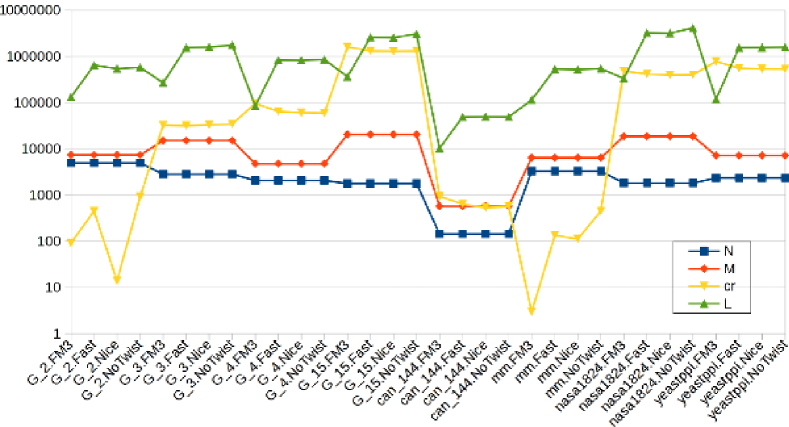
We computed the number of crossings and the total edge length for each resulting layout. Figure 3 shows the statistics of the graph layout results. The y-axis shows a logarithmic scale. As shown in the figure, the number of crossings varies a lot between the graphs and the layouts. The total edge length appears to be proportional to the number of edges and the number of vertices .
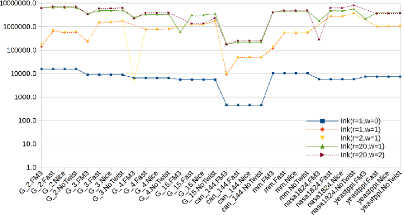
We compared the amount of ink of the same graph layouts using different settings of vertex radius and edge width. The first setting =1 and is used as the base. This means the drawing only shows the vertices, but not the edges. The other settings are (=1, =1), (=2, =1), (=20, =1) and (=20, =2) to test the variations of node radius and edge width.
Figure 4 shows the estimated amount of ink using INKA for all of the graphs. The y-axis shows a log scale. There are several interesting results. First, the figure depicts that the larger the values of and , the more ink is used. For example, the blue line ( = 1 and = 0) is as the base line for all the other lines. Drawing only vertices require less ink than the other settings. Second, when the radius is changed slightly (for example, from 1 to 2) the total amount of ink is slightly changed (see the red and the yellow lines). Third, when the edge width slightly varies, the total amount of ink also changes slightly (see the green and plum color lines). Fourth, the amount of ink may decrease with larger node radius or with large edge width. Last but not least, FMMM layouts appear to use less ink than the other layouts, for all data sets.
7 Discussions
7.1 Data-ink in graph visualization
An important criteria in visualization is the data-ink ratio by Tufte [26]. In the perspective of graph visualization, the data-ink (or accordingly we call graph-ink) is the non-erasable ink that presents nodes and edges. Removing the data-ink from the drawing would cause a missing of node(s) or edge(s). The graph-ink ratio is the proportion of the graph-ink compared to the total amount of ink (or pixels) used in the drawing.
7.2 Drawing factor relationship
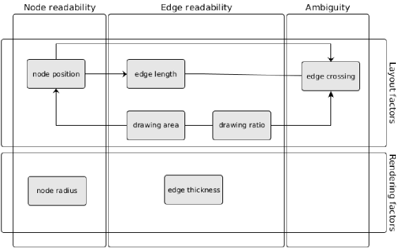
From our INKA model, we summarize the relationship between drawing factors. Figure 5 depicts a diagram that summarizes the relationship between the common drawing factors.
7.2.1 Ink-effectiveness vs. Clarity
In contrast, the ink expression in the Equation 1 can be interpreted as follows:
| (4) |
where the clarity of nodes is defined as the total amount of ink used for drawing all nodes; the clarity of edges is equal to the total amount of ink used for drawing all edges; and the is account to the ambiguity.
From Equation 4, one can deduce that the more ink-effective (or less ink used), the less readability and also the more ambiguity the drawing becomes. The larger the , the less faithful [15] the drawing becomes (e.g., more overlap makes it harder to derive the original graph from the drawing). Thus, this is the side effect of minimizing the total ink for graph drawing.
Often, increasing node size and edge thickness may improve clarity of the drawing. Let us consider how an increase of two factors affect the ink-effectiveness.
Consider a graph and a fixed layout of . Let us consider two drawings and with variations in node size and edge thickness. Let and be the ink measures of and , respectively.
For drawings with the same (i.e. =) but different edge widths ( and ), the total ink difference between and is given by:
Thus, thicker edges may or may not improve ink effectiveness; it depends on the number of crossings existing in the drawing. Interestingly, one could find that for a pair of widths and , the total ink is the same between two drawings if .
For drawings with same thickness (i.e., = ) but different node radius ( and ), the total ink difference between and is given by:
This implies that larger node size improves (node) readability quadratically while reducing ink effectiveness.
7.3 Limitations
Our INKA model gives a fast way to approximate the total amount of ink used for a layout of a graph before the rendering has been achieved. The approximation of described in Section 3 is somewhat simplistic. However, in practice, the edge width is often set to a small value (so as to see the lines); thus, the approximation is still a good estimation of the amount of ink.
8 Conclusion and Future work
In this paper, we have introduced a new INKA model and have applied the model to analyse common drawing factors used in graph drawing. The relationship between the most common drawing factors is encapsulated in the INKA-total equation (Eq. 2) and INKA-area inequality in Section 3. (Eq.3). The common drawing factors include edge crossing, total edge length, drawing area, node radius and edge width.
Overall, the INKA model gives a useful foundation to estimate the feasibility of a layout design for certain values of drawing factors. The new model also gives a way to approximate the total ink used in a drawing. We have demonstrated several use cases of our INKA model. We also have presented our evaluation of INKA for real-world data sets using different layouts.
Our examples and experimental results of the INKA model have motivated several directions for future work. First, one can integrate INKA model into graph layout algorithms to better lay out and render graphs. Second, to be ink effective, the total edge length should be small while the number of crossings may be large. But good drawings should balance between ink-effectiveness while keeping the number of crossings (ambiguity) small. This can be formulated as a minimization problem of , for some non-negative numbers and . Third, it would be interesting to extend INKA model to model and understand about the relationships among other layout factors (such as minimum edge length, symmetry, node distribution, orthogonality and crossing angles) and other rendering factors (such as color and transparency).
Acknowledgments
The authors would like to thank anonymous reviewers for very helpful feedbacks.
References
- [1] T. Bruckdorfer, S. Cornelsen, C. Gutwenger, M. Kaufmann, F. Montecchiani, M. Nöllenburg, and A. Wolff. Progress on partial edge drawings. In International Symposium on Graph Drawing, pages 67–78. Springer, 2012.
- [2] M. Chimani, C. Gutwenger, M. Jünger, G. W. Klau, K. Klein, and P. Mutzel. The Open Graph Drawing Framework (OGDF). CRC Press, 2012.
- [3] M. Coleman and D. Parker. Aesthetics-based graph layout for human consumption. Software: Practice and Experience, 26(12):1415–1438, 1996.
- [4] R. Davidson and D. Harel. Drawing graphs nicely using simulated annealing. ACM Transactions on Graphics (TOG), 15(4):301–331, 1996.
- [5] R. Davidson and D. Harel. Drawing graphs nicely using simulated annealing. ACM Trans. Graph., 15(4):301–331, Oct. 1996.
- [6] T. A. Davis and Y. Hu. The university of florida sparse matrix collection. ACM Trans. Math. Softw., 38(1):1:1–1:25, Dec. 2011.
- [7] G. Di Battista, P. Eades, R. Tamassia, and I. G. Tollis. Graph Drawing: Algorithms for the Visualization of Graphs. Prentice Hall PTR, Upper Saddle River, NJ, USA, 1st edition, 1998.
- [8] A. Frick, A. Ludwig, and H. Mehldau. A fast adaptive layout algorithm for undirected graphs. In Proceedings of the DIMACS International Workshop on Graph Drawing, GD ’94, pages 388–403, London, UK, UK, 1995. Springer-Verlag.
- [9] T. Fruchterman and E. Reingold. Graph drawing by force-directed placement. Software – Practice & Experience, 21(11):1129–1164, 1991.
- [10] E. Gansner and Y. Koren. Improved circular layouts. In Graph Drawing, pages 386–398. Springer, 2006.
- [11] E. R. Gansner, Y. Hu, S. North, and C. Scheidegger. Multilevel agglomerative edge bundling for visualizing large graphs. In 2011 IEEE Pacific Visualization Symposium, pages 187–194. IEEE, 2011.
- [12] S. Hachul and M. Jünger. Drawing large graphs with a potential-field-based multilevel algorithm. In GD ’04, pages 285–295, Berlin, Heidelberg, 2004. Springer-Verlag.
- [13] W. Huang, P. Eades, S.-H. Hong, and C.-C. Lin. Improving multiple aesthetics produces better graph drawings. Journal of Visual Languages & Computing, 24(4):262–272, 2013.
- [14] T. Kamada and S. Kawai. An algorithm for drawing general undirected graphs. Information Processing Letters, 1989.
- [15] Q. H. Nguyen, P. Eades, and S. Hong. On the faithfulness of graph visualizations. In GD ’12, Redmond, WA, USA, pages 566–568, 2012.
- [16] S. C. North and G. Woodhull. Online hierarchical graph drawing. In International Symposium on Graph Drawing, pages 232–246. Springer, 2001.
- [17] J. Pach. Every Graph Admits an Unambiguous Bold Drawing, pages 332–342. Springer Berlin Heidelberg, Berlin, Heidelberg, 2012.
- [18] H. Purchase. Which aesthetic has the greatest effect on human understanding? In Proceedings of the 5th International Symposium on Graph Drawing, pages 248–261. Springer-Verlag, 1997.
- [19] H. Purchase. Metrics for graph drawing aesthetics. Journal of Visual Languages & Computing, 13(5):501–516, 2002.
- [20] H. Purchase, R. Cohen, and M. James. Validating graph drawing aesthetics. In Proceedings of the 5th International Symposium on Graph Drawing, volume 1027, page 435. Springer, 1996.
- [21] E. Reingold and J. Tilford. Tidier drawings of trees. Software Engineering, IEEE Transactions on, (2):223–228, 1981.
- [22] R. A. Rossi and N. K. Ahmed. The network data repository with interactive graph analytics and visualization. In AAAI, 2015.
- [23] K. Sugiyama, S. Tagawa, M. Toda, M. Carpano, M. Garey, D. Johnson, P. Eades, S. Whitesides, P. Eades, N. Wormald, et al. Methods for visual understanding of hierarchical systems. IEEE Trans. Syst. Man Cybern, 25:261–295, 1994.
- [24] R. Tamassia, editor. Handbook on Graph Drawing and Visualization. Chapman and Hall/CRC, 2013.
- [25] R. Tamassia, G. Di Battista, and C. Batini. Automatic graph drawing and readability of diagrams. IEEE Transactions on Systems, Man and Cybernetics, 18(1):61–79, 1988.
- [26] E. Tufte. The visual display of quantitative information, volume 31. Graphics press Cheshire, CT, 1983.
- [27] M. van Kreveld. Bold graph drawings. Comput. Geom. Theory Appl., 44(9):499–506, nov 2011.
- [28] L. Vismara, G. Di Battista, A. Garg, G. Liotta, R. Tamassia, and F. Vargiu. Experimental studies on graph drawing algorithms. Softw., Pract. Exper., 30(11):1235–1284, 2000.