Good Colour Maps: How to Design Them
Abstract
Many colour maps provided by vendors have highly uneven perceptual contrast over their range. It is not uncommon for colour maps to have perceptual flat spots that can hide a feature as large as one tenth of the total data range. Colour maps may also have perceptual discontinuities that induce the appearance of false features. Previous work in the design of perceptually uniform colour maps has mostly failed to recognise that CIELAB space is only designed to be perceptually uniform at very low spatial frequencies. The most important factor in designing a colour map is to ensure that the magnitude of the incremental change in perceptual lightness of the colours is uniform. The specific requirements for linear, diverging, rainbow and cyclic colour maps are developed in detail. To support this work two test images for evaluating colour maps are presented. The use of colour maps in combination with relief shading is considered and the conditions under which colour can enhance or disrupt relief shading are identified. Finally, a set of new basis colours for the construction of ternary images are presented. Unlike the RGB primaries these basis colours produce images whereby the salience of structures are consistent irrespective of the assignment of basis colours to data channels.
1 Introduction
A colour map can be thought of as a line or curve drawn through a three dimensional colour space. Individual data values are mapped to positions along this line which, in turn, allows them to be mapped to a colour. For a colour map to be effective it should allow the structure and form of the data to be seen and, ideally, allow the communication of metric information in the data (its values) as well [44]. Achieving a good representation of the structure of the data is primarily achieved by ensuring that the perceptual contrast that occurs as one moves along the colour map path in colour space is close to uniform and that the colours in the map follow an intuitive perceptual ordering. Communicating accurate metric information via colours in the map is difficult and is inevitably compromised due to simultaneous contrast and chromatic contrast effects. Typical viewing conditions are not controlled and most displays are not calibrated, the best one can reasonably hope to communicate is some qualitative metric information. However, there is no good reason why structure and form information should be compromised in any way.
Unfortunately many widely used colour maps 111GIS environments may make the distinction between colour maps and colour ramps whereby a colour map is obtained by employing an algorithm such as histogram equalisation or linear stretching to map data values to colours on a colour ramp. The form of the colour ‘ramp’ is arbitrary and is not necessarily a ramp. In GIS terms this paper is about the design of colour ramps. provided by vendors have highly uneven perceptual contrast. Colour maps may have points of locally high colour contrast leading to the perception of false anomalies in your data when there is none. Conversely colour maps may also have ‘flat spots’ of low perceptual contrast that prevent you from seeing features in the data.
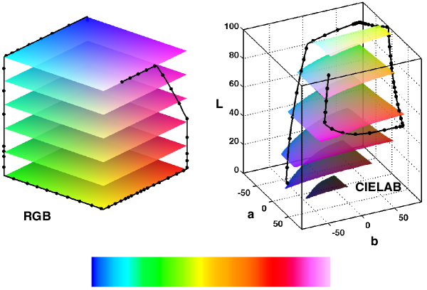
In many cases these problems arise because the colour maps have been designed as piecewise linear paths through RGB space. However, this colour space is not the best in which to design or analyse a colour map. It is better to use a colour space such as CIELAB which has been designed to be perceptually uniform whereby distances between points in the 3D colour space are intended to closely correspond to human perception of colour difference. CIELAB space represents colour in term of lightness, varying from 0 to 100, and and components nominally representing the red-green and yellow-blue opponent channels respectively. The vertical axis through this space at corresponds to the grey scale. The distance away from this axis corresponds to chroma. Note that while CIELAB is designed to be perceptually linear this is only true for visual stimuli at very low spatial frequencies, this is not widely recognised but has a significant bearing on colour map design. This will be discussed further in Section 2.
Figure 1 shows a typical rainbow style colour map along with its path through the RGB and CIELAB colour spaces. Its straight line construction in RGB space is evident. The spacing of the dots along the paths in the respective colour spaces is proportional to the spacing of adjacent values in the colour map. Notice the uneven spacing within the CIELAB colour space. The clustering of points in the green and red regions produce perceptual flat spots in the colour map. The extended section of near constant lightness between cyan and yellow exacerbates the green flat spot. The kinks and uneven point spacing along the curve at cyan, yellow and red produce the false anomalies seen at these points. The reversal of lightness gradients at yellow and red also contribute to this.
It should be emphasised that this paper is concerned with the design of colour maps for rendering data that varies over a continuous range such as geophysical exploration images or medical imagery. For colour maps suited to the display of data consisting of a limited number of categorical values it is suggested that you refer to the work by Brewer [3, 4, 5, 6]. However, while the emphasis of Brewer’s work is mainly directed towards cartographic applications many of her design techniques and principles are also relevant here.
1.1 Evaluating Colour Maps
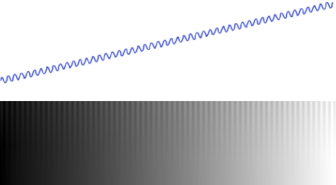
Possibly a contributing factor to the proliferation of poor colour maps has been the absence of a simple test image that allows colour maps to be evaluated. The test image shown in Figure 2 attempts to remedy this. Its design is inspired by the sinusoidal gratings used for psychophysical contrast sensitivity tests [26, 43, 45]. It consists of a sine wave superimposed on a ramp function, this provides a set of constant magnitude features presented at different offsets. The spatial frequency of the sine wave is chosen to lie in the range at which the human eye is most sensitive222Note the figures in this paper present the test image slightly smaller than its designed size., and its amplitude is set so that the range from peak to trough represents a series of features that are 10% of the total data range. The amplitude of the sine wave is modulated from its full value at the top of the image to zero at the bottom. If the colour map has uniform perceptual contrast the sine wave should be uniformly visible across the full width of the image. At the very bottom of the image, where the sine wave amplitude is zero, we just have a linear ramp which simply reproduces the colour map. We should not perceive any identifiable features across the ramp.
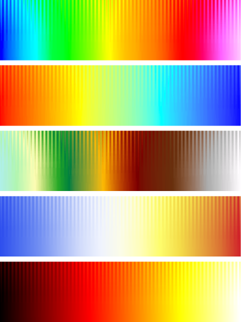
Of course viewing a colour map on this test image cannot replace a detailed psychophysical evaluation but it allows immediate recognition of any serious faults in the map (or your display monitor). Recognising that most images are viewed in uncontrolled conditions on uncalibrated displays this is all that is necessary except for the most exacting of applications. This test image immediately reveals the perceptual flat spots and false features in the vendor colour maps shown in Figure 3. For details on the design of the test image see Appendix A.
2 The Importance of Lightness
In order to achieve uniform perceptual contrast in a colour map an initial approach might be to set the spacing of colour map points along a path through colour space according to a colour difference formula such as CIE76 [8], which corresponds to the Euclidean distance in CIELAB space, or CIEDE2000 [9, 20]. This approach has been used by numerous workers including Pizer [27], Tajima [41], Robertson and O’Callaghan [29], Levkowitz and Herman [19], Rogowitz et al. [30] and Moreland [23]. In all these cases CIE76, or the Euclidean distance in CIELUV space, was used as the perceptual contrast measure.
However, the problem with this approach is that these colour difference formulas were derived from experiments where human subjects were asked to compare large isolated patches of colour that subtend a significant field of view. Initially these difference formulas were developed from the CIE 1931 Standard Observer [46, 13, 7] and then subsequently the CIE 1964 Standard Observer [38, 36, 10]. Noting that a 10mm screen object viewed at a distance of 600mm subtends about 1 degree of visual angle we can see that these colour difference formulas are only valid for spatial scales that are very much larger than what we are typically seeking to resolve in an image.
At fine spatial scales acuity performance on chromatic gratings is significantly lower than it is for achromatic luminance gratings [28, 24, 18]. Mullen [24] indicates that the contrast sensitivity function of red-green and blue-yellow gratings is characteristic of a low-pass filter. Acuity performance starts to decrease significantly for spatial frequencies greater than about 3 cycles/degree with resolution ultimately failing at about 11-12 cycles/degree. In addition to spatial frequency effects at small fields of view, below 0.5 degrees of viewing angle, there is a severe loss of colour discrimination and ultimately below about 0.3 degrees an observer with normal trichromatic vision becomes dichromatic [42]. Thus, when one talks about CIELAB space being perceptually uniform this is really only the case for very low spatial frequencies. In acknowledgment of this a spatial extension to CIELAB, S-CIELAB, was developed by Zhang and Wandell [47] by introducing a pre-processing spatial filering step before computing the CIE76 colour difference. The spatial filters being designed to approximate the human contrast sensitivity function for achromatic and chromatic signals. Johnson and Fairchild [14] subsequently applied these ideas to form a spatial extension to CIEDE2000. At high spatial frequencies these modified measures become dominated by lightness differences. The effect of spatial scale on the perception of colour difference has been studied by Stone [39] for the design of graphs and charts. She notes that while large patches of different isoluminant colours can be readily distinguished this is not the case when the same colours are used at fine spatial scales, say for line graphs or scatter plots. For these kinds of charts legibility at fine spatial scales becomes dominated by luminance contrast. Subsequent work by Stone et al. [40] describes a preliminary attempt to determine a scale dependent, non-uniform rescaling of CIELAB space for colour difference calculations using data from crowd sourced experiments.
Thus, for the purposes of colour map design, where we are interested in the ability to resolve fine structures within images, the perceptual contrast between colours is dominated by the difference in the lightness of the colours. Any difference in hue or chroma/saturation is relatively unimportant.
Figure 4 provides an illustration of the importance of lightness gradient with respect to position along the colour map. Two colour maps are constructed from the same path through CIELAB space. The path consists of two line segments of equal length but of different slope through the colour space. One colour map is generated by selecting points equispaced along the path. This corresponds to points having equal colour contrast under the CIE76 equation. The other map is generated by selecting points at equal increments of CIELAB lightness.
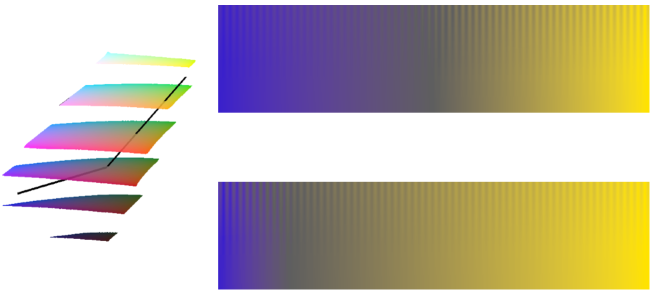
When rendered on the test image the colour map formed from equispaced points can be divided into two sections corresponding to the two segments of different slope. The right half of the colour map provides good feature contrast. The left half renders the test image poorly with the feature contrast very much reduced as a result of the reduced lightness gradient across this part of the map. On the other hand the colour map formed from points of equal increment in lightness value renders the test image well. The sine wave pattern is seen uniformly across the full width of the test image. Note the blue section of the colour map is compressed because there is a small change in lightness across this segment. Thus, the number of colour map points on this section of the path are correspondingly reduced.
The importance of the lightness gradient in a colour map is made very evident when one constructs a colour map of constant lightness. Figure 5 shows a map generated from equispaced points on a curve through CIELAB space at a lightness level of 70. Notice how the sine wave pattern in the test image is almost impossible to discern. At first sight such a colour map would seem to be a poor choice for displaying data. However, as will be shown later, constant lightness and low contrast colour maps can be useful when displaying data with relief shading.

3 Prior Work
As mentioned above there have been many attempts to generate perceptually uniform colour maps using the Euclidean distance in CIELAB or CIELUV space as a measure of perceptual contrast [27, 41, 29, 19, 30, 23]. In general this work failed to recognize that the perceptual uniformity of CIELAB is not valid at fine spatial scales and this has resulted in inconsistent success in generating good colour maps. For example Levkowitz and Herman [19] constructed a colour map path that was designed to maximise the traversed CIELUV distance while also maintaining a colour ordering. However, they reported that this map was less effective than a linearised grey scale when evaluated on medical images. This was despite their optimised map traversing a CIELUV distance six times that of the grey scale map. Rogowitz et al. [30], in their search for good colour maps for representing magnitude information, constructed color maps which traced carefully controlled paths through Munsell and CIELAB color spaces. They concluded that luminance and saturation were good candidates for representing magnitude and that hue based maps performed poorly.
Rogowitz and Treinish [31] recognised that the chromatic and achromatic responses of the eye have very different characteristics with respect to spatial frequency. They make the suggestion that low frequency information in data can be mapped to colour saturation while dedicating luminance for encoding high frequency information. They point out a number of problems with rainbow maps, with colour ordering being confused and viewers tending to partition images into uneven bands. Ware [44] makes the distinction between the need to identify the data’s form and its metric information. Simultaneous contrast and chromatic contrast effects makes accurate metric information from lightness or colour difficult but he concludes that if you wish to read metric quantities with a colour key then a rainbow like map works well. For maximal form information he suggests a grey scale should be used. Where both are required a sequence that increases monotonically in luminance while cycling through a range of hues is suggested.
Kindlmann et al.[16] devised a novel way of constructing perceptual colour maps by exploiting our ability to recognise whether a face is being presented as a negative or positive image. This was used to perform luminance matching between colours and a grey scale. From this they were able to demonstrate the generation of an isoluminant colour map and a map of monotonically increasing lightness. Rogowitz and Kalvin [32] used face images for the evaluation of colour maps. They mapped various color scales onto the intensity values of a face and asked viewers to rate the images for their ‘naturalness’. They concluded that monotonically increasing luminance in a colour map was important, and that rainbow maps performed badly. This conclusion is perhaps not surprising given that any map with non-monotonically increasing luminance will disrupt the shading pattern on a face, making it look unnatural.
Kalvin [15] makes the point that, as well as perceptual uniformity, it is important that a colour map is perceptually ordered. He constructs a directed graph on the 12 edges of the RGB cube and suggests that if a colour map path traverses any section of the graph in the specified direction then it will have an appropriate perceptual ordering. McNames [22] proposed a colour map designed to reproduce well in both colour and grey scale. It is based on a spiral path through RGB space. The map has a monotonically increasing lightness scale but the perceptual smoothness of its colour variations is not ideal.
In relation to diverging colour maps Spence and Efendov [35] assessed the ability of human subjects to discriminate isoluminant targets in an image display. They set up isoluminant bipolar/diverging colour maps that passed from one colour through grey to another colour at a lightness level of 85. Colours that differed in hue angle by 180 degrees in CIELAB space were not necessarily the best performers with hue angle differences of 90 degrees often performing well. Pairs of colours with non-negative CIELAB components (on the yellow side of CIELAB rather than blue) tended to do well. However, these result were for isoluminant targets and it likely that results for maps varying in luminance would be different.
More recently the importance of the lightness gradient in a colour map is noted by Niccoli [25]. In designing his perceptual colour maps he ensures the lightness profiles are linear, or follow a cube law to match Steven’s power law [37]. However his reasoning for using a cube law is not clear given that CIELAB lightness is intended to be perceptually linear.
4 Colour Map Design
The initial step is to design a path through colour space that one wishes the colour map to traverse. The colour maps presented here are constructed by specifying control points in CIELAB space and then fitting a 1st or 2nd order B-spline through them to form the colour map path. A 1st order spline forms a linear path between the control points and a 2nd order one uses quadratic basis functions to form the path. B-splines provide a general and flexible means of defining colour map paths. This is important because colour map paths often have to be carefully hand crafted in order to achieve a desired perceptual outcome within the sometimes awkward constraints of the colour space gamut. Having formed a colour map path one then needs to determine a set of locations along the path that are equispaced in terms of perceptual contrast to form the final colour map.
The technique used here for obtaining N colour map values of equal perceptual contrast along a colour map path is similar that originally used by Pizer [27] for linearizing the perceptual contrast on CRT monitors. The process is analogous to performing histogram equalisation of an image whereby the cumulative distribution of image values is used as a remapping function to obtain a uniform distribution of grey values. In our application, for colour maps, we use the cumulative sum of perceptual contrast differences along the map as the remapping function for equalising the perceptual contrast.
First, an initial colour map is generated by evaluating N points at equal spline parameter increments along the path. The perceptual differences between successive colour map entries are then computed. For most colour maps this will be simply the magnitude of lightness differences between successive colour map entries. However, for isoluminant, or low lightness contrast colour maps, the CIE76 formula would be used. From this a cumulative sum of the contrast differences along the colour map is formed. The total cumulative contrast change is then divided into N equispaced values and a reverse mapping back to the spline parameters required to obtain these equispaced contrast values is obtained via linear interpolation of the cumulative contrast curve. These new remapped locations form the final colour map. In practice this process is repeated recursively on its own output. This helps overcome any approximations induced by using linear interpolation to estimate the locations of equal perceptual contrast in the reverse mapping. This is mainly an issue for colour maps with only a few entries. Of course this contrast equalisation process can be applied to existing colour maps as well as being used for the design of new maps. The overall process is illustrated in Figure 6 using MATLAB’s ‘hot’ colour map [21] as the input map requiring perceptual contrast equalization.
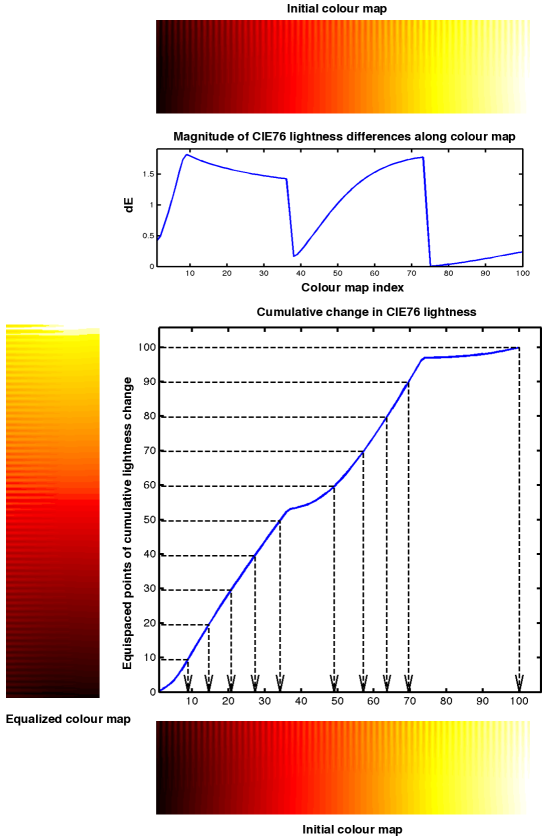
For most colour maps where the perceptual contrast is dominated by lightness variations it is important to ensure that the colour map path does not have extended segments with little or no lightness gradient. If this is the case then when the path is sampled for points of equidistant lightness change one may end up with undesirable hue and/or chroma discontinuities in the colour map. Any attempt to remove the hue or chroma discontinuities by incorporating the CIE76 colour difference formula in the perceptual contrast equalization process is complicated by the fact that one should be mindful of the different characteristics of the eye’s sensitivity to contrast in luminance and chromaticity. Luminance contrast sensitivity is band-pass in nature whereas chromatic contrast sensitivity is low-pass in nature [24]. Thus, the perceptual contrast across a colour map is inescapably a function of spatial scale. However, to minimise the effect of scale a colour map path should be dominated either by lightness changes or by chromatic changes, but not a mixture of both. We want to avoid any perceptual contrast equalization process requiring luminance contrast to be played off against chromatic contrast over different sections of the colour map. Under this situation one is likely to produce a map that is especially scale dependent with regard to perceptual contrast.
4.1 CIE76 or CIEDE2000?
Various limitations of the CIE76 colour difference measure ultimately led to the development of the CIEDE2000 formula which incorporates correction factors that are applied to the differences in lightness, chroma and hue [34]. In seeking to equalize the perceptual contrast across a colour map the question arises as to which formula one should use. A basic evaluation of the two formulas reveals that the lightness correction that is incorporated in CIEDE2000 is possibly useful but its effect is barely noticeable. However, the CIEDE2000 chroma correction is considerably more significant [34]. This correction noticeably emphasizes the contrast in high chroma regions at the expense of the low chroma sections. At the high spatial frequencies of interest to us this correction proves to be quite inappropriate. Thus, in the absence of any alternative it would appear that CIE76 is the most appropriate colour difference formula to use. Though, for most cases, we are only interested in its lightness component. Ultimately one should remember that neither colour difference formula was designed for the spatial frequencies that we are interested in.
4.2 A Taxonomy of Colour Maps
Colour maps can be organized according to the following attributes:
linear, diverging, rainbow, cyclic, and isoluminant.
![]()
Linear colour maps have colour lightness values that increase or
decrease linearly over the colour map’s range and are intended for
general use. These colour maps can be considered a subset of what are
know as sequential maps [3, 4]. The
term linear is used here to emphasise the fact that we are concerned
with maps for which the lightness gradient is constant.
![]()
Diverging colour maps follow some pattern of symmetry about their
centre. They are suitable where the data has a specific reference
value and we are interested in differentiating values that lie above,
or below, this value.
![]()
Rainbow colour maps, which nominally follow some representation of the
spectrum, have well documented
shortcomings [3, 5, 31, 2]. However,
rainbow colour maps are ubiquitous and are unlikely to go away.
Accordingly they warrant a category of their own.
![[Uncaptioned image]](/html/1509.03700/assets/c_cyclic_mygbm_30-95_c78_n256.png)
Cyclic colour maps have colours that are matched at each end with
first order continuity. They are intended for the presentation of
orientation values or angular phase data.
![]()
Isoluminant colour maps are constructed from colours of equal
perceptual lightness. These colour maps are designed for use with
relief shading. On their own these colour maps are not very useful
because features in the data are very hard to discern. However, when
used in conjunction with relief shading their constant lightness means
that the colour map does not induce an independent shading pattern
that will interfere with the structures induced by the relief shading.
The relief shading provides the structural information and the colours
provide the metric, data classification information.
Colour maps may have multiple attributes. For example, diverging-linear or diverging-isoluminant. In addition to isoluminant maps one can construct low lightness contrast maps for use with relief shading. The aim being to combine the perceptual cues that might be obtained from, say, a linear or diverging colour map with the perceptual cues induced by relief shading.
4.3 Linear Colour Maps
The distinguishing feature of these colour maps is that the lightness values vary in a linear manner even though the colour map path itself may be curved. This linear variation of lightness, either monotonically increasing or decreasing, induces a clear ordering of colours making interpretation of data straightforward. Thus, linear colour maps are suitable for general purpose data display. Some examples are shown in Figure 7.
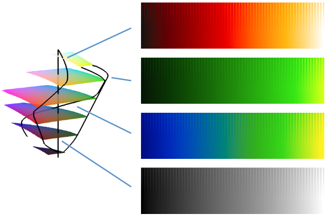
It can be useful to constrain the lightness values to, say, 10 to 95 rather than using the full range of 0 to 100. It is often the case that monitors and printers display a reduced lightness range more reliably with features at the dark and light ends of the colour map being less susceptible to saturation. The overall image contrast will be reduced slightly but the ability to identify features in the data may be better.
4.4 Diverging Colour Maps
Diverging colour maps are intended for the display of data having a well defined reference value where we are interested in differentiating values that lie above, or below, this reference point. Within the colour map the reference value is typically denoted by a neutral colour, white, black or grey.
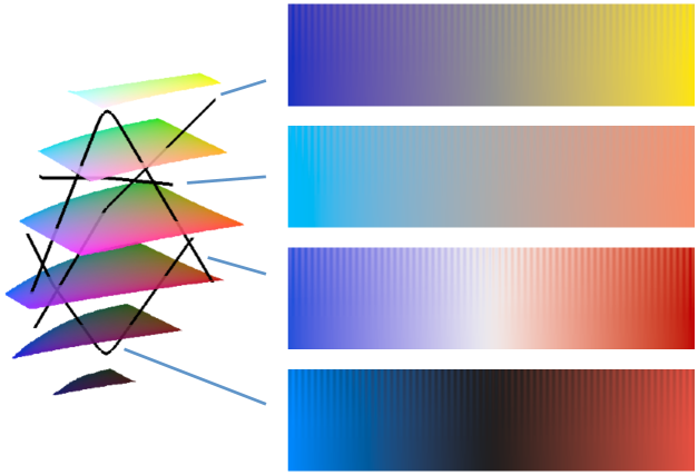
The most commonly encountered diverging colour map is a blue-white-red map. However, such a colour map involves a reversal of lightness gradient at the centre. This discontinuity in the lightness gradient induces the perception of a false feature, see Figure 9. To remove this the lightness values can be smoothed, say, with a Gaussian filter. This softens the gradient reversal and removes the false feature. However, a compromise has to be accepted. The smoothing introduces a small region in the colour map where the lightness gradient is reduced to zero. This creates a small perceptual flat spot where structures will be harder to see. The degree of smoothing required is not large. A Gaussian filter with a standard deviation of around 5 to 7, within a 256 level colour map, is typically sufficient. Gradient reversals in hue or chroma prove to be relatively untroubling but smoothing of reversals in these attributes is probably wise.
It should be noted that a lightness gradient reversal will induce a perceptual flat spot even if no smoothing is applied. Structures in the data with values that straddle the central reference point in the map will be represented by colours that are effectively isoluminant, for example, blues and reds of nearly equivalent lightness. Thus, structures in this data range will be hard to resolve. Accordingly, lightness gradient reversals in a colour map can be the source of both type 1 and type 2 errors simultaneously. Anyone interpreting data rendered with such a colour map should be mindful of this. Thus, lightness gradient reversals in a colour map should be avoided where possible.

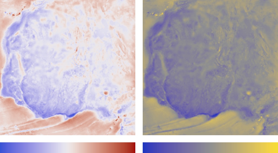
While a blue-white-red diverging map may be the most common other variations are possible, as shown in Figure 8. For example, the reference value can be denoted by black rather than white. Another variation that can be very effective is a linear-diverging map that varies from blue through grey to yellow. By having no lightness gradient reversal it avoids the creation of a perceptual flat spot at the centre and provides an intuitive colour ordering (Figure 10). This kind of diverging colour map could probably be used more widely. One can also conceive of an isoluminant, or low contrast, diverging colour map for use in conjunction with relief shading.
To ensure perceptual symmetry the end points of a diverging map should have the same chroma, and if the lightness values reverse then the end points should also have the same level of lightness. Without sufficient care a diverging blue-white-red colour map constructed in RGB space may not have this perceptual symmetry. RGB red and blue have lightness levels of 53 and 32 and chroma values of 105 and 134 respectively. This requirement for perceptual symmetry means that the colour sequences that can be used for linear-diverging colour maps is somewhat constrained by the gamut boundary. For example, a blue-grey-yellow sequence might not be one’s first choice aesthetically (and it is against Spence and Efendov’s findings [35]) but it allows the maximum range of lightness values across the colour map while also permitting end point colours with chroma that is both large and equal.
It is worth commenting here that for data to be rendered correctly with a diverging colour map it is important that the data values are respected so that the desired reference value within the data is correctly associated with the central entry of the diverging colour map. In many visualization packages the default display methods may not respect data values directly. Typically, data values are normalised by applying an offset and rescaling, before rendering with a colour map for display. Obviously this can lead to incorrect display of data with a diverging colour map.
4.5 Rainbow Colour Maps
The construction of rainbow colour maps requires a contrived path through CIELAB space involving reversals in the lightness gradient which can upset a viewer’s perceptual ordering of the colours in the map [31, 3, 5, 2]. Thus, rainbow colour maps are generally not recommended. However, it would appear unlikely that people will stop using them. It might be argued they have a legitimate use where the main aim is to differentiate data values rather than communicate a data ordering. Brewer [5], while cautioning against their indiscriminate use, also accepts that rainbow maps will continue to be used because of their attractive vibrancy. She also makes the case that rainbow colour maps can be used effectively as diverging maps, using yellow to indicate the data reference point.
With care it is possible to generate a minimally bad rainbow colour map. First, it is best to construct the colour map path so that in going from blue to green it does not pass through cyan. If cyan is included, the subsequent colour map path from cyan through green to yellow has very little lightness variation. This creates an extended region of low perceptual contrast that is not readily corrected. False anomalies are also induced at cyan and yellow, see Figure 11. With cyan excluded, and using a less extreme colour map path that incorporates a darker green, it is possible to equalize the magnitude of the lightness gradient and thus obtain uniform perceptual contrast. If this is then followed by smoothing of the lightness reversals at yellow and red to reduce the perception of false anomalies at these points one can obtain a reasonable colour map, albeit with small perceptual flat spots at yellow and red. See Figure 11.
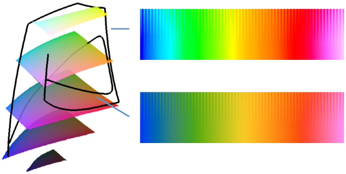
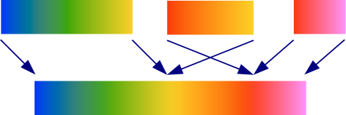
The main problem with rainbow colour maps is that having yellow (and perhaps also cyan) in the interior of the map creates a colour ordering conflict. The rainbow colour map presented here can be thought of as being the combination of three linear colour maps: A blue to yellow map; a red to yellow map; and a red to pink map. Individually each of these colour maps provide a logical ordering of colours with lightness values increasing from left to right. However, in constructing the overall colour map the red to yellow segment is reversed when it is inserted into the composite map. This makes the colour ordering of the overall map inconsistent. So while red may be ‘greater than’ green in terms of position in the colour map individually the perceptual ordering of the two colours is not clear, see Figure 12. If a rainbow colour map also includes cyan then an additional colour ordering ambiguity is introduced because cyan is slightly lighter than green.
4.6 Cyclic Colour Maps
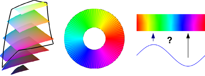
To present orientation values or phase data effectively in a visual way requires the use of a cyclic colour map. A map that is often employed for this purpose is the hue circle from the HSV colour space. However, this colour map has a number of problems. The perceptual contrast is uneven across the colour map with sections of low lightness contrast from cyan to yellow, and from red to magenta. The secondary colours of cyan, magenta and yellow, being lighter, also tend to generate false anomalies, see Figure 13. The other problem with this colour map is that, being based on the three primary colours, it partitions the circle into three segments; a red, a green, and a blue segment. These are separated by smaller sections corresponding to the secondary colours. This is not consistent with the way in which we typically divide the circle. Generally we tend to think of the four main compass directions of north, south, east and west. Or, if the data is cyclic over , we would think of the four orientation angles of 0, 45, 90 and 135 degrees. Alternatively we may be just interested in a partitioning of angular phase into positive and negative regions corresponding to the peaks and troughs of a periodic sine wave. Either way, the partitioning of the circle into three, or six, segments as is done by the HSV colour map makes it a difficult map to use when one is trying to communicate angular information in a visual way. Ideally, in a manner similar to diverging colour maps, where we wish to have a recognizable reference point, we would like cyclic colour maps to have recognizable sections that can be related to principal orientations of interest. This, in conjunction with the desire to have even perceptual contrast, means that designing good cyclic colour maps is a challenging task.
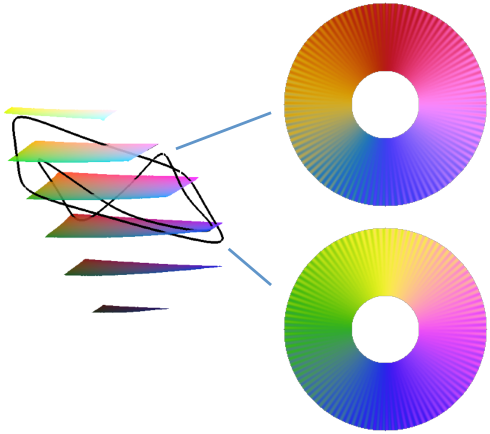
A colour map formed from a circle at a constant level of lightness in CIELAB space is an obvious map to construct. However, a difficulty is that the size of any circular path centred on the , axis is heavily constrained by the gamut boundary. A lightness level of around 65 to 75 allows the largest diameter circles to be constructed. Even so, the maximum chroma is only about 40 and the colours obtained are not very vivid making it hard to identify any reference regions in the colour map. Also, the fact that the colour map is of constant lightness means that the resolution of fine scale features is difficult.
To obtain a colour map with good fine scale feature resolution and with four identifiable regions that can be associated with the main compass directions requires a colour map path that visits four distinct colours of high chroma that are also distributed with some symmetry of lightness values. One strategy to achieve this is as follows: Two light colours of equal lightness, and two dark colours of equal lightness are chosen. A colour map path that alternates between light and dark colours in a cyclic zig zag pattern is then used to form the map. If the perceptual contrast equalization of the colour map only takes into account the lightness differences of the colours then the four reference colours will end up being equally spaced in the colour map even though the path lengths between them may be quite different. Finding four colours with reasonably large chroma that form a harmonious sequence is a challenge given gamut constraints. Another factor to consider is that an important part of having colours that can be recognized is that they should be colours that we can readily name [12]. A path that has proved successful is one that traverses blue, a darkened yellow, dark red, pink and back to blue. Alternatively, the darkened yellow can be replaced with green. This produces a map with better defined quadrants though the colour sequence is not so harmonious. In designing such a map one often needs to incorporate additional intermediate control points in the path to try to equalize the width of the four colour segments. Finally, the four lightness gradient reversals in the colour map need to be smoothed to avoid the creation of false features within the map.
A second strategy to achieve four identifiable regions in the map is to form a diamond shaped path through the colour space. A light colour and a dark colour are chosen to form the top and bottom points of the diamond. Two extra colours from widely spaced locations in the gamut at a lightness level half way between the first two colours are used to complete the diamond shaped path. As with the zig zag path the fact that the sequence of colours form equal steps in lightness difference means that the four colours will end up being equally spaced in the colour map. A diamond shaped path passing through magenta, yellow green and blue is quite successful. See Figure 14.
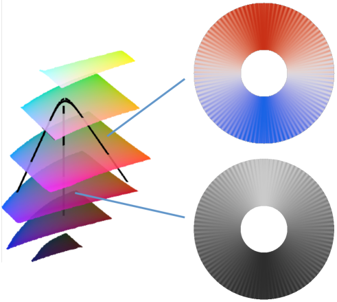
If one is prepared to accept a colour ambiguity corresponding to phase angles of 0 and 180 degrees then the principles used for diverging colour maps can be employed. One can construct a cyclic map that starts at a neutral colour, increases to a saturated colour, returns to the neutral colour, increases to a different saturated colour before returning to the neutral colour to complete the cycle. A white-red-white-blue-white colour map following this scheme is shown in Figure 15. It is also possible to form a cyclic grey scale in a related manner. As with diverging colour maps smoothing of the lightness gradient reversals is required. When interpreting data that has been rendered with such a colour map one has to resolve the ambiguities that occur at phase angles of 0 and 180 degrees by context.
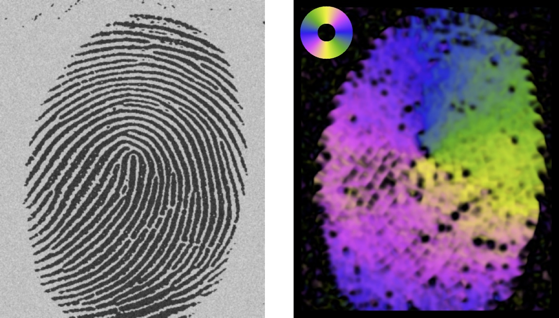
As with diverging colour maps, for angular data to be rendered correctly it is important that the data values are respected so that values are correctly associated with specific entries in a cyclic colour map. The assignment of colours to values also needs to respect whether the data is cyclic over 180 degrees, as with orientation data, or over 360 degrees as with phase data. When rendering orientation data it can be useful to perform a cyclic rotation of the colour map, corresponding to 25% of its length, so that the ‘low’ and ‘high’ regions of the colour map are aligned with the horizontal and vertical directions. See Figure 16.
The other factor to consider when displaying angular data is that it is also often associated with auxiliary data that might provide information about its amplitude, reliability, or coherence. It can be useful to use this auxiliary data to modulate the colour map rendering of the angular data in some manner. The approach adopted here is to render the angular information with a chosen colour map and then, in RGB space, scale the colours towards black, or towards white, as a function of the associated auxiliary data. This modulation/desaturation allows this auxiliary information to be simultaneously presented and, in doing so, suppress the visualization of angular data that is of low magnitude and/or reliability.
5 Colour Maps for Relief Shading
Relief shading can be an effective way of presenting data. By treating the data as if it is a 3D surface and generating the shading corresponding to the surface being illuminated from some direction we can use the eye’s innate ability to interpret shading patterns to invoke a perception of the 3D shape. However, while interpretation of the data’s ‘shape’ is enhanced, any sense of actual data values is diminished because shading only depends on the surface gradient.
The use of colour in conjunction with relief shading can provide a powerful enhancement to the perception of shape induced by the shading. In addition, colour can also be used to convey information of data value that is lost by relief shading. However, if colour is misused it is also potentially destructive to relief shading.
The main consideration when combining colour with relief shading is to ensure that the colour map does not interfere with the perception of features induced by the shading. A theoretical ideal is that the colour map be of constant lightness. The reason for this is that the perception of features within the data is provided by the relief shading. If the colour map itself has a wide range of lightness values within its colours then these may induce an independent shading pattern that could interfere with the relief shading. Having a colour map of uniform lightness will ensure orthogonality between the information induced by the colours and the information induced by the shading.
An interesting property of colour is that it can enhance the perception of 3D induced by relief shading. A constant lightness colour map, such as the one presented in Figure 5, will generally produce unattractive image renderings that are difficult to use. However, when an isoluminant image rendering is combined with a shading pattern such that the colour gradients are not aligned with the shading gradients then an amplification of the 3D shading perception can be obtained. See Kingdom [17] for a description of this effect. On the other hand if a shading pattern is rendered with a colour map having a significant lightness gradient the 3D structure induced by the original shading pattern can be disrupted leading to a poor visualization. Referring to Figure 17 notice how, in the lower-right image, that the diagonal shading bands are no longer uniform in their darkness. Also note that where the darker blue regions lie alongside the shading bands the confusion in the shading pattern is further compounded. Compare this to the image in the top-right of the figure and note how the shading has been left untouched by the colouring. Note that in this example the shading pattern is applied to the colour image multiplicatively. To achieve the perception of a coloured surface being shaded the luminance of the colours need to be modulated by the relief shading333This is in contrast to some GIS implementations where it is only possible to combine a shading image with a colour image via a transparency blending of the two images, a weighted sum. This is the wrong mechanism to use..
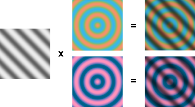
This example probably represents a worst case scenario where the spatial frequency of the colour lightness variations is close to the spatial frequency of the relief shading variations thereby maximizing the potential interference. While this result is interesting this synthetic example is not typical in that the shading pattern only has a single frequency component. Most data sets derived from natural data have an amplitude spectrum that decays inversely proportional to the frequency raised to some power. That is, the amplitude spectrum is roughly proportional to where typically ranges between 1 and 2 [1, 11]. If the relief shading pattern has a more distributed frequency spectrum of this form it appears that the colour-shading interaction effects that we see on a simple sinusoidal shading pattern are not necessarily so strongly reproduced.
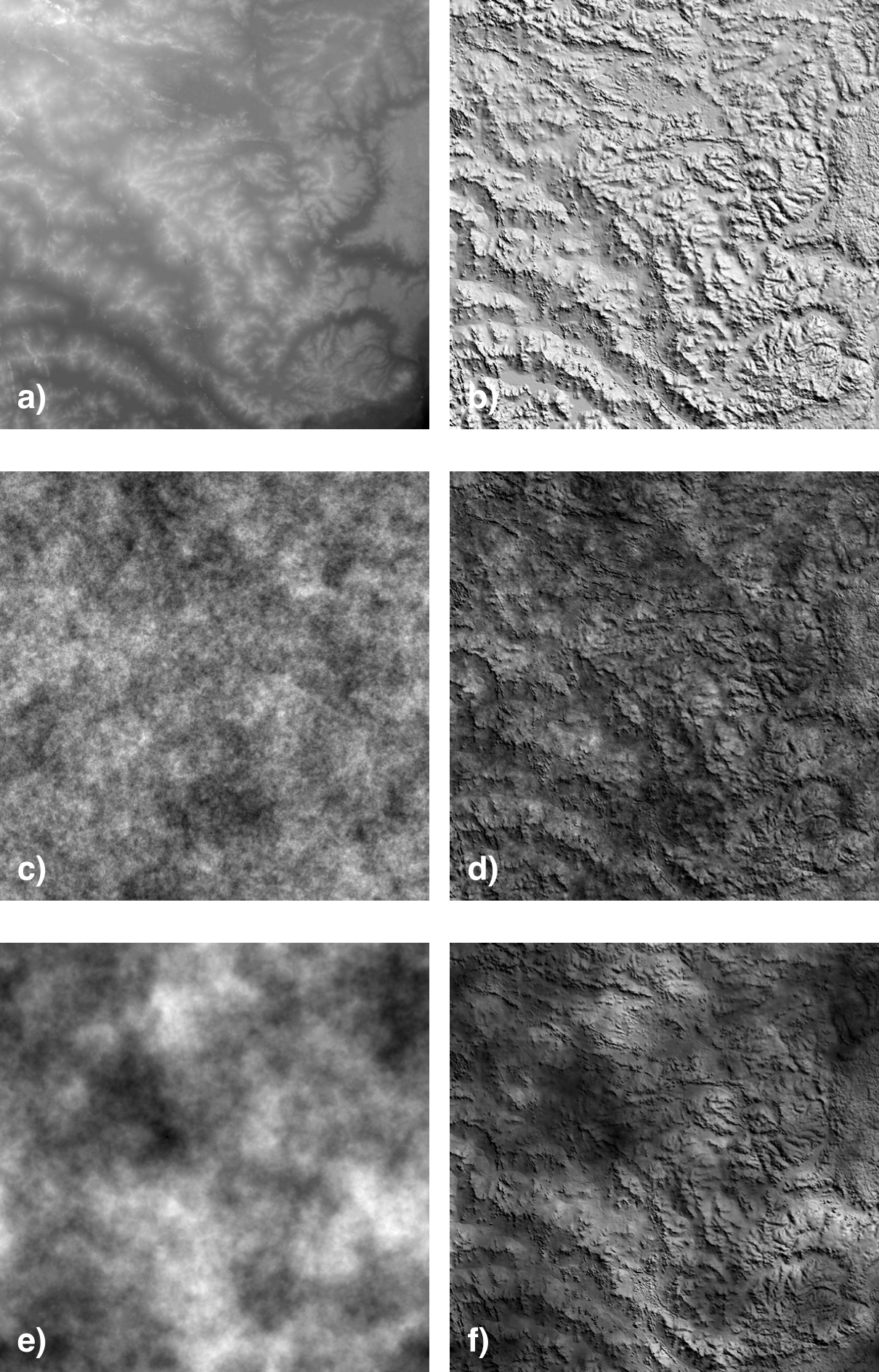
Figure 18 shows an example of a Digital Elevation Model (DEM) and a raw relief shading of the data. The amplitude spectrum of this particular relief shading image falls off at a rate roughly proportional to . To test how the frequency content of an overlaying image might interfere with the 3D shape perception the shading pattern was combined with a number of noise images having an amplitude spectrum of the form . The noise images were grey to maximise any possible interference with the relief shading.
As can be seen in Figure 18 setting , which roughly matches the noise amplitude spectrum to the spectrum of the relief shading, results in considerable disruption to the 3D shape perception. However, for , which results in a noise spectrum more dominated by lower frequencies, there is almost no interference with the shape perception (ignoring the regions where the level of darkness in some of the noise patches masks the shading). Also, not shown for space reasons, if the shading image is combined with noise image having a flatter spectrum using, say, there is also little interference with the overall 3D shape perception, though the finer details of the shading are masked to some degree by the higher frequency content of the noise.
Empirically it appears that as long as the image that is combined with the relief shading is not closely matched to the frequency spectrum of the relief shading then there is no special need to employ an isoluminant colour map. This is especially so if the image being combined with the shading pattern is of predominantly lower frequencies. However, obviously, if one uses a non-isoluminant colour map it should not have any very dark sections that could completely mask the relief shading altogether. This also depends, of course, on the scaling of gradient values used to generate the shading.
If the noise image from Figure 18 (c) is rendered with an isoluminant colour map and combined with the relief shading then, as expected, there is no disruption to the 3D perception. However, any apparent amplification of the 3D perception, as was the case with the simple sine wave shading example, appears to be very limited if indeed there is any at all. It would appear that once the relief shading pattern is, in some sense, rich enough the addition of colour makes little difference.
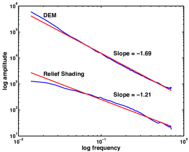
It is common to drape a colour image that has been derived from the data itself over the relief shading. The results presented here would indicate that this practice is valid and unlikely to create any perceptual problems. Forming a relief image from a data set is somewhat akin to taking a derivative of the surface. This has the effect of amplifying the spectral content of the image as a function of frequency. Thus the original data will have a stronger low frequency content than the relief shading image. In the example shown in Figure 18 the DEM amplitude spectrum falls away at approximately whereas the amplitude spectrum of the raw relief shading image falls away at approximately , see Figure 19. This difference appears to be more than sufficient to avoid any adverse interaction between the two. Another reason for expecting little interaction is that the image gradient values (and hence shading values) will, in general, be independent of the image data values themselves.
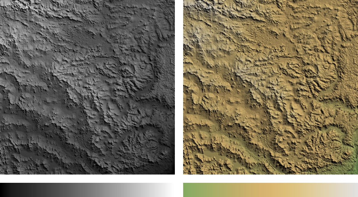
An important advantage of combining relief shading with an image that has been derived from the data is that it allows the communication of overall data properties, metric information, in addition to the form and structure that is provided by the shading. With just a raw grey scale relief image you only get a sense of the local surface normal information, you have no sense of the absolute data values. If the data range is very large this can be useful as the relief shading acts a form of dynamic range reduction allowing small scale features to still be seen within an arbitrarily large range of data values (assuming that shadows are not rendered as part of the relief shading). However, in other cases the loss of any sense of absolute data value can be a disadvantage. Overlaying an image derived from the data values overcomes this problem and allows the best of both worlds. In the renderings of the DEM data shown in Figure 20 the highest and lowest regions in the data can now be identified, even with the grey colour map.
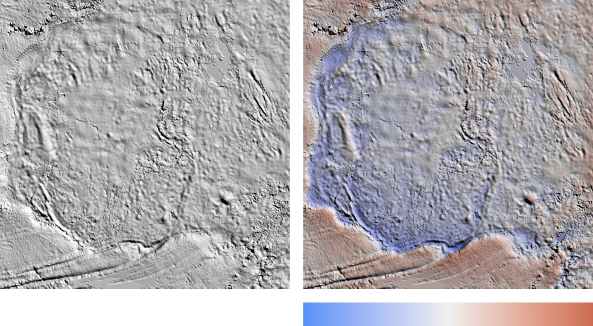
Another example of the value of relief shading combined with a coloured image derived from the data is shown in Figure 21. Using the residual gravity image of West Africa shown earlier we can see that a relief shaded image allows small scale structures to be identified readily. However, it is hard to get a sense of the magnitude of the deviation of features above and below zero. Combining the relief shading with an image of the data rendered with a diverging colour map allows the fine structures to be seen in conjunction with the polarity of the data. Compare this result with the diverging colour map renderings of this data that were presented in Figure 10.
5.1 Summary
Relief shading combined with a coloured image, even a grey scale image, can be a very useful way to present data. If the frequency content of the coloured image is significantly different from the relief shading then no particular precautions are needed with the colour map other than to ensure it does not have any significantly dark colours that could mask the shading altogether. However, as a general guide it is probably wise to use a low contrast colour map with a range of lightness values no more than, say, 50 to minimise any potential disruption to the shading pattern. In saying this one should note that the scaling of the gradient values used to generate the shading is arbitrary. If the scaling of gradients is small then sensitivity to non-isoluminance of the colour map will naturally increase. If the image being combined with the relief shading is derived from another source then it is possible that the frequency content of the two images may interfere. Should this be the case then an isoluminant, or very low contrast, colour map should be used.
6 Colours for Ternary Images
A ternary image is a colour image formed from three bands of a multichannel image. A basis colour is applied to each band and the images are summed to produce the final result. Almost invariably the RGB primaries of red, green and blue are used as the basis colours as this is the simplest and most obvious implementation. Multichannel Landsat imagery is commonly presented in this way. Ternary images are also used for rendering geophysical radiometric data whereby the potassium, thorium and uranium values are used to specify the red, green and blue components of an image respectively.
A difficulty with using the RGB primaries as basis colours is that the perceptual sensitivity of the eye to these colours is not equal. In particular the eye is quite insensitive to blue, having much fewer blue cones than green and red ones [33]. This is reflected in red, green and blue having very differing CIELAB lightness values of approximately 53, 88 and 32 respectively. Moreover, of equal importance is the relative lightness of the secondary colours that are obtained when the basis colours are mixed. Cyan, magenta and yellow have lightness values of 91, 60 and 97 respectively. If a data channel is assigned to green, or a combination of channels are directed to the yellow or cyan secondary colours, then these channels will be given an inappropriately large perceptual prominence over the others. Thus, the RGB primaries are not the ideal basis colours for forming ternary images.
Indeed, the early work of Tajima [41] recognized that using RGB to represent 3 channels of Landsat data was not ideal given the perceptual non-uniformity of the colour space. He proposed mapping the Euclidean space representing the 3 channels of data into a portion of CIELUV space. However this approach does not acknowledge the fact that CIELUV is only intended to be perceptually uniform at very low spatial frequencies.
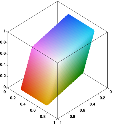
The RGB primaries were designed to allow natural colours to be reproduced on display monitors. However our aims are different. We are not wanting to reproduce colours, instead we are seeking to create colours that convey information. Accordingly we want three basis colours that can be assigned to each channel of data in a way that allows all the information to be seen with equal perceptual prominence. We do not want any channel, or combination of channels, to be treated preferentially. To achieve this our ideal would be to have three basis colours that are nominally red, green and blue, that sum to white in RGB space, that are matched in lightness, and have the same chroma. The secondary colours resulting from these basis colours should also be matched in lightness and chroma. In practice this ideal cannot be attained but, with some effort, a workable compromise is achievable.
Designing an objective function to find a set of basis colours that maximally satisfy these requirements via an optimization search is complicated by the fact that we also want the gamut of colours that can be created by the basis colours to be as large as possible. Accordingly, a manually constrained optimization strategy was adopted. After some experimentation the following basis colours were constructed
| ‘Red’ | RGB: [0.90 0.17 0.00] | CIELAB lightness 50, chroma 92 |
| ‘Green’ | RGB: [0.00 0.50 0.00] | CIELAB lightness 46, chroma 71 |
| ‘Blue’ | RGB: [0.10 0.33 1.00] | CIELAB lightness 44, chroma 100. |
The corresponding secondary colours have coordinates
‘Cyan’
RGB: [0.10 0.83 1.00]
CIELAB lightness 79, chroma 43
‘Magenta’
RGB: [1.00 0.50 1.00]
CIELAB lightness 72, chroma 78
‘Yellow/Orange’
RGB: [0.90 0.67 0.00]
CIELAB lightness 73, chroma 77.
The manually defined constraints were to set the ‘green’ basis colour
to [0.0, 0.5, 0.0] and to fix the red component of the ‘red’ basis
colour at 0.9. The reasoning behind this choice for ‘green’ is that
at a lightness level of around 45 this colour is the most heavily
constrained in terms of chroma. Thus this colour has to be the
maximal ‘green’ possible for a given lightness level. Fixing the red
component of the ‘red’ basis colour at 0.9 was in recognition of the
fact that in order to ensure a more uniform lightness of the secondary
colours the red component has to be reduced from 1.0, but at the same
time we want the gamut to be kept as large as possible. Finally, the
blue component of the ‘blue’ was also fixed at 1.0. Given these
constraints, and the condition that the colours sum to white, the
unassigned green component of 0.5 and red component of 0.1 were then
distributed between the basis colours via an optimisation search in
order to minimise the lightness differences. This resulted in the
colours given above.
With these choices the maximum lightness difference between any of the basis colours, or between any of the secondary colours, is kept to about 6. However, the maximum difference in chroma is larger than one would like at 35. Little can be done about this due to gamut limitations. Given the relative importance of lightness differences at fine spatial scales this compromise was deemed acceptable. By imposing different manual constraints the maximum lightness difference between the basis colours can be made arbitrarily small but the chroma of the basis colours, and the gamut of colours that can be created from them, become unacceptably small.

The utility of the proposed basis colours can be evaluated by taking a dataset with three channels and, by forming all possible permutations of colour-channel assignment, creating six ternary images. While features will appear in each image with different colours we would like the salience of the features to be consistent across the images no matter what colour-channel permutation is used. As shown in Figure 23 this is closely achieved using the proposed basis colours. By avoiding any bias that might arise from choosing a particular colour-channel assignment this should allow a more consistent and reliable interpretation of data.
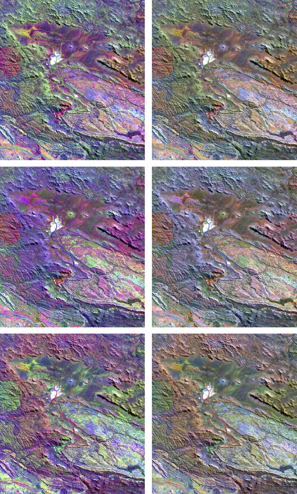
An inevitable consequence of using the proposed near-isoluminant basis colours is that the gamut of colours that can be represented is a reduced subset of the RGB cube. This is reflected in the more subdued colours in the ternary images shown in Figure 23. However, what is gained is a more consistent representation of the data.
7 Conclusion
This work presents a set of principled design techniques for the construction of perceptually uniform colour maps. Previous work in the design of perceptually uniform colour maps has had inconsistent success in generating good colour maps because, in many cases, there has been a failure to recognise that CIELAB space is only designed to be perceptually uniform at very low spatial frequencies. The key factor is recognising that, at the spatial frequencies that are relevant for most image analysis tasks, it is the lightness variations in the colour map that are most important with hue or saturation proving to be relatively unimportant. Once this is acknowledged then the design process for different classes of colour maps becomes relatively straightforward, and the compromises that have to be made become easier to understand.
Linear colour maps are, naturally, the easiest to construct. However diverging, rainbow, and cyclic colour maps require lightness gradient reversals. These must be smoothed to avoid the creation of false features within the colour map. At the same time these reversals also induce localised perceptual flat spots because the map colours in the vicinity of these points are close to isoluminant. This holds even if no smoothing is performed on the lightness profile of the map. Anyone interpreting data with such a colour map must be mindful of this. For this reason linear-diverging colour maps may be better to use than the more classical reversing ones. Acknowledging that rainbow colour maps will continue to be used it is shown how minimally bad rainbow maps can be generated with reasonable perceptual uniformity even if they do lack perceptual ordering. Finally, the challenge of designing good cyclic colour maps is considered and it is shown how four-colour cyclic maps can be constructed to reflect the typical way in which we partition the circle.
An important part of constructing good colour maps, and preventing the use of bad ones, is the availability of simple test images that allow colour maps to be evaluated readily. The test images presented here are simple to generate and have proved themselves very capable of revealing serious deficiencies in many standard colour maps supplied by vendors. Hopefully the test images will also facilitate further experimentation in colour map design strategies.
Relief shading combined with a coloured image, even a grey scale image, can be a very useful way to present data. This allows some sense of metric information to be communicated in conjunction with the form information being provided by the shading. As long as the frequency content of the coloured image is significantly different from, and preferably lower than, that of the relief shading then no particular precautions are needed with the choice of colour map. However, low contrast maps of lighter shades will be most effective. This assumes though that the shading pattern has a well distributed frequency spectrum, as is the case with a typical DEM surface. Where the shading pattern does not have a rich spectrum and is primarily composed of low frequencies it may be necessary to employ an isoluminant colour map to ensure the colours in the map do not disrupt the perception of structure from the shading. Under these conditions one can expect the use of colour to amplify the perception of structure from shading.
Finally the formation of ternary images from three basis colours is examined in detail. The RGB primaries are not a good choice as basis colours and their use can result in very different perceptions of data depending on the assignment of colours to data channels. The important observation is that the basis colours are required, through a process of mixing, to create colours that communicate information in a way that is not biased towards any channel, or combination of channels. Three colours that closely satisfy these needs are presented. They are closely matched in lightness, as are their secondary colours, and they produce ternary images where the perception of structures and features in the data are highly stable no matter what colour–channel permutations are used.
MATLAB code for the design and construction of the colour maps, and
code for generating the test images is available
from:
http://www.cet.edu.au/research-projects/colourmaps .
Also
available from this web site is a set of perceptually uniform colour
maps prepared in a variety of formats.
Acknowledgment
This work was supported by the Centre for Exploration Targeting at The University of Western Australia.
Appendix A The Colour Map Test Image
As shown in Figure 2 the test image consists of a sine wave superimposed on a ramp function. The sine wave amplitude is set so that the range from peak to trough represents a series of features that are 10% of the total data range. The amplitude of the sine wave is modulated from its full value at the top of the image to 0 at the bottom.
The wavelength of the sine wave is set at 8 pixels. With an image width of 512 pixels this gives a pattern of 64 cycles. On a computer monitor with a nominal pixel pitch of 0.25mm this results in a physical wavelength of 2mm. At a monitor viewing distance of 600mm this corresponds to 0.19 degrees of viewing angle or approximately 5.2 cycles per degree. This falls within the range of spatial frequencies (3–7 cycles per degree) at which most people have maximal contrast sensitivity to a sine wave grating [26, 43]. A wavelength of 8 pixels is also sufficient to provide a reasonable discrete representation of a sine wave. The aim is to present a stimulus that is well matched to the performance of the human visual system so that what we are primarily evaluating is the colour map’s perceptual contrast and not the visual performance of the viewer.
Inevitably, with this choice of spatial frequency, the test image is biased towards discrimination of light-dark variations rather than chromatic variations. However, there is no escaping the fact that when we look at an image we want to be able to resolve features at this scale, and finer.
The sine wave amplitude increases with the square of the distance from the bottom of this image. This provides a gradual rate of increase in the amplitude with a reasonably wide, low contrast, region at the bottom of the image allowing us to see the colour map on a ramp. Each row of the test image is normalised so that it spans a range of 0 to 255. This means that the underlying ramp at the top of the image will be reduced in slope slightly to accommodate the sine wave.
An equivalent circular image for evaluating cyclic colour maps has also been devised. It consists of a sine wave of 100 cycles superimposed on a spiral ramp function. The spiral ramp starts at a value of 0 pointing right, increasing anti-clockwise to a value of as it completes the full circle. This gives a discontinuity on the right side of the image. The amplitude of the superimposed sine wave is modulated from its full value at the outside of the circular pattern to 0 at the centre. The sine wave amplitude of means that the overall size of the sine wave from peak to trough represents 10% of the total spiral ramp of . It is rendered in Figure 25 using a linear grey colour map to illustrate the cyclic discontinuity.

References
- [1] Per Bak, Chao Tang, and Kurt Wiesenfeld. Self-organized criticality: An explanation of the 1/f noise. Phys. Rev. Lett., 59:381–384, July 1987.
- [2] David Borland and Russell M. Taylor. Rainbow color map (still) considered harmful. IEEE Computer Graphics and Applications, 27(2):14–17, March 2007.
- [3] Cynthia A. Brewer. Color use guidelines for mapping and visualization. In A.M. MacEachren and D.R.F Taylor, editors, Visualization in Modern Cartography, pages 123–147. Elsevier, 1994.
- [4] Cynthia A. Brewer. Guidelines for the use of the perceptual dimensions of color for mapping and visualization. In Color Hard Copy and Graphic Arts III, volume 2171, pages 54–63. SPIE, 1994.
- [5] Cynthia A. Brewer. Spectral schemes: Controversial color use on maps. Cartography and Geographic Information Systems, 24(4):203–220, 1997.
- [6] Cynthia A. Brewer. Color Brewer 2.0. http://www.colorbrewer2.org, 2013.
- [7] CIE. Commission Internationale de l’Eclairage proceedings 1931. Cambridge University Press, 1932.
- [8] CIE. Recommendations on uniform color spaces, color-difference equations, psychometric color terms. Supplement No. 2 to CIE Publication No. 15, Colorimetry, 1971, 1978.
- [9] CIE. Improvement to industrial colour-difference evaluation. CIE Publication No. 142-2001, 2001. Vienna.
- [10] M.D. Fairchild. Color Appearance Models. John Wiley and Sons, 3 edition, 2013.
- [11] D.J. Field. Relations between the statistics of natural images and the response profiles of cortical cells. Journal of the Optical Society of America A, 4(12):2379–2394, 1987.
- [12] Paul Green-Armytage. A colour alphabet and the limits of colour coding. Colour: Design & Creativity, 5:1–23, 2010.
- [13] John Guild. The colorimetric properties of the spectrum. Philosophical Transactions of the Royal Society of London, Series A, 230:149–187, 1931.
- [14] Garrett M. Johnson and Mark D. Fairchild. A top down description of S-CIELAB and CIEDE2000. Color Research and Application, 28(6):425–435, 2003.
- [15] Alan D. Kalvin. Graduated profiling: Enumerating and generating perceptual colormaps for uncalibrated computer displays. In Bernice E. Rogowitz and Thrasyvoulos N. Pappas, editors, Human Vision and Electronic Imaging VII, volume 4662, 2002.
- [16] Gordon Kindlmann, Erik Reinhard, and Sarah Creem. Face-based luminance matching for perceptual colormap generation. In Proceedings of the Conference on Visualization ’02, VIS ’02, pages 299–306, Washington, DC, USA, 2002. IEEE Computer Society.
- [17] Fredrick A. Kingdom. Color brings relief to human vision. Nature Neuroscience, 6(6):641–644, June 2003.
- [18] P. Lennie and M. D’Zmura. Mechanisms of color vision. Critical Reviews in Neurobiology, 3:333–400, 1988.
- [19] Haim Levkowitz and Gabor T. Herman. The design and evaluation of color scales for image data. IEEE Computer Graphics and Applications, 12(1):72–80, January 1992.
- [20] M.R. Luo, G. Cui, and B. Rigg. The development of the CIE 2000 colour-difference formula: CIEDE2000. Color Research and Application, 26:340––350, 2001.
- [21] MathWorks. MATLAB documentation. http://www.mathworks.com.au/help/matlab/ref/colormap.html, 2014.
- [22] James McNames. An effective color scale for simultaneous color and gray-scale publications. IEEE Signal Processing Magazine, 23:82–96, January 2006.
- [23] Kenneth Moreland. Diverging color maps for scientific visualization. In 5th International Symposium on Visual Computing, volume 5876 of Advances in Visual Computing: Lecture Notes in Computer Science, pages 92–103. Springer, December 2009.
- [24] K. Mullen. The contrast sensitivity of human colour vision to red-green and blue-yellow chromatic gratings. Journal of Physiology (London), 359:381–400, 1985.
- [25] Matteo Niccoli. The rainbow is dead… Long live the rainbow! http://mycarta.wordpress.com/2012/05/29/the-rainbow-is-dead-long-live-the-rainbow-series-outline/, 2012.
- [26] L.A. Olzak and J.P. Thomas. Seeing spatial patterns. In Kenneth R. Boff, Lloyd Kaufman, and James P. Thomas, editors, Handbook of perception and human performance. Wiley, 1986.
- [27] S.M. Pizer. Intensity mappings to linearize display devices. Computer Graphics and Image Processing, 17(3):262–268, 1981.
- [28] A.B. Poirson and B.A. Wandell. The appearance of coloured patterns: Pattern color separability. Journal of the Optical Society of America, 12:2458–2471, 1993.
- [29] P.K. Robertson and J.F. O’Callaghan. The generation of color sequences for univariate and bivariate mapping. IEEE Computer Graphics and Applications, 6(2):24––32, February 1986.
- [30] B. E. Rogowitz, A. D. Kalvin, A. Pelah, and A. Cohen. Which trajectories through which perceptually uniform color spaces produce appropriate color scales for interval data? In IS&T Seventh Color Imaging Conference: Color Science, Systems, and Applications, pages 321–326. Society for Imaging Science and Technology, 1999.
- [31] B. E. Rogowitz and L. A. Treinish. Data visualization: The end of the rainbow. IEEE Spectrum, 35(12):52–59, 1998.
- [32] Bernice E. Rogowitz and Alan D. Kalvin. The ‘Which Blair Project:’ A quick visual method for evaluating perceptual color maps. In In Proceedings of IEEE Visualization, 2001.
- [33] A. Roorda and D.R. Williams. The arrangement of the three cone classes in the living human eye. Nature, 397(6719):520–522, February 1999.
- [34] G. Sharma, W. Wu, and E.N. Dalal. The CIEDE2000 color-difference formula: Implementation notes, supplementary test data, and mathematical observations. Color Research and Application, 30(1):21–30, 2005.
- [35] Ian Spence and Adele Efendov. Target detection in scientific visualization. Journal of Experimental Psychology: Applied, 7(1):13–26, 2001.
- [36] N.I. Speranskaya. Determination of spectrum color co-ordinates for twenty seven normal observers. Optics and Spectroscopy, 7:424–428, 1959.
- [37] S.S. Stevens. On the psychophysical law. The Psychological Review, 64(3):153–181, 1957.
- [38] Walter Stanley Stiles and Jennifer M. Burch. N.P.L. colour matching investigation: final report. Optica Acta, 6:1–26, 1958.
- [39] Maureen Stone. In color perception, size matters. IEEE Computer Graphics and Applications, 32(2):8–13, March/April 2012.
- [40] Maureen Stone, Danielle Albers Szafir, and Vidya Setlur. An engineering model for color difference as a function of size. In 22nd Color and Imaging Conference. Society for Imaging Science and Technology, 2014.
- [41] J. Tajima. Uniform color scale applications to computer graphics. Computer Vision, Graphics and Image Processing, 21(3):305–325, 1983.
- [42] L.C. Thomson and W.D. Wright. The colour sensitivity of the retina within the central fovea of man. Journal of Physiology (London), 105:316–331, 1947.
- [43] F.L. Van Nes and M.A. Bouman. Spatial modulation transfer in the human eye. Journal of the Optical Society of America, 57:401–406, 1967.
- [44] Colin Ware. Color sequences for univariate maps: Theory, experiments and principles. IEEE Computer Graphics and Applications, 8(5):41–49, 1988.
- [45] A.B. Watson, H.B. Barlow, and J.G. Robson. What does the eye see best? Nature, 302:419–422, 1983.
- [46] William David Wright. A re-determination of the trichromatic coefficients of the spectral colours. Transactions of the Optical Society, 30(4):141–164, 1928.
- [47] X.M. Zhang and B.A. Wandell. A spatial extension to CIELAB for digital color image reproduction. Society for Information Display Symposium Technical Digest, 27:731––734, 1996.