Multi-scale Dynamics in a Massive Online Social Network
Abstract
Data confidentiality policies at major social network providers have severely limited researchers’ access to large-scale datasets. The biggest impact has been on the study of network dynamics, where researchers have studied citation graphs and content-sharing networks, but few have analyzed detailed dynamics in the massive social networks that dominate the web today. In this paper, we present results of analyzing detailed dynamics in the Renren social network, covering a period of 2 years when the network grew from 1 user to 19 million users and 199 million edges. Rather than validate a single model of network dynamics, we analyze dynamics at different granularities (user-, community- and network-wide) to determine how much, if any, users are influenced by dynamics processes at different scales. We observe independent predictable processes at each level, and find that while the growth of communities has moderate and sustained impact on users, significant events such as network merge events have a strong but short-lived impact that is quickly dominated by the continuous arrival of new users.
1 Introduction
A number of interrelated processes drive dynamics in social networks. A deeper understanding of these processes can allow us to better model and predict structure and dynamics in social networks. In turn, improved models and predictors have numerous practical implications on the design of infrastructure, applications, and security mechanisms for social networks.
Details of these dynamic processes are best studied in the context of today’s massive online social networks (OSNs), e.g. Facebook [34], LinkedIn [23], and Renren [12]. Unfortunately, the providers of these networks generally consider their dynamic network data to be trade secrets, and have few incentives to make such data available for research. Instead, studies have analyzed citation networks [21], content sharing networks [17], and high level statistics of social networks [1]. Others [20, 25, 9] sought to verify the validity of generative models such as preferential attachment (PA) [5].
Our goal is to better understand in detail the evolutionary dynamics in a social network. This includes not only the initial growth process during a social network’s formation, but also the ongoing dynamics afterwards, as the network matures. Much of the prior work in this area, including generative graph models and efforts to validate them [5, 20, 25, 9], has focused on capturing network dynamics as a single process. In contrast, we are interested in the question “how are individual user dynamics influenced by processes at different scales?” How much are the dynamics of users influenced by external forces and events, such as the activities of friends in communities they belong to, or by large-scale events that occur at the network level?
In this work, we explore these questions empirically through a detailed analysis of social network dynamics at multiple scales: at the individual user level, at the level of user communities, and at the global network level. We study a dynamic graph, i.e. a sequence of detailed timestamped events that capture the ongoing growth of the Renren online social network [12]. With over 220 million users, Renren is the largest social network in China, and provides functionality similar to Facebook. We focus our analysis on the first two years of Renren’s growth, from its first user in November 2005, to December 2007 when it had over 19 million members. This captures the network’s initial burst of growth, as well as a period of more sustained growth and evolution. Our anonymized data includes timestamps of all events, including the creation of 19 million user accounts and 199 million edges. This dataset is notable because of three features: its scale, the absolute time associated with each event, and a rare network merge event, when the Renren social network merged with its competitor 5Q.com in December 2006, effectively doubling its size from 600K users to 1.3 million users in a single day.
Our analysis of network dynamics in the Renren dataset focuses on three different levels of granularity: nodes, communities, and networks. At each level, we search for evidence of impact on user behavior. Along the way, we also make a number of intriguing observations about dynamic processes in network communities and network-wide events.
Individual Nodes. The creation of links between individual users has been studied in a number of contexts, and is long believed to be driven by generative models based on the principle of preferential attachment, i.e. users prefer to connect to nodes with higher degree [5]. Our goal is to extend the analysis of this model with respect to two new dimensions. First, preferential attachment defines how a sequence of edges are created in logical order, but how do node dynamics correlate with absolute time? Second, does the strength of the preferential attachment model strengthen or weaken as the network grows in scale and matures?
Communities. Intuitively, the behavior of a user is likely to be significantly impacted by the actions of her friends in the network. This has been previously observed in offline social networks [35]. Our goal is to empirically determine if user activity at the level of communities has a real impact on individual users. To do so, we first implement a way to define and track the evolution of user communities over time. We track the emergence and dissolution of communities over time, and quantify the correlation of user behavior to the lifetime, size, and activity level of the communities they belong to.
Networks. Finally, we wish to quantify the impact, if any, of network-level events on individual user behavior. By network-level events, we refer to unusual events that affect the entire network, such as the merging of two distinct social networks recorded in our dataset. We analyze user data before and after the merge of the Renren and 5Q social networks, and quantify the impact of different factors on user behavior, including duplicate accounts, and user’s edge creation preferences over time.
Key Findings. Our analysis produces several significant findings. First, we find that nodes (users) are most active in building links (friendships) shortly after joining the network. As the network matures, however, we find that new edge creation is increasingly dominated by existing nodes in the system, even though new node arrivals is keeping pace with network growth. Second, we find that influence of the preferential attachment model weakens over time, perhaps reflecting the reduced visibility of each node over time. As the network grows in size, users are less likely to be aware of high degree nodes in the network, and more likely to obey the preferential model with users within a limited neighborhood. Third, at the level of user communities, we find that users in large communities are more active in creating friends. Active nodes with high degrees tend to join and help form large communities, and their activity introduces new friends to their neighbors, further encouraging edge formation within the community. In addition, we found that a combination of community structural features can predict the short-term “death” of a community with more than 75% accuracy.
Finally, in our analysis of the network merge event, we use user activity to identify duplicate accounts across the networks. Aside from duplicate accounts, we find that the network merge event has a distinct short-term impact on user activity patterns. Users generate a high burst in edge creation, but the cross-network activity fades and quickly becomes dominated by edge creation generated by new users. Overall, this quickly reduces average distance between the two networks and melds them into a single indistinguishable network.


2 Network Level Analysis
We begin our study by first describing the dataset, and performing some basic analysis to understand the impact of network dynamics on first order graph metrics. Our data is an anonymized stream of timestamped events shared with us by Renren [12]. Our basic measurements in this section set the context for the analysis of more detailed metrics in later sections.
Renren Dynamic Dataset. The first edge in the Renren social network was created on November 21, 2005. The network was originally named Xiaonei, or “inside school,” since it was targeted as a communication tool for college students. Xiaonei expanded beyond schools in November 2007, and changed its name to Renren (“ everyone”) in 2009.
Our anonymized dataset encompasses the timestamped creation events of all users and edges in the Renren network. The dataset covers more than 2 years, starting on November 21, 2005 and ending December 31, 2007. In all, the dataset includes the creation times of 19,413,375 nodes and 199,563,976 edges. To perform detailed analysis on the social graph, we produce 771 graphs representing daily static snapshots from the timestamped event stream. Note that in this paper, we will use the term node to mean an OSN user and edge to mean a friendship link.
An unusual event happened on December 12, 2006, when Renren/Xiaonei merged its social network with 5Q, a competing social network that was created in April 2006. On the merge date, Renren had 624K users with 8.2 million social links, and 5Q had 670K users with 3 million social links. Wherever possible, we treat the merge as an external event to minimize its impact on our analysis of network growth. We present detailed analysis of the network merge event in Section 5.
On Renren, each user is limited to 1,000 friends by default. Users may pay a fee in order to increase their friend cap to 2,000. However, prior work has shown that very few users take advantage of this feature [12]. We make the same observation about our dataset: the number of users with 1,000 friends is negligibly small.
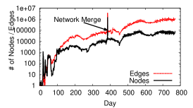
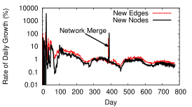
Network Growth. Figure 1(a) depicts the growth of the Renren network in terms of the number of nodes and edges added each day. Day 0 is November 21, 2005. Overall, the network grows exponentially, which is expected for a social network. However, there are a number of real world events that temporarily slow the growth, and manifest as visible artifacts in Figure 1(a). The two week period starting at day 56 represents the Lunar New Year holiday; a two-month period starting on day 222 accounts for summer vacation; the merge with 5Q network causes a jump in nodes and edges on day 386; additional dips for the lunar new year and summer break are visible starting at days 432 and 587, respectively. In Figure 1(b), we plot daily growth as a normalized ratio of network size from the previous day. It shows that relative growth fluctuates wildly when the network is small, but stabilizes as rapid growth begins to keep rough pace with network size.
Graph Metrics Over Time. We now look at how four key graph metrics change over the lifetime of our data stream, and use them to identify structural changes in the Renren network. We monitor average degree, average path length, average clustering coefficient, and assortativity. As before, the analysis of each metric starts from November 21, 2005.
Average Degree. As shown in Figure 1(c), average node degree grows for much of our observed time period, because the creation of edges between nodes out paces the introduction of new users to the network. This trend changes around day 305, when a period of rapid growth in users starts to reduce average degree. This arises from a sudden influx of new users due to several successful publicity campaigns by Renren. In December 2006, average degree drops suddenly when 670K loosely connected 5Q nodes join the Renren network. Average degree resumes steady growth following the event, again showing edge growth out pacing node growth and increasing network densification [21].
Average Path Length. We follow the standard practice of sampling nodes to make path length computation tractable on our large social graphs. We compute the average path length over a sample of 1000 nodes from the SCC for each snapshot, and limit ourselves to computing the metric once every three days. As seen in Figure 1(d), the results are intuitive: path length drops as densification increases (i.e. node degree increases). There is a significant jump when 5Q joins Renren on day 386, but resumes a slow drop as densification continues after the merge.
Average Clustering Coefficient. Clustering coefficient is a measure of local density, computed as the ratio of the existing edges between the immediate neighbors of a node over the maximum number of edges possible between them. We plot average clustering coefficient in Figure 1(e). In early stages of network growth (before day 60), the network was very small and contained a large number of small groups with loose connections between them. Groups often formed local cliques or near-cliques, resulting in high clustering coefficients across the network. Once the network grows in size, average clustering coefficient transitions to a smooth curve and decreases slowly. The network merge produces a small jump, since the 5Q network had many small clusters of 3 or 4 nodes that boosted average clustering coefficient.
Assortativity. Finally, we plot assortativity in Figure 1(f). Assortativity is the probability of a node to connect to other nodes with similar degree, computed as the Pearson correlation coefficient of degrees of all node pairs. In the early stages of the network, the graph is sparse and dominated by a small number of supernodes connecting to many leaf nodes. This produces a strong negative assortativity that fluctuates and then evens out as the network stabilizes in structure. Assortativity evens out at around 0, meaning nodes in Renren have no discernible inclination to be friends with nodes of similar or different degree.
Summary. We observe that the high-level structure of the Renren social network solidifies very quickly. Several key properties stabilize after the first 2 months, with others establishing a consistent trend after 100 days. While the notable network merge with 5Q introduces significant changes to network properties, the effects quickly fade with time and continued user growth.

3 Edge Evolution
In this section, we study the behavior of individual nodes in terms of how they build edges over time. Many studies have shown that nodes build edges following the preferential attachment (PA) model [5, 20, 25, 9]. Specifically, when a new node joins the network and creates edges, it chooses the destination of each edge proportionally to the destination’s degree. In other words, nodes with higher degrees are more likely to be selected as the destination of new edges, leading to a “rich get richer” phenomenon.
Using the dynamic Renren network data, we extend the analysis of this model in two new dimensions. First, while PA defines how a sequence of edges is created in logical order, we seek to understand how node activities correlate with absolute time. Second, we are interested in whether, as the network evolves, the predictive ability of the PA model grows or weakens over time.
3.1 Time Dynamics of Edge Creation
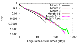
Edge Inter-arrival. We begin by analyzing the edge creation process in absolute time, focusing on the speed that nodes add edges. First, we look at the inter-arrival time between edge creation events. For each node, we collect the inter-arrival times between all its edges, then place them into buckets based on the age of the node when the edge was created. We then aggregate all users’ data together for each bucket, e.g. the “Month 1” bucket contains all edge inter-arrival times where one or both of the nodes was less than 1 month old.
We plot the results in Figure 2(a). We observe that the time gap between a node’s edge creations follows a power-law distribution. The scaling exponent is between 1.8 and 2.5 in Figure 2(a). Overall, this power-law distribution provides a realistic model of a user’s idle time between edge creations at different stages of her lifetime.
Edge Creation Over Lifetime. The above result motivates us to examine the normalized activity level within each user’s lifetime. We plot in Figure 2(b) the distribution of new edges based on the normalized age of the users involved. To avoid statistical outliers, we consider only nodes with at least 30 days of history in our dataset and degree of at least 20. As expected, users create most of their friendships early on in their lifetimes. Edge creation converges to a constant rate once most of the offline friends have been found and linked.
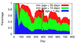
Node Age and Edge Creation. We observe above that nodes tend to generate a significant portion of their edges soon after joining the network. Since most generative graph models use new nodes to drive edge creation, we ask the question “What portion of the new edges created in the network are driven by the arrival of new nodes?” For each day in our dataset, we take each edge created on that day and determine its minimal age, i.e. the minimum age of its two endpoints. The distribution of this value shows what portion of new edges are created by new nodes.
We compute and plot this distribution in Figure 2(c). We show the relative contribution by nodes of different ages by plotting three stacked percentages, showing the portion of daily new edges with minimal age 1 day, days, and days. We see that when the network is young ( days), the vast majority of new edges connect brand new nodes (i.e. 1 day old). As the network stabilizes and matures, that portion quickly drops, and continues to decrease over time. Edges with minimal age of 10-30 days dominate new edges for much of our trace, but their contribution steadily drops over time from 95% around day 100 to 48% by day 770. Note that this drop occurs even after the daily relative network growth has reached a constant level (see Figure 1(b)). It is reasonable to assume that in today’s Renren network (4.5 years past the end of our data), the vast majority of new edges connect mature users who have been in the network for significant amounts of time.
This result in Figure 2(c) is important, because it shows a dramatic change in the driving force behind edge creation as the network matures. Most generative graph models assume edge creation is driven by new nodes. However, our data indicates that existing models will only accurately capture the early stages of network creation. Capturing the continuous evolution of a mature network requires a model that not only recognizes the contribution of mature nodes in edge creation, but also its continuous change over time.
3.2 Strength of Preferential Attachment
Next, we take a look at the preferential attachment model and how well it predicts changes over time and network growth. We follow the method in [20] to measure the strength (or degree) of preferential attachment using edge probability . This function defines the probability that an edge chooses its destination with degree , normalized by the total number of nodes of degree before this time step:
| (1) |
where if the destination of the edge is of degree , and 0 otherwise.
Intuitively, if a network grows following the PA model, its edge probability should have a linear relationship with : . The authors of [20] verified this conclusion using synthetic graphs, and also tested the PA model on four real social networks: Flickr, Delicious, Answers, and LinkedIn. The first three networks follow the PA model with , while for LinkedIn, . From these observations, we can define a criterion for detecting preferential attachment: when , the network grows with a strong preferential attachment, and when , the edge creation process becomes increasingly random.
Using this criterion, we validate the PA model over time on Renren by fitting measured at time to and examining over time. Our study seeks to answer an important question: “Does the Renren network display the same level of preferential attachment consistently over time?” In other words, does stay constant over time? And if not, is the preferential attachment stronger (or weaker) at a particular stage of network growth?
We make some small adjustments to the computation of on the Renren data. First, because our data does not state who initiated each friendship link (edge directionality), we perform our test with two scenarios. The first is biased in favor of preferential attachment because it always selects the higher degree end-point as the destination. In the second scenario the destination is chosen randomly from the two end-points. Second, to make the computation tractable on our large number of graph snapshots, we compute once after every new edges. Finally, to ensure statistical significance, we start our analysis when the network reaches a reasonable size, e.g. 600K edges.
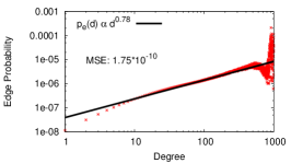
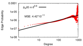
Results. We start by examining whether is a good fit. For this we use the Mean Square Error (MSE) between the measured and the fitted curve. We observe that the MSE decreases with the edge count, ranging from 1.8e-5 to 3.5e-13. This confirms that the fit is tight for the measured edge probability. To illustrate the results, Figures 3(a)-(b) show the edge probability when the network reaches 57M edges, using the two destination selection methods. The corresponding MSEs of the fit are 1.7e-10 and 4.4e-11, respectively.
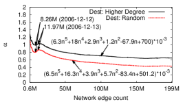
Next, we examine over time in Figure 3(c). We make two key observations. First, when using the higher-degree method is always larger than when using random selection. This is as expected since the former is biased in favor of preferential attachment. More importantly, the difference between the two results is always 0.2. This means that despite the lack of edge destination information, we can still accurately estimate from these upper and lower bounds.
Second, decays gradually over time, dropping from 1.25 (when Renren first launched) to 0.65 (two years later at 199M edges). This means that when the network is young, it grows with a strong preferential attachment. However, as the network becomes larger, its edge creation is no longer driven solely by popularity. Perhaps this observation can be explained by the following intuition. When a social network first launches, connecting with “supernodes” is a key factor driving friendship requests. But as the network grows, it becomes harder to locate supernodes inside the massive network and their significance diminishes.
Finally, we observe a small ripple at the early stage of the network growth, when experiences a surge on December 12, 2006 (8.26M edges). This is due to the Renren/5Q merge event, which generated a burst of new edges that produce a bump in for that single day.
3.3 Summary of Observations
Our analysis produces three conclusions:
-
•
In a node’s lifetime, edge creation rate is highest shortly after joining the network and decreases over time.
-
•
Edge creation in early stages of network growth is driven by new node arrivals, but this trend decreases significantly as the network matures.
-
•
While edge creation follows preferential attachment, the strength degrades gradually as the network expands and matures.
These results set the stage for the following hypothesis. An accurate model to capture the growth and evolution of today’s social networks should combine a preferential attachment component with a randomized attachment component. The latter would provide a degree of freedom to capture the gradual deviation from preferential attachment.
4 Community Evolution
In online social networks, communities are groups of users who are densely connected with each other because of similar backgrounds, interests or geographic locations. Communities effectively capture “neighborhoods” in the social network. As a result, we believe they represent the best abstraction with which to measure the influence of social neighborhoods on user dynamics. We ask the question, “how do today’s social network communities influence their individual members in terms of edge creation dynamics?”
To answer our question, we must first develop a method to scalably identify and track communities as they form, evolve, and dissolve in a dynamic network. There is ample prior work on community detection in static graphs [26, 7, 33, 6]. More recent work has developed several algorithms for tracking dynamic communities across consecutive graph snapshots [16, 28, 22, 31, 30]. Some of these techniques are limited in scale by computational cost, others require external information to locate communities across snapshots of the network.
In the remainder of this section, we describe our technique for scalably identifying and tracking communities over time. We then present our findings on community dynamics in Renren, including community formation, dissolution, merging, and splitting. Finally, we analyze community-level dynamics and use our detected communities to quantify the correlation between node and community-level dynamics.
4.1 Tracking Communities over Time
Tracking communities in the presence of network dynamics is a critical step in our analysis of network dynamics at different scales. Prior work proved that dynamic community tracking is an NP-hard problem [31]. Current dynamic community tracking algorithms [16, 28, 22, 31, 30, 10] are approximation algorithms that “track” a community over multiple snapshots based on overlap with an incarnation in a previous snapshot. In this section, we briefly describe our mechanism, which is a modified version of [10] that provides tighter community tracking across snapshots, using the incremental version of the Louvain algorithm [6]. At a high level, we use incremental Louvain to detect and track communities over snapshots, and use community similarity to determine when and how communities have evolved.
Similarity-based Community Tracking. Louvain [6] is a scalable community detection algorithm for static graphs based on optimizing modularity [26]. It uses a bottom up approach that iteratively groups nodes and communities together, and migrates nodes between communities until the improvement to modularity falls below a threshold .
Our approach leverages the fact that Louvain can be run in incremental mode, where communities from the current snapshot are used to bootstrap the initial assignments in the next snapshot. Given how sensitive community detection is to even small changes in modularity, this approach enables more accurate tracking of communities by providing a strong explicit tie between snapshots. Finally, we follow the lead of [10], and track communities over time by computing the similarity between communities. Similarity is quantified as community overlap and is computed using set intersection via the Jaccard coefficient.
Community Evolution Events. Using similarity to track communities allows us to detect major community events, including their birth, death, merges, and splits. We define a community splits at snapshot when is the highest correlated community to at least two communities and at snapshot . When at least two communities and at snapshot contribute most of their nodes to community at snapshot , we say and have merged.
When a community splits into multiple communities , we designate as the updated in the new snapshot, where is the new community who shares the highest similarity with . We say that all other communities in the set were “born” in the new snapshot. Similarly, if multiple communities merge into a single community , we consider to have evolved from the community that it shared the highest similarity with. All other communities are considered to have “died” in the snapshot.
Choosing . The threshold in Louvain is an important parameter that controls the trade off between quality of community detection and sensitivity to dynamics. If is too small, the algorithm is too sensitive, and over-optimizes to any changes in the network, needlessly disrupting the tracking of communities. If is too large, the process terminates before it optimizes modularity, and it produces inaccurate communities.
Choosing the best value for means optimizing for the dual metrics of high modularity and robustness (insensitivity) to slight network dynamics. First, we use network-wide modularity as a measure of modularity optimization for a given value. Second, to capture robustness to network dynamics, we use community similarity [10]: the ratio of common nodes in two communities to the total number of different nodes in both communities. More specifically, for two consecutive snapshots, we compute the average similarity between communities that exist in both snapshots. We run the Louvain algorithm on our snapshots using several different threshold values, and select the best that generates both good modularity and strong similarity. We repeat this procedure on shrinking ranges of until modularity and similarity can no longer be improved.
Sensitivity Analysis. We run the Louvain algorithm on Renren dynamic graph snapshots generated every 3 days. We start from Day 20, when the network is large enough (64 nodes) to support communities, and only consider communities larger than 10 nodes to avoid small cliques.
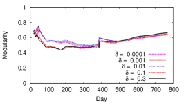
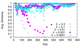
We scale between 0.0001 and 0.3, and plot the resulting modularity and average similarity in Figure 4. As shown in Figure 4(a), in all snapshots the modularity for all thresholds is more than 0.4. According to prior work [19], modularity indicates that Renren has significant community structure. As expected, a threshold around 0.01 is sensitive enough for Louvain to produce communities with good modularity. Note that the big jump in modularity on Day 386 is due to the network merge event.
Figure 4(b) shows that thresholds 0.0001 and 0.001 produce lower values of average similarity (i.e. they are less robust and more sensitive) compared to higher thresholds between 0.1 and 0.3. Thus, Louvain with generates relatively good stability of communities between snapshots.
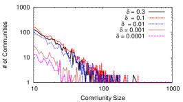
Lastly, we examine whether detected communities are highly sensitive to the choice of . As an example, Figure 4(c) plots the distribution of community sizes observed on Day 602. The conclusion from this figure is that once the threshold exceeds 0.01, the impact of on community size is reduced to a minimum. The same conclusion applies to other snapshots as well.
Based on the results in Figure 4, we repeat the Louvain algorithm within a finer threshold range of 0.01 to 0.1. We find that a threshold value of 0.04 provides the best balance between high modularity and similarity. We use to track and measure dynamic communities in the rest of our analysis on Renren.

4.2 Community Statistics Over Time
In the next three sections, we leverage our community tracking methodology to analyze the dynamic properties of Renren communities. We begin in this section by looking at the community size distribution, how it changes over time, and the distribution of lifetimes for all communities. In Section 4.3, we take a closer look at the dynamic processes of community merges and splits. We explore the possibility of predicting community death from observed dynamics. Finally, in Section 4.4, we analyze the impact of community membership on individual user dynamics, and gauge how and to what extent community dynamics are observed to have influenced individual user dynamics.
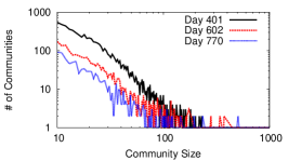
Community Size. The size distribution of communities is an important property that reflects the level of clustering in the network structure. Since the network structure is constantly evolving, we can compute a community size distribution for each snapshot in time. We already observed in Figure 4(c) that the distribution of community sizes follows a power-law distribution.
Our goal is to understand not only the instantaneous community size distribution, but also how the distribution changes over time as the network evolves. Thus, we compute the distributions for days 401, 602, and 770; 3 specific snapshots roughly evenly spaced out in our dataset following the network merge event. We plot the resulting community size distributions in Figure 5(a). The figure shows that the three snapshots consist of a large number of small communities and a long tail of large communities, consistent with the power-law distribution. This is consistent with other daily snapshots as well. More importantly, these snapshots show a gradual trend towards larger communities. Over the year of time between snapshots 401 and 770, the number of small communities shrunk by an order of magnitude. In turn, the sizes of the largest communities increase significantly.
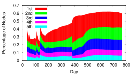
To take a closer at how communities grow over time, we focus on the portion of the network that is covered by a small number of the largest communities. We take the top five communities sorted by size, and plot the percentage of the overall network they contain in Figure 5(b). We see that their coverage of the network shows a clear and sustained growth over time. They grow from less than 30% around day 100 to more than 60% of the entire network by the end of our dataset. Over time, this trend seems to indicate that as the network matures, connectivity becomes uniformly strong throughout the main connected component, while distinctions between communities fade.
Community Lifetime. In a dynamic network, how long a community remains in the network is another important statistical property. By using our community identification method between snapshots, we measure the distribution of community lifetime. Figure 5(c) shows that most of the communities only stay in the network for a very short period of time. Specifically, 20% of communities have lifetimes of less than a day, meaning that they disappear in the next snapshot after they are first detected. 60% of the communities have lifetimes less than 30 days, at which point they are merged into other communities. This shows an extremely high level of dynamics at the community level.
4.3 Community Merging and Splitting
Community merging and splitting are the main reasons underlying community death and birth. Therefore, understanding these processes in detail is critical to understanding dynamics at the community level as a whole. We study these processes in detail, with three questions in mind: What factors influence the split and merge processes for communities? What features, if any, are good indicators for whether a community will merge soon? Finally, can we predict which communities will merge together?
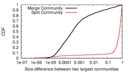
First, we study whether community size impacts splitting or merging. For splitting events, we only consider the largest two communities resulting from the split. Similarly for merge events, we focus on the two largest communities merging to become one community. We use as a metric the ratio of the size of the second largest community to the size of the largest community. The smaller the ratio is, the larger the size difference is between the two communities. In Figure 6(a), we plot the ratio of community splitting with a red line and community merging with a black line. We observe that for 80% of merged community pairs, this ratio is less than 0.005. This reflects that for most merge events, there is a large size discrepancy between the smaller community and a larger community. This is consistent with our observation that small communities tend to disappear over time, while the biggest communities continue to grow in size. The community splitting process acts in a totally different manner. The red line in Figure 6(a) shows that the ratio for 70% split communities pairs are more than 0.5. Thus, when a community splits into smaller communities, the community tends to split into two comparable size communities.
Predicting Merging. Since community merge is the only reason causing the death of the communities, we are curious whether there are any structural features specific to the merge process, and whether we can accurately predict if a community is going to merge with another in the next snapshot. We identify three structural metrics, including community size, in-degree ratio, the ratio of the edges inside a community over the sum of the degrees of nodes in the community, and the similarity of a community to itself in the previous snapshot (defined in Section 4.1).
Since these metrics evolve over time, we also consider short-term changes in these features as additional factors. For example, consider the community size feature. We can identify its first order change indicator as a feature: if a community is smaller than its incarnation in the previous snapshot, we use -1 to indicate the decrease. Similarly, we use 1 to mark an increase and 0 to mark no change. For each metric, we can also consider its second order change indicator. If the change in community size from snapshot to is larger than the size change from snapshot to , we use 1 to indicate an acceleration in this metric. Similarly, we use -1 to mark a deceleration in this metric. In total, we start with the three basic metrics and add on their standard deviation, their first order change indicator, and their second order change indicator.
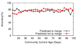
Leveraging these feature metrics, we can now predict whether a community will merge with another in the next snapshot. Specifically, we apply a Support Vector Machines (SVM) [36] over these features, together with the age of each community. For consistency, we do not consider communities created on the day of the network merge with 5Q because those changes are driven by external events. To examine the accuracy of our prediction, we compute two metrics: 1) the ratio of the number of communities predicted to merge in the next snapshot to the number of communities who actually merge, and 2) the ratio of the number of communities predicted to not merge in the next snapshot to the number of communities who do not merge.
Figure 6(b) plots our two accuracy metrics as a function of the community age. They show that our method achieves reasonable prediction accuracy. It achieves an average accuracy of 75% in predicting community merges and 77% in predicting no merges. This means that we can reliably track communities’ short-term evolution.
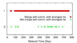
We are also interested in predicting which destination community a given community will merge into. After examining each merged community pair, we make an interesting observation. With a very high probability (99%), a community will merge with another community that has the largest number of edges to , or the strongest tie with . Figure 6(c) illustrates this trend by plotting red dots for all merge events where a community merges with the peer with the strongest tie, and a green triangle otherwise. The results show that the trend is consistent over time. Thus, we conclude that the inter-community edge count is a reliable metric for predicting the destination of community merges.
4.4 Impact of Community on Users
To understand how communities impact users’ activity, we compare edge creation behaviors of users inside communities to those outside of any community. Overall, our results show that community users score higher on all dimensions of activity measures, confirming the positive influence of community on users.
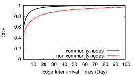
Edge Inter-arrival Time. Figure 7(a) plots the CDF of edge inter-arrival times for community and non-community users. We observe that users within different communities display similar edge inter-arrival statistics, and merge their results into a single CDF curve for clarity. The considerable distance between the two curves confirms that community users are more enthusiastic in expanding their social connections than non-community users.
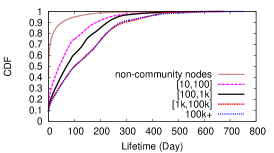
User Lifetime. Next, we examine how long users stay active after joining the network, and whether engagement in a community drives up a user’s activity span. We define a user ’s lifetime as the gap between the time builds her last edge and the time joins the network.
Figure 7(b) plots the CDF of user lifetime for users in different size communities as well as non-community users. represents communities of size between and . We find that the lifetime distribution depends heavily on the size of the community. The larger the community is, the longer its constituent user’s lifetimes are. Compared to non-community users, users engaging in a community tend to stay active for a longer period of time. This confirms the positive impact of community on users.
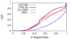
In-Degree Ratio. We also study how users within each community connect to each other. We compute each user’s in-degree ratio, i.e. the ratio of her edge count within her community to her degree. Figure 7(c) shows the CDF of the in-degree ratio for users in communities of different sizes. We observe that users in larger communities have a larger in-degree ratio, indicating that they form a greater percentage of edges within their own community. In particular, 18-30% of nodes only interact with peers in their own communities, and the portion of these nodes grows with the community size. These results show that like offline communities, online social communities also encourage users to interact “locally” with peers sharing mutual interests.
4.5 Summary of Results
Our efforts on tracking and analyzing the evolution of communities lead to the following key findings:
-
•
The Renren social network displays a strong community structure, and the size of the communities follows the power-law distribution.
-
•
The majority of communities are short-lived, and within a few days they quickly merge into other larger communities. The merges of these communities can be reliably predicted using structure features and dynamic metrics.
-
•
The membership to a community has significant influence on users’ activity. Compared to stand-alone users, community users create edges more frequently, exhibit a longer lifetime, and tend to interact more with peers in the same community.
5 Merging of Two OSNs
On December 12, 2006 the OSN Xiaonei merged with another OSN called 5Q. This combined entity became the Renren that exists today. Our access to the graph topological and temporal data that characterizes this merge gives us a unique opportunity to study how this network-level event impacts users’ activity.
In this section, we analyze the forces at work during the merge. First, we look at the edge creation activity of users over time in order to isolate users that have become inactive. This enables us to estimate how many duplicate accounts there were between Xiaonei and 5Q. Second, we examine edge creation patterns within and between the two OSNs, and show that user preferences vary by OSN and over time. We observe that the merge is the primary driver of new edge creation for only a short time; edges to new users that joined Renren after the merge rapidly take over as the driving force. Finally, we calculate the distance between users in each group to quantify when the two distinct OSNs become a single whole. We calculate that the average path length from one OSN to the other drops rapidly in the days following the merge, even when edges to new users are ignored. This demonstrates that the two OSNs quickly become a single, indistinguishable whole.
5.1 Background
The predecessor to Renren, named Xiaonei, opened for business in November 2005 to students in Chinese universities. Before the two networks merged, Xiaonei counted 624K active users and 8.2M edges. 5Q was a competing OSN created in April 2006 that also targeted university students. Before the merge, 5Q included 670K active users and 3M edges.
On December 12, 2006, the two OSNs officially merged into a single OSN known as Renren. During the merge, both OSNs were “locked” to prevent modification by users, and all information from 5Q was imported and merged into Xiaonei’s databases. Starting the next day, users could log-in to the combined system and send friend requests normally, e.g. users with Xiaonei profiles could friend 5Q users, and vice versa. New users just joining the system would not notice any difference between Xiaonei and 5Q user’s profiles.
Since both 5Q and Xiaonei targeted university students, it was inevitable that some users would have duplicate profiles after the merge. Renren allowed users to choose which profile they wanted to keep, either Xiaonei or 5Q, during their first log-in to the site after the merge.
Definitions. In this section we investigate the details of the merge between Xiaonei and 5Q. To facilitate this analysis, we classify the edges created after the merge into three different groups. External edges connect Xiaonei users to 5Q users, whereas internal edges connect users within the same OSN. New edges connect a user in either OSN with a new user who joined Renren after the merge. Time based measurements are presented in “days after the merge,” e.g. one day after the merge is day 387 in absolute terms, since the merge occurs during day 386 of our dataset.
5.2 Measuring the Merge
User Activity Over Time. We start our analysis by examining the number of active Xiaonei and 5Q users over time. We define a user as “active” if it has created an edge within the last days. In our data, 99% of Renren users create at least one edge every 94 days (on average), hence we use that as our activity threshold .
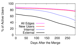
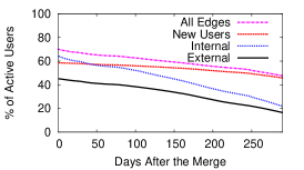
Figure 8(a) shows the number of active users over time for Xiaonei, while Figure 8(b) focuses on the 5Q users. Each “all edges” line highlights the number of users actively creating edges in each group. Although we have 384 days of data after the merge, the x-axis of Figures 8(a) and 8(b) only extends 290 days. Since our minimum activity threshold is 94 days, we cannot determine whether users have become inactive during the tail of our dataset.
We now address the question: how many duplicate accounts were there on Xiaonei and 5Q? Users with accounts on both services were prompted to choose one account or the other on their first log-in to Renren after the merge. However, the discarded accounts were not deleted from the graph. Thus, it is likely that any accounts that are inactive on the first day after the merge are discarded, duplicate accounts.
Figures 8(a) and 8(b) reveal that 11% of Xiaonei accounts and 28% of 5Q accounts are immediately inactive. Thus, it is likely that at least 39% of users had duplicate accounts on Xiaonei and 5Q before the merge. Interestingly, users demonstrate a strong preference for keeping Xiaonei accounts over 5Q accounts.
As time goes on, the number of active accounts in each group continues to drop. Presumably, these users lose interest in Renren and stop generating new friend relationships. After 284 days, the number of inactive Xiaonei accounts doubles to 23%, while on 5Q, 52% of accounts are inactive. The relative decrease in active accounts over time (12% on Xiaonei versus 24% on 5Q) demonstrates that Xiaonei users are more committed to maintaining their OSN presence. This observation corresponds to our earlier finding that users with duplicate accounts tended to keep their Xiaonei accounts. Xiaonei users form a self-select population of more active OSN users when compared to 5Q users.
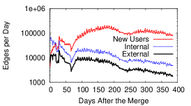
The “new users,” “internal,” and “external” lines give the first glimpse of the types of connections favored by Xiaonei and 5Q users. For each line, a user is considered active only if they have created an edge of the corresponding type in the last 94 days. Users in both graphs show similar preferences: edges to new users are most popular, followed by internal and then external edges. The large activity gap between internal and external edges highlights the strong homophily among each group of users. Internal and external edge creation activity declines more rapidly than edges to new users. This makes sense intuitively: the number of Xiaonei and 5Q users is static, and hence the pool of possible friends slowly empties over time as more edges are created.
Edge Creation Over Time. Next, we switch focus to look at the characteristics of edges, rather than individual users. By looking at the relative amounts of internal, external, and edges to new users that are created each day, we can identify what types of connections are driving the dynamic growth of Renren after the merge.
Figure 8(c) shows the number of internal, external, and new edges created per day. Initially, internal and external edges are more numerous than edges to new users. However, 3 days after the merge new edges begin to outnumber external edges, and by day 19 new edges out pace internal edges as well. This result demonstrates that new users quickly become the primary driver of edge creation, as opposed to new edges between older, established users. This is not surprising: since Renren is growing exponentially, the number of new users eventually dwarfs the sizes of Xiaonei and 5Q, which remain static.
Note that this result does not conflict with the results presented in Section 3. Section 3 examines the edge creation patterns over the lifetime of all Renren users. In this section, we are comparing the edge creation patterns of users who existed before the merge to everyone who joined after. Thus, the age “buckets” in this section are very course.
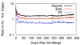
We now ask the question: are there differences between the types of edges created by Xiaonei and 5Q users? Although Figure 8(c) demonstrates that internal edges always outnumber external edges, the reality of the situation is more complicated when the edges are separated by OSN.
Figure 9(a) plots the ratio of internal to external edges over time for Xiaonei and 5Q. Initially, users on both OSNs favor creating internal edges (i.e. the ratio is 1). However, by day 16, the ratio for 5Q users starts to permanently favor external edges. The reason for this strange result is that Xiaonei users create more than twice as many edges than 5Q users. In our dataset Xiaonei users create 3.9 million internal edges, while 5Q users only create 1.5 million. However, unlike internal edges, external edges affect the statistics for both groups. Thus, the number of external edges (2.2 million total in our dataset) is driven by the more active user base. Even though Xiaonei users create less external edges than internal edges, the number is still proportionally greater than the number of internal edges created between 5Q users. The “both” line in Figure 9(a) is always 1 because Xiaonei users create more edges overall, which weights the average upwards.
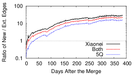
Figure 9(b) plots the ratio of edges to new users versus external edges over time for Xiaonei and 5Q. This plot reveals that the inflection point where users switch from preferring external edges to new edges is different for the two OSNs. The ratio becomes 1 for Xiaonei 5 days after the merge, whereas 5Q takes 32 days. Despite these differences, both OSNs demonstrate the same overall trend for the ratio to eventually tip heavily in favor of edges to new users.
Distance Between Xiaonei and 5Q. Finally, we examine the practical consequences of edge creation between Xiaonei and 5Q. Our goal is to answer the question: at what point do Xiaonei and 5Q become so interconnected that they can no longer be considered separate graphs?
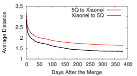
To answer this question, we calculate the distance, in hops, between users in each group. Intuitively, the distance between the groups should decrease over time as 1) more external edges are created, and 2) more internal edges increase the connectivity of users with external edges. In our experiments, we select 1,000 random users from each OSN on each day after the merge and calculate the shortest path from each of them to any user in the opposite OSN. Thus, the lowest value possible in this experiment is 1, e.g. the randomly selected user has an external edge directly to a user in the opposite OSN. New users and edges to new users are not considered in these tests.
Figure 9(c) shows that the average path length between the two OSNs rapidly declines over time. Although average path lengths for both OSNs initially start above 3 hops, within 47 days average path lengths are 2. Path lengths from Xiaonei to 5Q are uniformly shorter, and by the end of the experiment the average path length is 1.5.
The distance between Xiaonei and 5Q rapidly approaches an asymptotic lower bound in Figure 9(c). Once this bound is reached, it is apparent that the graphs can become no closer together. Thus, we conclude that by day 50, when both lines begin to flatten and approach the lower bound, Xiaonei and 5Q can no longer be considered separate OSNs. These results demonstrate how quickly the two disjoint OSNs can merge into a single whole, even when edge creation is biased in favor of internal edges (see Figure 9(a)).
5.3 Summary of Results
Our analysis of the network merge produces several high-level conclusions:
-
•
There were a large number of duplicate accounts between Xiaonei and 5Q that become inactive immediately after the merge.
-
•
Edges to new nodes quickly become the driving force behind edge creation.
-
•
Despite user’s preference against external edges, Xiaonei and 5Q very quickly merge into a single, well connected graph.
We also observe that the network merge alters user’s edge creation patterns for a short time (until equilibrium is restored):
-
•
The total number of edges created per day increases, driven by the sudden appearance of so many new users.
-
•
Users individual preferences for internal/external edges changes drastically in the days following the merge.
-
•
Xiaonei users are more active than 5Q users. Thus, the external edges created between Xiaonei and 5Q force 5Q users to become more active than they normally would be.
6 Related Work
Dynamic OSN Measurement. Several studies have measured basic dynamic properties of graphs. [21] analyzed four citation and patent graphs, and proposed the forest fire model to explain the observed graph densification and shrinking diameter. [20] studied details of dynamics in four OSNs to confirm preferential attachment and triangle closure features. Similar conclusions were reached by studies on Flickr [25] and a social network aggregator [9]. [15] measured network temporal radius and found out that there is a gelling point to distribution. In addition, [2] measured weighted dynamic graphs, [1] analyzed the growth of a Korean OSN, and [32] considered temporal user interactions as graph edges instead of static friendship. Finally, [11, 17] analyzed blogspace dynamics.
Some studies focused on analyzing social network dynamics through explicitly defined groups [4, 37, 13] or disconnected components [18, 24, 14]. [17] tried to identify blog communities and detect bursts in different temporal snapshots. [27] utilized the clique percolation method [8] to identify overlapping community dynamics in mobile and citation graphs. Unlike these studies, our work focuses on the evolution of implicit communities in a densely connected, large-scale social graph.
Dynamic Community Detection and Tracking Algorithms. There are two approaches to detecting and tracking dynamic communities. One approach is to minimize the self-defined temporal cost of communities between snapshots. [31] proved that this problem is NP-hard and then several works [31, 30, 22] proposed approximation algorithms. However, these algorithms only scale to graphs with thousands of nodes. [28] and [16] propose dynamic community detection algorithms that scale to graphs with hundreds of thousands of nodes. The drawback of [28] is that it cannot track individual community evolution.
The other approach is to match communities detected by static community detection algorithms across temporal snapshots. [10] maps communities between snapshots if their similarity is higher than a threshold. [3, 29] tracks communities between snapshots based on critical community events. These algorithms do not consider any temporal correlation of communities when they detect communities between snapshots.
7 Conclusion
This work presents a detailed analysis of user dynamics in a large online social network, using a dataset that covers the creation of 19 million users and 199 million edges over a 25 month period. More specifically, we focus on analyzing edge dynamics at different levels of scale, including dynamics at the level of individual users, dynamics involving the merge and split of communities, and dynamics involving the merging of two independent online social networks.
Our analysis produced a number of interesting findings of dynamics at different scales. First, at the individual node level, we found that the preferential attachment model gradually weakens in impact as the network grows and matures. In fact, edge creation in general becomes increasingly driven by connections between existing nodes as the network matures, even as node growth keeps pace with the growth in overall network size. Second, at the community level, we use an incremental version of the popular Louvain community detection algorithm to track communities across snapshots. We empirically analyze the birth, growth, and death of communities across merge and split events, and show that community merges can be predicted with reasonable accuracy using structural features and dynamic metrics such as acceleration in community size. Finally, we analyze detailed dynamics following a unique event merging two comparably-sized social networks, and observe that its impact, while significant in the short term, quickly fades with the constant arrival of new nodes to the system.
While our results from Renren may not generalize to all social networks, our analysis provides a template for understanding the dynamic processes that are active at different scales in many complex networks. A significant take-away from our work is that the actions of individual users are not only driven by dynamic processes at the node-level, but are also significantly influenced by events at the community and network levels. A comprehensive understanding or model of an evolving network must account for changes at the network and community levels and their impact on individual users.
References
- [1] Ahn, Y., Han, S., Kwak, H., Moon, S., and Jeong, H. Analysis of topological characteristics of huge online social networking services. In Proc of WWW (2007).
- [2] Akoglu, L., McGlohon, M., and Faloutsos, C. RTM: Laws and a recursive generator for weighted time-evolving graphs. In Proc. of ICDM (2008).
- [3] Asur, S., Parthasarathy, S., and Ucar, D. An event-based framework for characterizing the evolutionary behavior of interaction graphs. ACM TKDD 3, 4 (2009), 16.
- [4] Backstrom, L., Huttenlocher, D., Kleinberg, J., and Lan, X. Group formation in large social networks: membership, growth, and evolution. In Proc. of KDD (2006).
- [5] Barabási, A., and Albert, R. Emergence of scaling in random networks. Science 286, 5439 (1999), 509.
- [6] Blondel, V., Guillaume, J., Lambiotte, R., and Lefebvre, E. Fast unfolding of communities in large networks, 2008. J. Stat. Mech.
- [7] Clauset, A., Newman, M., and Moore, C. Finding community structure in very large networks. Physical review E 70, 6 (2004).
- [8] Derényi, I., Palla, G., and Vicsek, T. Clique percolation in random networks. Physical review letters 94 (2005).
- [9] Garg, S., Gupta, T., Carlsson, N., and Mahanti, A. Evolution of an online social aggregation network: an empirical study. In Proc. of IMC (2009).
- [10] Greene, D., Doyle, D., and Cunningham, P. Tracking the evolution of communities in dynamic social networks. In Proc. of ASONAM (2010).
- [11] Guo, L., Tan, E., Chen, S., Zhang, X., and Zhao, Y. Analyzing patterns of user content generation in online social networks. In Proc. of KDD (2009).
- [12] Jiang, J., Wilson, C., Wang, X., Huang, P., Sha, W., Dai, Y., and Zhao, B. Y. Understanding latent interactions in online social networks. In Proc. of IMC (2010).
- [13] Kairam, S., Wang, D., and Leskovec, J. The life and death of online groups: predicting group growth and longevity. In WSDM (2012).
- [14] Kang, U., McGlohon, M., Akoglu, L., and Faloutsos, C. Patterns on the connected components of terabyte-scale graphs. In Proc. of ICDM (2010).
- [15] Kang, U., Tsourakakis, C., and Faloutsos, C. Radius plots for mining tera-byte scale graphs: Algorithms, patterns, and observations. In Proc. of SDM (2010).
- [16] Kim, M., and Han, J. A particle-and-density based evolutionary clustering method for dynamic networks. Proceedings of the VLDB Endowment 2, 1 (2009), 622–633.
- [17] Kumar, R., Novak, J., Raghavan, P., and Tomkins, A. On the bursty evolution of blogspace. World Wide Web 8, 2 (2005), 159–178.
- [18] Kumar, R., Novak, J., and Tomkins, A. Structure and evolution of online social networks. In Proc. of KDD (2006).
- [19] Kwak, H., Choi, Y., Eom, Y., Jeong, H., and Moon, S. Mining communities in networks: a solution for consistency and its evaluation. In Proc. of IMC (2009).
- [20] Leskovec, J., Backstrom, L., Kumar, R., and Tomkins, A. Microscopic evolution of social networks. In Proc. of KDD (2008).
- [21] Leskovec, J., Kleinberg, J., and Faloutsos, C. Graphs over time: densification laws, shrinking diameters and possible explanations. In Proc. of KDD (2005).
- [22] Lin, Y., Chi, Y., Zhu, S., Sundaram, H., and Tseng, B. Facetnet: a framework for analyzing communities and their evolutions in dynamic networks. In Proc of WWW (2008).
- [23] LinkedIn Infrastructure Team. Data infrastructure at linkedin. In Proc. of ICDE (2012).
- [24] McGlohon, M., Akoglu, L., and Faloutsos, C. Weighted graphs and disconnected components: patterns and a generator. In Proc. of KDD (2008).
- [25] Mislove, A., et al. Growth of the flickr social network. In Proc. of WOSN (2008).
- [26] Newman, M., and Girvan, M. Finding and evaluating community structure in networks. Physical review E 69, 2 (2004).
- [27] Palla, G., Barabasi, A., and Vicsek, T. Quantifying social group evolution. Nature 446, 7136 (2007), 664–667.
- [28] Sun, J., Faloutsos, C., Papadimitriou, S., and Yu, P. Graphscope: parameter-free mining of large time-evolving graphs. In Proc. of KDD (2007).
- [29] Takaffoli, M., et al. A framework for analyzing dynamic social networks. Applications of Social network Analysis (ASNA) (2010).
- [30] Tantipathananandh, C., and Berger-Wolf, T. Constant-factor approximation algorithms for identifying dynamic communities. In Proc. of KDD (2009).
- [31] Tantipathananandh, C., Berger-Wolf, T., and Kempe, D. A framework for community identification in dynamic social networks. In Proc. of KDD (2007).
- [32] Viswanath, B., Mislove, A., Cha, M., and Gummadi, K. On the evolution of user interaction in facebook. In Proc. of WOSN (2009).
- [33] Wakita, K., and Tsurumi, T. Finding community structure in mega-scale social networks. CoRR abs/cs/0702048 (2007).
- [34] Wilson, C., Boe, B., Sala, A., Puttaswamy, K. P. N., and Zhao, B. Y. User interactions in social networks and their implications. In Proc. of EuroSys (April 2009).
- [35] Zachary, W. An information flow model for conflict and fission in small groups. Journal of anthropological research (1977), 452–473.
- [36] Zhang, T. An introduction to support vector machines and other kernel-based learning methods. AI Magazine 22, 2 (2001), 103.
- [37] Zheleva, E., Sharara, H., and Getoor, L. Co-evolution of social and affiliation networks. In Proc. of KDD (2009).