Gindraft=false
Testing long-term earthquake forecasts: likelihood methods and error diagrams
Abstract
We propose a new method to test the effectiveness of a spatial point process forecast based on a log-likelihood score for predicted point density and the information gain for events that actually occurred in the test period. The method largely avoids simulation use and allows us to calculate the information score for each event or set of events as well as the standard error of each forecast. As the number of predicted events increases, the score distribution approaches the Gaussian law. The degree of its similarity to the Gaussian distribution can be measured by the computed coefficients of skewness and kurtosis. To display the forecasted point density and the point events, we use an event concentration diagram or a variant of the Error Diagram (ED).
We demonstrate the application of the method by using our long-term forecast of seismicity in two western Pacific regions. We compare the ED for these regions with simplified diagrams based on two-segment approximations. Since the earthquakes in these regions are concentrated in narrow subduction belts, using the forecast density as a template or baseline for the ED is a more convenient display technique. We also show, using simulated event occurrence, that some proposed criteria for measuring forecast effectiveness at EDs would be strongly biased for a small event number.
Key words: Probabilistic forecasting; Spatial analysis; Fractals and multifractals; Probability distributions; Earthquake interaction, forecasting, and prediction; Statistical seismology.
1 Introduction
This paper continues our analysis of stochastic point process forecast verification (Kagan 2007b). There (ibid.) we had discussed two interrelated methods for measuring the effectiveness of earthquake prediction algorithms: the information score based on the likelihood ratio (Kagan 1991) and the “Error Diagram” (ED). These methods have been applied (Kagan 2007b) to temporal renewal stochastic processes, but only for very long processes with the number of events approaching infinity.
In this work we extend our analysis by 1) discussing spatial (not temporal) random processes (fields); 2) considering forecast testing if the number of events is relatively small; 3) applying newly developed techniques to long-term earthquake forecasts.
Two issues are related to the problem of testing point process forecasts: 1) Spatial random point fields density evaluation and its prediction is a mature discipline with many publications. Baddeley et al. (2005), Baddeley (2007), Daley and Vere-Jones (2003, 2008) provide reviews. As we explain below, the earthquake forecasting problem is different in many respects from regular density evaluation and requires special treatment. However, some results of this paper can be applied to test the forecast of a random spatial pattern. 2) Well-developed application methods exist in weather and climate prediction; their reviews have been recently published by Jolliffe & Stephenson (2003), Palmer & Hagedorn (2006), DelSole & Tippett (2007). These prediction methods consider continuous processes and fields; however, with necessary modifications some of these methods can be used for stochastic point processes.
Our main focus here is on the two most widely used approaches to assessing earthquake prediction methods (Zaliapin & Molchan 2004). Both approaches evaluate how a prediction method reveals new information about impending earthquake activity. The first approach starts by estimating the expected spatio-temporal distribution of seismicity and uses the classical likelihood paradigm to evaluate predictive power. Accordingly, it uses the nomenclature of statistical estimation. The second one applies the results by Molchan (1990, 1997; see also Molchan & Keilis-Borok 2008) who proposed error diagrams for measuring prediction efficiency. The EDs plot the normalized rate of failures-to-predict () versus the normalized time of alarms (). The ED can be considered as a time-dependent analog of the Neyman-Pearson lemma on making a decision: should we expect an earthquake within a given spatio-temporal region? Consequently, it uses the language of hypothesis testing.
The error diagram is related to the Relative Operating Characteristic (ROC) (Swets 1973; Mason 2003, pp. 66-76), used in signal detection and weather prediction efforts. In the ROC diagrams the success rate of an event prediction is compared against the false alarm rate.
Starting with Molchan’s (1990) paper, previous EDs were almost exclusively time-dependent. We apply the ED to time-independent spatial earthquake distributions. In some respects, the earthquake spatial pattern is more difficult to analyze than the temporal distribution. In the latter case, we have a reasonable null model (the uniform in time Poisson process) which can be compared to any test model. In the spatial case, the simple model of uniformly distributed seismicity can hardly serve as an initial approximation; even large earthquakes (which often can be well-approximated by a Poisson temporal process) are strongly clustered in space. This property of seismicity is caused by the fractal nature of earthquake spatial distribution (Kagan 2007a). Although in our forecast (Kagan & Jackson 2000) we use a projection of earthquake centroids on the Earth surface which smoothes their spatial distribution (Kagan 2007a), the spatial distribution still preserves a self-similar fractal pattern with large parts of the Earth practically aseismic.
Diagrams similar to EDs have been used previously to describe spatial distribution of seismicity: Rong & Jackson (2002, their Fig. 3); Kagan et al., (2003, their Fig. 5.3); Helmstetter et al., (2007, their Fig. 4); and Shen et al., (2007, their Figs. 1B, 2B) created spatial “Concentration Diagrams” to characterize the agreement (or lack thereof) between the predicted seismicity distribution and future earthquakes. These diagrams plot the fraction of the event success rate (equivalent to ) versus the normalized area (), sorted by probability density. The sorting is largely analogous to water-level threshold analysis (Zechar & Jordan 2008). These concentration diagrams can easily be converted to EDs by adding an ascending diagonal and then reflecting the plot in the line ordinate ().
In principle, such diagrams can be treated like ROC plots where cells with events are considered as success and empty cells as false alarms. However, this interpretation encounters difficulties when the cells are not infinitesimally small, so some may contain more than one event. Moreover, as we show below, for a point process on a sphere it is difficult to define cells of equal size. Usual sphere subdivision yields unequal cells larger at the equator and smaller towards the poles.
Characterizing prediction performance is a major challenge for ED analysis. Since prediction results are represented by a function (curve), it is important to find a simple one-parameter criterion (a functional) that briefly expresses the efficiency value. Several functionals have been proposed, each with some advantages or disadvantages. For example, Kagan & Jackson (2006, their Section 5) show that two ED trajectories with a very different behavior have the same “Sum of Errors” () value, which often is proposed as a measure of ED forecast efficiency (Kossobokov 2006; Molchan & Keilis-Borok 2008).
2 Long-term earthquake forecasts
Kagan & Jackson (1994, 2000) present long-term and short-term earthquake forecasts in several regions using the CMT catalog (Ekström et al. 2005; http://www.globalcmt.org/). The forecasted earthquake rate is calculated as a spatially smoothed earthquake distribution. The spatial kernel used in the smoothing has units of earthquakes per unit area and time. In our studies it applies to all shallow (depth less or equal 70 km) earthquakes with moment Nm (magnitude 5.8) and greater. The kernel is elongated along the fault-plane, which is estimated from available focal mechanism solutions.
To take into account the impact of earthquakes outside the forecasted regions boundaries, we consider events up to 1000 km outside the region window. The rate density from those earthquakes is added to the forecast density of ‘inside’ events applying the kernel estimates. This additional probability density from outside events is on average balanced by a contribution ‘leakage’ from many ‘insider’ earthquakes close to the boundaries.
An important feature of Kagan & Jackson’s (1994) method is a jack-knife like procedure (Silverman 1986) for testing the predictive power of the smoothing. It optimizes the kernel parameters choosing those values which best predict the second half of a catalogue, using a maximum likelihood criterion, from the first half. We argue that because the seismicity pattern exhibits a long-term clustering (Kagan & Jackson 1991), such a procedure is better suited to predict the future earthquake rate. We also assume on an ad hoc basis (Kagan & Jackson 1994, 2000) that the background probability density is uniform over the whole region and integrates to 1% of the total earthquake rate
| (1) |
with .
Kagan (2007a) shows that the fractal dimension of earthquake hypocenters, , strongly depends on the earthquake catalog time interval. For temporally short catalogs is close to zero and approaches the asymptotic value for catalogs of decades length. In a more intuitive setting, this result signifies that in short time intervals, hypocenters are concentrated in a few point clouds. With increased time, seismicity spreads over a fault system or seismic belt length, eventually occupying a set with the dimension in excess of the 2-D plane. Therefore, if one uses a set of earthquake epicenters in a relatively short catalog to predict the future seismicity rate, the optimal forecast kernel should spread beyond the presently available event points, i.e., to be smoother than the standard density estimators (Silverman 1986) would suggest.
The forecasts are expressed as the rate density (that is, the probability per unit area and time). They are updated every day and posted for two western Pacific regions at http://scec.ess.ucla.edu/ykagan/predictions_index.html (see FORECAST TEST FOR 2004-2006:). Table 1 displays a small extract of the forecast tables available at the Web site. In this Table we sorted (ordered) entries by the values of earthquake forecast densities.
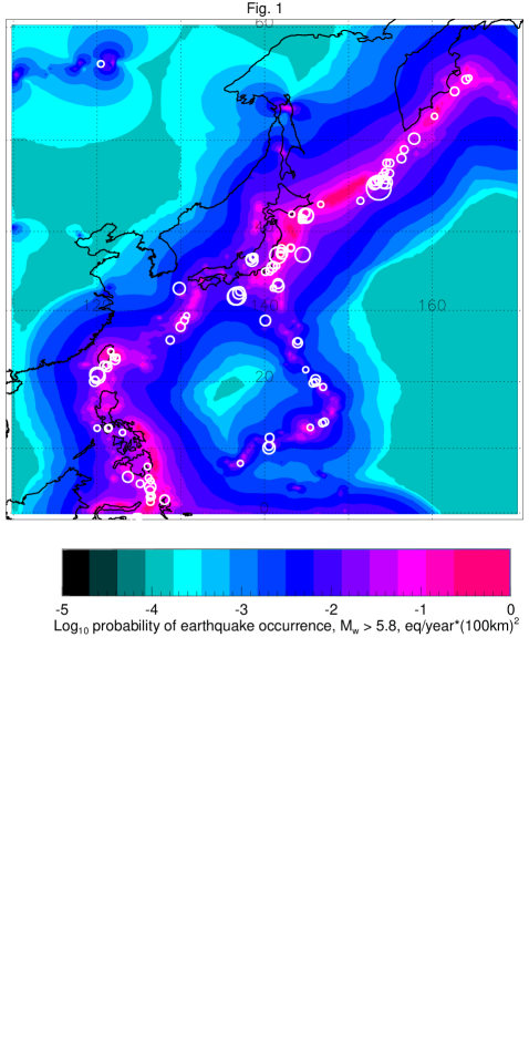
In Fig. 1 we display the long-term forecast map computed for the northwest (NW) Pacific region using the CMT catalog for 1977-2003. Shallow earthquakes in 2004-2006 are shown in white. Similar maps for NW and southwest (SW) Pacific are shown, for instance, in Figs. 8a,b by Kagan & Jackson (2000). On visual inspection, the model predicts the spatial distribution of seismic activity reasonably well. We tested this forecast by a Monte-Carlo simulation (Kagan & Jackson 1994).
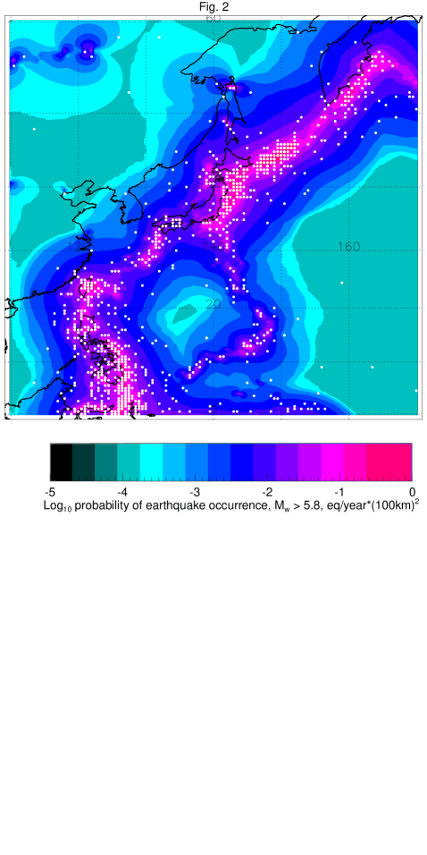
In Fig. 2 we show the forecasted earthquake density with 10 sets of synthetic catalogs, each having 108 events. Earthquakes are assumed to occur at the centers of grid cells; therefore some of the grid points are occupied by more than one event. Some of the simulated points occur in areas of low seismicity (compare Fig. 2 with Fig. 1). As mentioned above, this feature of the forecast is used to prevent surprises, i.e., an occurrence of earthquakes in zones where no nearby events happened in 1977-2003.
Table 2 summarizes annual earthquake rates for both western Pacific regions. Because events outside the region’s boundaries have influence, the rates calculated through the smoothing procedure and evaluated by a direct method (dividing the earthquake numbers by time interval) are close but do not coincide.
3 Log-likelihood
Kagan & Knopoff (1977, see also Vere-Jones 1998) suggested measuring the effectiveness of the earthquake prediction algorithm by first evaluating the likelihood ratio to test how well a model approximates an earthquake occurrence. In particular, they estimated the information score, , per one event by
| (2) |
where is the log-likelihood ratio, is the number of earthquakes in a catalog, is used to obtain the score measured in the Shannon bits of information, is the probability of earthquake occurrence according to a stochastic model, conditioned by the past:
| (3) |
where is the past history of the process up to the moment , and is a similar probability for the event occurrence according to the Poisson process.
The Poisson process rate can be calculated by normalizing the seismicity level in the forecast regions. Several rates, such as shown in Table 2, can be used in the normalization. To make our results comparable to the forecast rate density, we use values
| (4) |
where is the annual rate of earthquakes in each region in 1977-2003 (Table 2), and are the upper and lower latitudes, respectively, and ditto for longitudes. For the NW-Pacific region eq/(day km2); for the SW-Pacific eq/(day km2).
Several methods can be used in calculating the information score for a set of forecasted events. Using the forecasted rate values ( for cell centers in which earthquakes occurred) we compute
| (5) |
where is the number of events.
In Eq. 5 and in derivations below, we assume that earthquakes in the cells are identically distributed independent (i.i.d.) events. The assumed independence may be challenged by the clustered nature of earthquake occurrence of which foreshock-mainshock-aftershock sequences are the most clear example (Kagan & Knopoff 1977; Kagan 1991). However, given the high magnitude (5.8) threshold for the CMT catalog, the clustering is less pronounced. The dependent events on average constitute only about 0.2 of the total seismic activity (Kagan & Jackson 2000, Eq. 23). Thus, we expect that earthquake statistical inter-dependence would have relatively small influence.
As another option, instead of (5) we compute the information score for the actual epicenter (centroid) locations ()
| (6) |
In simulated catalogs we generate multiple () sets of events (Table 2) and calculate the rate for cell centers as the earthquake location (see Fig. 2)
| (7) |
and
| (8) |
This method has an advantage in that we do not need to calculate the rate densities again, as for , but instead use the previously computed forecast tables (as shown in Table 1) to evaluate the scores.
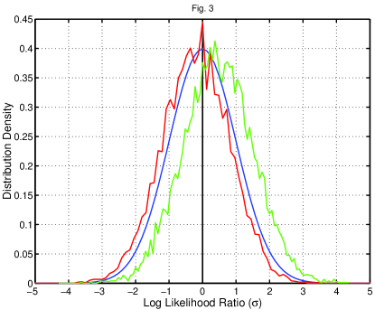
In Fig. 3 we display the log-likelihood function distribution differences for the simulation as shown in Fig. 2. We simulate earthquake locations according to 1977-2003 forecasts for each region. Each time we calculate the log-likelihood function and subtract the log-likelihood function value obtained for the real catalogue in 2004-2006. Thus, we display the histogram of (Eqs. 7 and 6).
4 Error diagrams
To test the long-term forecast efficiency numerically, we calculate the concentration diagram. To make these diagrams, we divide the region into small cells (0.5 by 0.5 degrees) and estimate the theoretical forecast rate of earthquakes above the magnitude threshold for each cell. We then count the events that actually occurred in each cell, sort the cells in the decreasing order of the theoretical rate, and compute the cumulative values of forecast and the observed earthquake rates (see Table 1). Similar plots have been used in several of our papers (Kagan et al. 2003; Helmstetter et al. 2007; Shen et al. 2007). In effect, these diagrams are equivalent to the error diagrams (EDs) proposed by Molchan (1990, 2003) and Molchan & Kagan (1992). But in this case we use the normalized spatial area, not time, as the horizontal axis.
4.1 Relation between the error diagram and information score
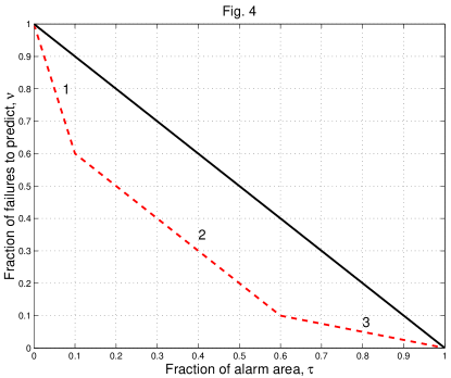
We illustrate the ED by a sketch in Fig. 4. For the spatial point distribution, this example is easier to construct and explain than for temporal renewal processes (Kagan 2007b). The square’s diagonal corresponds to the uniform Poisson distributions of the points in a region, i.e., a random guess forecast strategy. As a test example, we assume that the region consists of three sub-areas, their surfaces is 0.1, 0.5, and 0.4 of the total, and the number of events is 0.4, 0.5, and 0.1, in each zone respectively. The points in these zones are distributed according to the Poisson spatial process with the density . Then, the information score for such a point distribution can be calculated as (see Eq. 2)
| (9) |
For the normalized point Poisson distribution in the ED, the point density is unity. Hence its contribution to the information rate (9) is zero.
The information score can be calculated for continuous concave curves in an error diagram (Kagan 2007b)
| (10) |
If the ED consists of several linear segments (as in Fig. 4), then (10) converts to
| (11) |
where are cell numbers, is the total number of grid points, and and are the normalized rates of occurrence and cell area:
| (12) |
see Table 1. When such calculations are made for a spherical surface (as in Figs. 1-2), the steps are usually unequal in size, unless a special effort is made to partition a sphere into equal-area cells (see more in Kagan & Jackson 1998). This cell inequality complicates the calculation.
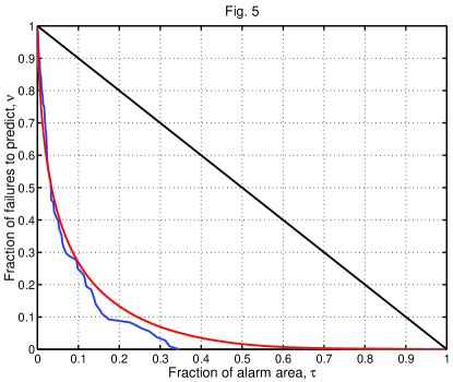
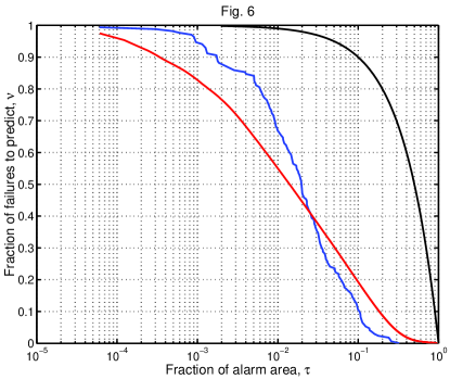
Figs. 5 and 6 show the EDs for both Pacific regions. The red curves are for the forecast, based on 1977-2003 seismicity, and the blue curves are for the earthquakes which occurred in these regions from 2004-2006. Both sets of curves are calculated using the forecast tables like those in the example (Table 1). In principle, the calculations such as in (12) can be made with unordered cells. The density ordering in Table 1 and Figs. 5, 6 is performed to create the ED diagrams.
The score values in Table 3 are calculated using the distribution shown by the red curves in Figs. 5, 6. The values for NW- and SW-Pacific indicate that the forecast yields an information score higher than 2-3 bits per event. This means that on average the probability gain (G) is a factor of 5 to 10 ( to ) when using the long-term forecast compared to a random guess. Of course, these values do not fully describe the forecast advantage. The boundaries of both regions have already been selected to contain the maximum number of earthquakes in relatively small areas. If we extend any of the regions toward the seismically quiet areas, the information score would significantly increase. The proper measure of long-term forecast effectiveness would extend the forecast method globally, i.e., over the whole Earth surface. Limited numerical experiments suggest that depending on degree of smoothing, the value of (Eq. 1), and other factors, the G-value for world-wide seismicity varies from about 10 to 25.
The above values of the probability gain, G, can be compared with similar calculations by Rhoades & Evison (2005, 2006), Console et al. (2006), and Rhoades (2007). These authors calculated the information rate per earthquake for a model of smoothed seismicity (PPE), similar to our long-term model. The PPE model was compared to a stationary and spatially uniform Poisson (SUP) model. The probability gain, computed using the information rate, for New Zealand, Japan, Greece, and California is about 4.5, 1.6, 1.6, and 3.4, respectively. These relatively small gain values are related with the choice by the authors of the regions that include only seismically active areas (see ibid.). Helmstetter et al. (2007, Table 1) obtained for different long-term seismicity predictive models in California the G-values ranging from 1.2 to 4.8.
The ED curves for earthquakes in Figs. 5, 6 are similar to the forecast earthquake curves. The computation of the likelihood scores (5, 6) shows that the NW earthquakes have a better score than the forecast, whereas SW events display the opposite behavior (see also Fig. 3). The scores using the actual centroid position () are larger than those for the cell centers (), an anticipated feature. Similarly, Table 3 shows that the average scores for synthetics () are very close to those of , which is understandable, since the simulation runs are extensive (see Eqs. 7, 8).
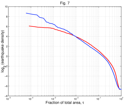
Fig. 7 shows the frequency curves for the log-likelihood function of both western Pacific regions. We display of the normalized rate (see column 5 of Table 1) against the normalized cumulative area of the cells (column 4). Curves for both regions exhibit high values of the rate () concentrated in a relatively small fraction of area. Low values at the right-hand end of the diagram correspond to the assumed uniform background probability density (Section 2, see also Figs. 1-2).
We calculate the higher order moments for the error curve ( of Eq. 11 corresponds to the first moment )
| (13) |
where .
The standard deviation of the log-likelihood for the set of events is
| (14) |
where is the earthquake number during 2004-2006 (see Table 2). The coefficient of skewness is
| (15) |
and coefficient of kurtosis is
| (16) |
These coefficients characterize how the likelihood curve differs from the Gaussian distribution; for the latter law both coefficients should be zero. The Central Limit theorem states that for large numbers of i.i.d. events their distribution should approach the Gaussian law. If the event number is small, we need to find an efficient way to numerically approximate the distribution of the sum of i.i.d. random variables.
In Table 3 both coefficients are large for one event likelihood curve (see also Fig. 7), but for the set of events they are small: the distribution is close to the Gaussian law as demonstrated in Fig. 3. The difference between the score values to is less than the standard error value (see Table 3). Thus both forecasts can be considered statistically successful.
The difference
| (17) |
shows the predictive efficiency of a forecast, i.e., whether on average earthquakes in 2004-2006 occurred at the sites listed in the prediction table (see an example in Table 1). For this particular time interval, both forecasts are sufficiently good. However, as other examples (Kagan & Jackson 2000, Fig. 9; Kagan et al. 2003, Fig. 5.2) demonstrate, this is not always the case. The values of differences (negative for the NW-Pacific and positive for the SW-Pacific) correspond to those simulations in Fig. 3, where we display the distribution of the difference .
By applying (11) to the blue curve of earthquakes in 2004-2006 in Figs. 5, 6 we evaluate the information score
| (18) |
(see Table 3). The value of is obviously significantly larger than all the other estimates of the score. Earthquake simulations provide an explanation for this feature (see Fig. 10 below).
4.2 Two-segment error diagrams and information score
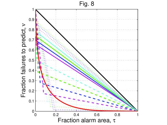
Similarly to Fig. 5 in Kagan (2007b), in Fig. 8 we display the approximation of the ED for the NW-Pacific by several two line segment diagrams with the same value of the information score, .
For the assumed information score , the contact point of two segments is defined by the equation (corrected Eq. 22 by Kagan 2007b)
| (19) |
By solving this equation for any value of the first segment slope (non-positive by definition), one obtains the -value for the contact point of two linear segments, .
The first of these curves has the second segment coinciding with the abscissa axis. This means that one can obtain the same information score by concentrating all the points in the part of the region. However, though the -value for such a pattern would be 2.36 bits, all points would have the same value of the probability gain. Hence, for such a likelihood value distribution, the variance and higher-order moments would be zero: very different from the actual probability gain pattern (Table 1). If we modify the two-segment model to distribute the events with different densities over the whole area, the variance and the other moments would be non-zero.
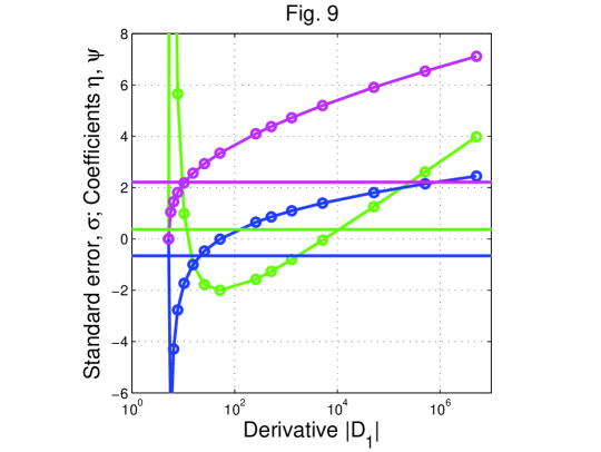
In Fig. 9 we show the dependence of the lower-order moments for the likelihood score on the slope. For (dashed magenta line, fifth curve from the bottom) the 2nd, 3rd, and 4th moments correspond roughly to the moments of the forecasted densities. Thus, such a two-segment model would reasonably well approximate the actual event distribution.
The contact coordinates of two segments for this curve are: and . Therefore, the point pattern having apparently the same lower-order moments as the actual earthquake forecast would have about 83% of points concentrated in 8% of the area, i.e., the point density will be 10.3 times higher than the uniform Poisson rate. The rest of the events would be distributed in 92% of the area and have the rate of 0.19 compared to the uniform Poisson distribution. As we mention in Section 2, in our Pacific forecast 0.01 part of the total earthquake rate is spread over the entire region (see Eq. 1 and Figs. 1-2).
4.3 Information score for 1977-2003 CMT and PDE catalogs
ED displays in Figs. 5, 6 are inconvenient since the most interesting parts of the curves are concentrated near and -axes. The reason for this feature is that seismicity is concentrated in relatively narrow seismic belts having a fractal spatial earthquake distribution. Now we focus on how other curves deviate from the forecasted (red) one. To make these deviations show more prominently, we need to display the curves in a relative abscissa format, using the 1977-2003 forecast density as a template or baseline for the likelihood score calculation.
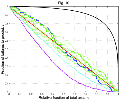
Fig. 10 shows several curves in a new format; in effect we convert the red curve in Fig. 5 to the diagonal. This is equivalent to calculating the information scores by using as a reference density
| (20) |
where is a rate density for all the other point distributions. Fig. 10 shows the difference between the forecast curve (red) and the earthquake curve (blue) better than Fig. 5.
Fig. 10 also displays the curve for the 1977-2003 CMT catalog. The numbers of events in the cell areas are shown in Table 1, column 8. Also shown is the curve for the PDE catalog (U.S. Geological Survey 2008) for 1968-2006. We obtain bits/event for the 1977-2003 CMT catalog and bits for the PDE. These values are significantly larger than those forecasted for 2004-2006. Therefore, our forecast predicts better locations of past earthquakes than those of future events. Why this paradox? In our forecast we use a broader smoothing kernel to capture the spread of seismicity with time (Section 2). Had we used the standard density estimation methods (Silverman 1986), the optimal kernel width would likely be smaller, but such a smoothing would not effectively forecast future seismicity. A similar explanation is apparently valid for the PDE score value. Helmstetter et al. (2007, Table 1) obtained (significantly higher than the G-values for predictive algorithms) when the same data were used to build the long-term seismicity model and to test it (see Section 4.1).
In Fig. 10 we also show several curves for the simulated earthquakes. These curves explain why the -value (18) is significantly larger than the other measures of the information score. The reason is twofold. First, the number of events in the 3-year interval is relatively small and the curves often fluctuate around the expected value (the red curve). These fluctuations increase the sum value in (18). The curves are often below the red forecast line, which would usually cause the score value to increase. Second, the ED curve should be concave (Molchan 1997; 2003). -values, listed in Table 3, are calculated with the original curves shown in Figs. 5, 6 which have many convex sections. If we make a lower envelope of the curve points, this would decrease the -value. However, our numerical experiments show that the decrease is not significant enough to bring the value sufficiently close to the score.
The fluctuations of the synthetic curves also suggest that some strategies proposed to measure the effectiveness of a prediction algorithm by considering the ED, like a sum of errors () or minimax errors (Molchan 1991; Molchan & Kagan 1992; Kossobokov 2006; Molchan & Keilis-Borok 2008) are biased for a small number of forecasted events. For western Pacific regions the number of predicted events () is relatively large; in many other applications of the ED (ibid.) this number is less than 10.
In Fig. 10 the forecast distribution curve is used as the template. Thus, we can measure the difference between this line and the other curves using many standard statistical techniques, like the Kolmogorov-Smirnov test, the Cramer-von Mises, etc., (Stephens 1974) to infer whether these distributions are statistically different.
5 Discussion
Several information scores are displayed in Table 3. Although these scores appear different, the difference is caused either by the small event number or a small number of simulations. The following limits can be easily conjectured
| (21) |
(see Eq. 8). In Table 3 the difference between these two scores is small due to the large number of simulations. Similarly,
| (22) |
(cf. Eq. 11). Also
| (23) |
In this paper we wanted to extend statistical analysis of the stochastic point processes on line (usually time) to multidimensional space. In particular, we wished to find the relation between two widely used statistical measures of prediction efficiency: likelihood scores and error diagrams. The equations derived here can be easily transformed to describe quantitative connection between the information scores and concentration diagrams (Section 1).
Summarizing our results, we list the following major points: 1. As with temporal stochastic processes (Kagan 2007b), we find forward and inverse relations between the information score and the error diagram curve for point spatial fields. The error diagram represents a much more complete picture of the stochastic point process than does likelihood analysis. 2. Since we are using a Poisson process to represent the long-term spatial point pattern, the resulting models are easier to visualize and calculate. However, the assumption of earthquake statistical independence and its influence on the information score value both need to be investigated. 3. We extend our analysis for relatively small samples of events and show that for such samples we should modify some of the testing criteria proposed for error diagrams. 4. We show that the forecasting blueprint for estimating future earthquake point density differs from standard methods of statistical density evaluation. Nevertheless, the connection between the likelihood score and error diagrams described above can be used in many density estimation problems. 5. We show that for testing the long-term forecast, it is sufficient to process the forecast table to obtain the error diagram and most information scores. Thus, the simulation which was used in previous work, and which requires significant computational resources, can be avoided in most cases (Rhoades 2008).
Acknowledgments
I appreciate partial support from the National Science Foundation through grants EAR 04-09890, EAR-0711515, and DMS-0306526, as well as from the Southern California Earthquake Center (SCEC). SCEC is funded by NSF Cooperative Agreement EAR-0106924 and USGS Cooperative Agreement 02HQAG0008. I thank David D. Jackson of UCLA and David Rhoades of GNS Science, New Zealand for very useful discussions. I thank Kathleen Jackson for significant improvements in the text. Publication 0000, SCEC.
References
- [1] Baddeley, A., 2007. Spatial point processes and their applications, Lecture Notes in Mathematics, Springer-Verlag, 1892, pp. 1-75.
- [2] Baddeley, A., Turner, R., Møller, J. & Hazelton, M., 2005. Residual analysis for spatial point processes, J. Royal Stat. Soc., B67(5), 617-651.
- [3] Console, R., Rhoades, D.A., Murru, M., Evison, F.F., Papadimitriou, E.E., and Karakostas, V.G., 2006. Comparative performance of time-invariant, long-range and short-range forecasting models on the earthquake catalogue of Greece, J. geophys. Res., 111, B09304, doi:10.1029/2005JB004113.
- [4] Daley, D. J. & Vere-Jones, D., 2003. An Introduction to the Theory of Point Processes, Springer-Verlag, New York, 2-nd ed., Vol. 1, pp. 469.
- [5] Daley, D. J. & Vere-Jones, D., 2008. An Introduction to the Theory of Point Processes, Springer-Verlag, New York, 2-nd ed., Vol. 2, pp. 573.
- [6] DelSole, T. & M. K. Tippett, 2007. Predictability: Recent insights from information theory, Rev. Geophys., 45, RG4002, doi:10.1029/2006RG000202.
- [7] Ekström, G., A. M. Dziewonski, N. N. Maternovskaya & M. Nettles, 2005. Global seismicity of 2003: Centroid-moment-tensor solutions for 1087 earthquakes, Phys. Earth planet. Inter., 148(2-4), 327-351.
- [8] Helmstetter, A., Y. Y. Kagan & D. D. Jackson, 2007. High-resolution time-independent grid-based forecast for earthquakes in California, Seism. Res. Lett., 78(1), 78-86.
- [9] Jolliffe, I. T. & D. B. Stephenson, Eds., 2003. Forecast Verification: a Practitioner’s Guide in Atmospheric Science, J. Wiley, Chichester, England, 240 pp.
- [10] Kagan, Y. Y., 1991. Likelihood analysis of earthquake catalogues, Geophys. J. Int., 106, 135-148.
- [11] Kagan, Y. Y., 2007a. Earthquake spatial distribution: the correlation dimension, Geophys. J. Int., 168(3), 1175-1194.
- [12] Kagan, Y. Y., 2007b. On earthquake predictability measurement: information score and error diagram, Pure appl. Geoph., 164(10), 1947-1962. DOI: 10.1007/s00024-007-0260-1
- [13] Kagan, Y. Y. & D. D. Jackson, 1991. Long-term earthquake clustering, Geophys. J. Int., 104(1), 117-133.
- [14] Kagan, Y. Y. & Jackson, D. D., 1994. Long-term probabilistic forecasting of earthquakes, J. geophys. Res., 99, 13 685-13 700.
- [15] Kagan, Y. Y. & D. D. Jackson, 1998. Spatial aftershock distribution: Effect of normal stress, J. geophys. Res., 103(B10), 24,453-24,467.
- [16] Kagan, Y. Y. & D. D. Jackson, 2000. Probabilistic forecasting of earthquakes, Geophys. J. Int., 143(2), 438-453.
- [17] Kagan, Y. Y. & D. D. Jackson, 2006. Comment on ‘Testing earthquake prediction methods: “The West Pacific short-term forecast of earthquakes with magnitude MwHRV 5.8”’ by V. G. Kossobokov, Tectonophysics, 413(1-2), 33-38, 10.1016/j.tecto.2005.10.007.
- [18] Kagan, Y. & L. Knopoff 1977. Earthquake risk prediction as a stochastic process, Phys. Earth planet. Inter., 14(2), 97-108.
- [19] Kagan, Y. Y., Y. F. Rong & D. D. Jackson, 2003. Probabilistic forecasting of seismicity, Chapter 5.2 in “EARTHQUAKE SCIENCE AND SEISMIC RISK REDUCTION”, NATO Science Series IV: Earth and Environmental Sciences, vol. 32, Eds. F. Mulargia & R. J. Geller, pp. 185-200, Kluwer, Dordrecht, The Netherlands.
- [20] Kossobokov, V. G., 2006. Testing earthquake prediction methods: “The West Pacific short-term forecast of earthquakes with magnitude MwHRV 5.8”, Tectonophysics, 413(1-2), 25-31.
- [21] Mason, I. B., 2003. Binary events, in Forecast Verification: a Practitioner’s Guide in Atmospheric Science, I. T. Jolliffe & D. B. Stephenson, Eds., pp. 37-76, J. Wiley, Chichester, England.
- [22] Molchan, G. M., 1990. Strategies in strong earthquake prediction, Phys. Earth planet. Inter., 61(1-2), 84-98.
- [23] Molchan, G. M., 1991. Structure of optimal strategies in earthquake prediction, Tectonophysics, 193(4), 267-276.
- [24] Molchan, G. M., 1997. Earthquake prediction as a decision-making problem, Pure appl. Geophys., 149(1), 233-247.
- [25] Molchan, G. M., 2003. Earthquake prediction strategies: A theoretical analysis, In: Keilis-Borok, V. I. & A. A. Soloviev, (Eds) Nonlinear Dynamics of the Lithosphere and Earthquake Prediction, Springer, Heidelberg, 208-237.
- [26] Molchan, G. M. & Y. Y. Kagan, 1992. Earthquake prediction and its optimization, J. geophys. Res., 97(B4), 4823-4838.
- [27] Molchan, G. & V. Keilis-Borok, 2008. Earthquake Prediction: Probabilistic Aspect, http://arxiv.org/abs/0802.1126v1, Geophys. J. Int., 173(3), 1012-1017, doi: 10.1111/j.1365-246X.2008.03785.x
- [28] Palmer, T. N. & R. Hagedorn, 2006. Predictability of Weather and Climate, 702 pp., Cambridge Univ. Press, New York.
- [29] Rhoades, D. A., 2007. Application of the EEPAS Model to Forecasting Earthquakes of Moderate Magnitude in Southern California, Seism. Res. Lett., 78(1), 110-115.
- [30] Rhoades, D., 2008. Is there a less computationally intensive way to test forecasting models? http://us.cseptesting.org/WGTMeeting05022008?action=AttachFile&do= get&target=rhoades.pdf
- [31] Rhoades, D. A., & F. F. Evison, 2005. Test of the EEPAS forecasting model on the Japan earthquake catalogue, Pure appl. Geophys., 162(6-7), 271-1290.
- [32] Rhoades, D. A., & F. F. Evison, 2006. The EEPAS forecasting model and the probability of moderate-to-large earthquakes in central Japan, Tectonophysics, 417(1-2), 119-130.
- [33] Rong, Y.-F. & Jackson, D. D., 2002. Earthquake potential in and around China: Estimated from past earthquakes, Geophys. Res. Lett., 29(16): art. no. 1780, DOI: 10.1029/2002GL015297.
- [34] Shen, Z.-K., D. D. Jackson & Y. Y. Kagan, 2007. Implications of geodetic strain rate for future earthquakes, with a five-year forecast of M5 earthquakes in southern California, Seism. Res. Lett., 78(1), 116-120.
- [35] Silverman, B. W. 1986. Density Estimation for Statistics and Data Analysis, London, Chapman and Hall, 175 pp.
- [36] Stephens, M. A. 1974. EDF statistics for goodness of fit and some comparisons, J. Amer. Statist. Assoc. (JASA), 69, 730-737.
- [37] Swets, J. A. 1973. The Relative Operating Characteristic in Psychology, Science, 182(4116), 990-1000.
- [38] U.S. Geological Survey, Preliminary determination of epicenters (PDE), 2008. U.S. Dep. of Inter., Natl. Earthquake Inf. Cent., http://neic.usgs.gov/neis/epic/epic.html
- [39] Vere-Jones, D., 1998. Probabilities and information gain for earthquake forecasting, Computational Seismology, 30, Geos, Moscow, 248-263.
- [40] Zaliapin, I. & Molchan, G., 2004. Tossing the Earth: How to Reliably Test Earthquake Prediction Methods, Eos Trans. AGU, 85(47), Fall Meet. Suppl., Abstract S23A-0302.
- [41] Zechar, J. D. & T. H. Jordan, 2008. Testing alarm-based earthquake predictions, Geophys. J. Int., 172(2), 715-724, doi:10.1111/j.1365-246X.2007.03676.x
| Lat. | Long. | EQ Rate () | Cell Rate () | EQs | Probab. | EQs | |
|---|---|---|---|---|---|---|---|
| EQ/(daykm2) | () km2 | EQ/[yr] | 04-06 | Gain (G) | 77-03 | ||
| 1 | 2 | 3 | 4 | 5 | 6 | 7 | 8 |
| 7.00 | 127.00 | 1.7909E-07 | 12254 | 0.2003970 | 0 | 68.3700 | 6 |
| 40.50 | 143.00 | 1.6302E-07 | 9388 | 0.1397471 | 0 | 62.2331 | 1 |
| 45.50 | 151.50 | 1.5134E-07 | 8653 | 0.1195765 | 0 | 57.7738 | 5 |
| 24.00 | 122.00 | 1.4759E-07 | 11278 | 0.1519959 | 1 | 56.3445 | 10 |
| 44.50 | 150.00 | 1.4496E-07 | 8805 | 0.1165462 | 0 | 55.3376 | 8 |
| 44.50 | 149.50 | 1.4252E-07 | 8805 | 0.1145830 | 0 | 54.4055 | 9 |
| 12.50 | 125.50 | 1.4152E-07 | 12053 | 0.1557541 | 0 | 54.0252 | 6 |
| 44.00 | 148.50 | 1.4150E-07 | 8881 | 0.1147490 | 0 | 54.0181 | 8 |
| …. | …. | …. | …. | …. | …. | …. | …. |
| 48.50 | 128.00 | 2.6198E-11 | 8180 | 0.0000196 | 0 | 0.0100 | 0 |
| 48.50 | 127.50 | 2.6189E-11 | 8180 | 0.0000196 | 0 | 0.0100 | 0 |
| 48.50 | 127.00 | 2.6183E-11 | 8180 | 0.0000196 | 0 | 0.0100 | 0 |
| Pacific Regions | |||
| Time | NW | SW | |
| Interval | Annual Rate | ||
| 77-03 Forecast | 35.7159 | 60.7509 | |
| 77-03 EQs | 968 | 1591 | |
| 77-03 EQs | 35.8546 | 58.9304 | |
| 04-06 EQs | 108 | 170 | |
| 04-06 EQs | 35.9918 | 56.6537 | |
| # | Info | Pacific Regions () | |
|---|---|---|---|
| Score | NW (108) | SW (170) | |
| 1 | 2.3645 | 3.3772 | |
| 2 | 2.3675 | 3.0506 | |
| 3 | 2.4067 | 3.2777 | |
| 4 | 2.3609 | 3.3768 | |
| 5 | 3.0970 | 3.9823 | |
| 6 | 0.3266 | ||
| 7 | 0.1002 | ||
| 8 | 2.2102 | 2.9720 | |
| 9 | |||
| 10 | 0.3685 | ||
| 11 | 0.2151 | 0.2296 | |
| 12 | |||
| 13 | |||
